
Yesterday’s (5th August, 2013) Australian Story ‘Corridors of power’ featured the battle between the Manning Alliance and TransGrid over the proposed high voltage transmission line from Stroud to Landsdowne in northern New South Wales.
The story touches on rising energy prices, regulated industry returns in natural monopolies and network 'gold plating’.
It is a ‘David and Goliath’ story - a community group versus a state owned enterprise. But the bigger story is the alarming decline in the utilisation of our national grid infrastructure, and that is a huge issue for the national productivity agenda.
That bigger story is framed by dramatic changes in our demand for electricity. Here I pick up on themes developed in a post some 12 months ago - the problem in the grid.
As is now well understood, and as my column has been beating on about ad nauseum, the demand for ‘poles & wire’ electricity is collapsing across the National Electricity Market, especially in New South Wales, for a variety of reasons (see here for some discussion).
And that demand reduction necessarily means our grid is now distributing far less electrical power than had been planned for. It necessarily means our grid is being utilised less productively.
In reality, the grid utilisation depends on the overall capacity of the grid, which varies in both space and time.
We know that the grid must be sized to carry the highest previous peak demand. And each year it is being extended to meet anticipated growth in peak demand events. To understand by just how much, it is necessary to look at those expectations for peak demand growth.
The figures below show just how average and peak demand have been changing in New South Wales over the last decade. Through much of the last decade both average and peak demand grew at an annual rate of about 2.1%. Of relevance is that average demand started to tail off in 2008 and is now in strong decline, while peak demand ‘peaked’ in financial year 2010-11.
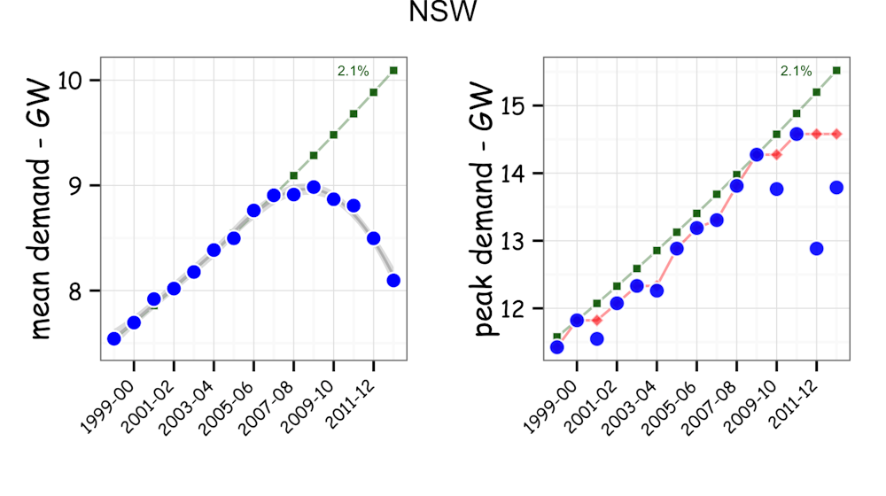
Those measures can be used to get at approximate estimates for just how our utilisation of the grid is changing, using two approaches. One compares the average demand to the previous highest peak demand event as shown by the red line in the right panel above. The other compares the average demand to the projected peak demand event as shown by the green line in the right panel above. For New South Wales the historical annual growth in peak demand is 2.1%.
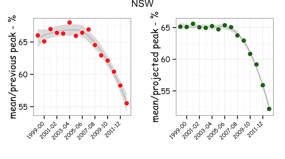
Based on these two measures we get a system-wide picture for how our utilisation rate of the grid is changing. As shown below, for much of the last decade the New South Wales grid was being used at about 65-70% of its capacity across the whole year. Since 2008, the utilisation rate has been falling. In the last financial year it was down to about 55% when measured against the previous highest peak (as depicted in red on the left in the figure below), and to 52% when measured against the projected peak (as depicted in green on the right in the figure below).
Alarmingly, there was a 3-4% decline in utilisation in the last year alone.
While those estimates give a macroscopic view of the grid, a more nuanced view is provided by looking at the proportion of time it is being used at a particular capacity level.
As shown below, the number of days in the year at which the New South Wales grid has been serving demand at above 50%, 66% and 75% of its estimated full capacity is changing dramatically.
At the 75% plus level, the utilisation has fallen from 80 days to 5 days per year, when measured against the previous highest peak capacity. When measured against the projected peak capacity, the fall has been from 60 days to 1 day. And all that in just 6 years.
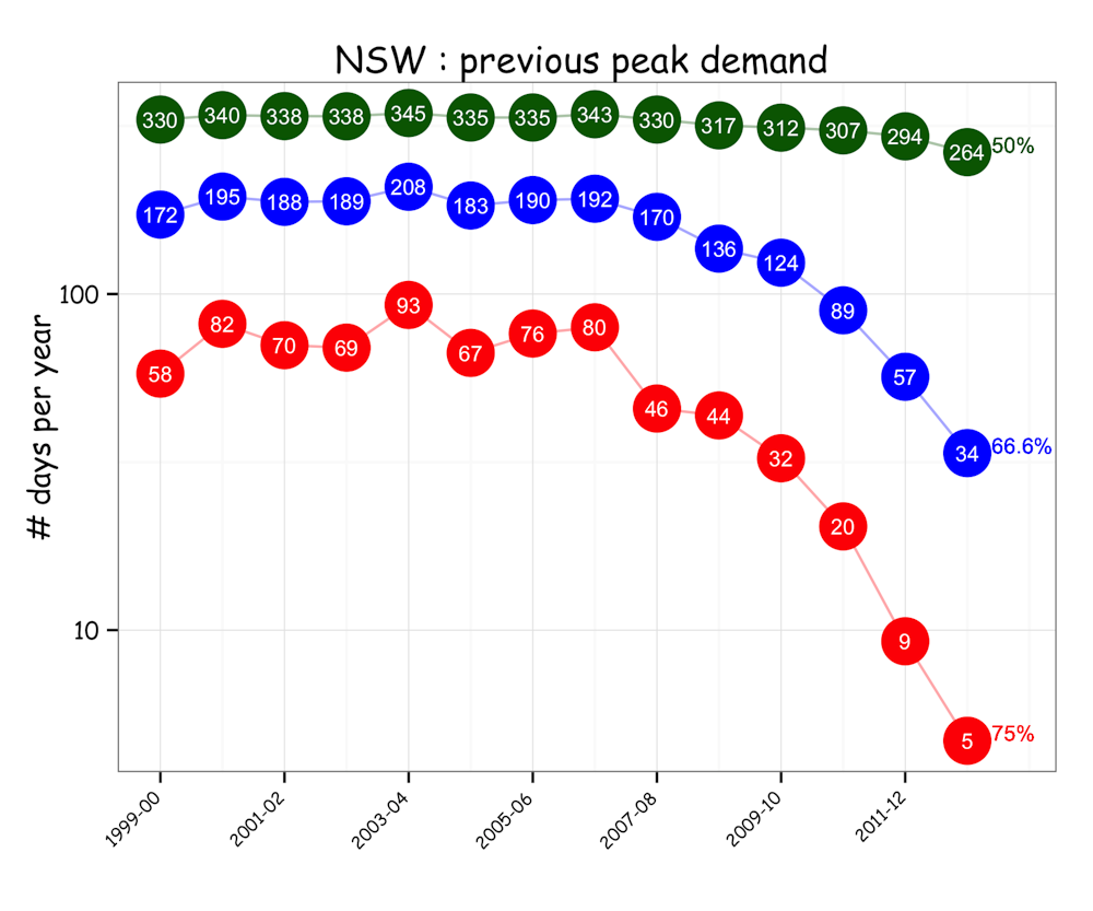
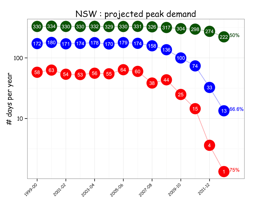
Bearing in mind that peak demand forecasting is problematic and that we have no absolute gold standard measure for the present grid capacity, these estimates indicate a staggering reduction in the way we are utilising the grid.
One consequence is that we are necessarily paying an increasing price to maintain the capacity of the grid in the expectation of what are very rare and increasingly uncertain peak demand events.
Such estimates point to the real Australian story being the alarming decline in national grid utilisation. And because the electricity grid is a key part of the national infrastructure, that is imposing a huge impost on the national productivity agenda.