
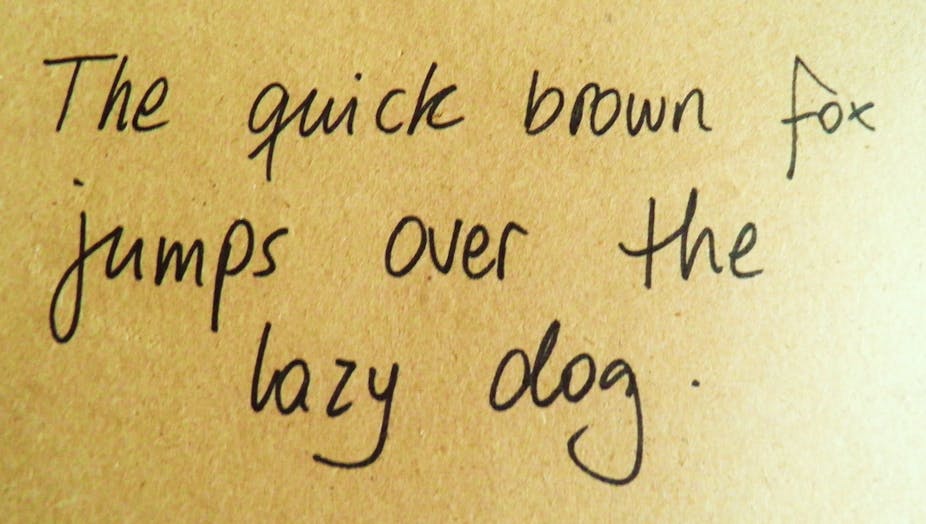
Pen maker Bic has been asking people around to world to submit their handwriting so it can produce what it is calling the Universal Typeface. Although the experiment is not claiming to have any scientific credibility and is much more aimed at selling pens, a look at what has been produced so far can tell us something about how we write.
The idea is for contributors to draw letters using a tool on the Universal Typeface website. These will then be gathered together and a typeface produced based on the results. If everyone wrote the letter I with a serif, for example, we might expect to see the eventual typeface having a serif for that letter.
The data


Bic’s experiment is essentially a marketing excercise so it won’t actually produce a truly universal typeface. But the data being gathered provides some interesting food for thought. What is actually being produced here is a mean shape for different letters. Looking at the data across countries provides an excellent demonstration of the effect of averaging. Any individuality is removed as the number of contributions increases. The end result is more representative by wiping out the interesting outliers.
There is a precedent for using this technique to combine letters. Designer Adrian Frutiger superimposed six typefaces to reveal a letter skeleton, or basic letter shape. This basic letter shape is now shared across fonts and is comparable to what psychologists refer to as the abstract letter identity, which is used to access word representations. Type designers apply stylistic features to basic letter shapes to individualise their font, avoiding a uniform prototype (or universal typeface).

Different strokes


As part of the experiment, Bic is using data to illustrate how letter shapes vary between different contributors. You can compare what the Czech Republic thinks an M looks like compared to the view from the UK, for example or whether artists draw Ws differently to people who work in finance.
There is a substantial imbalance between the number of characters contributed by each gender but it seems that men and women appear to contribute rather similar shapes for some letters. Q and M are very similar while E and H are slightly less so.
This is interesting as we often think of typefaces as having feminine or masculine connotations. Curly or softer typefaces might be associated with women but in fact, this large sample of female and male handwriting does not seem to show reliable differences between the two.


Graphologists may have a different view on this. It’s possible that the constraints of the Bic experiment might have prevented contributors from showing the true nature of their handwriting. We were, after all, writing on a screen rather than a piece of paper and many contributors will have used a mouse, which probably doesn’t accurately reflect their handwriting.
The experiment also throws up some very interesting data on handedness. Although the sample of right handed contributors is much larger than left-handed, there may be some differences emerging across letters.
An observational study of left-handed writing on paper has identified the effects of different writing techniques, such as penhold and grip, on the written trace. Research on left-handed interactions with touch screens would form an interesting comparison.
Universal but dull
For many of us, the letters we contributed to Bic’s experiment will have been rather different from what we would write on paper. Using a tablet, you might be able to use a stylus to simulate the writing experience, but many people will have used a mouse.
Although I could erase and re-draw my letters, I was still not satisfied with the outcome. My perceptual skills are rather more fine-tuned than my production capabilities.
But even if contributors are able to submit their actual handwriting to Bic, do we really want to use our writing as a model for reading? Teachers and educational publishers sometimes favour typefaces that correspond to children’s handwriting but it has also been shown that children can handle different letter shapes. Adult readers are also extremely adept at recognising most words within a fraction of a second, regardless of the font so there doesn’t seem to be a great need to mimic handwriting.
And aesthetically, the concept of a universal typeface is probably misguided. Unlike faces, where Galton observed that averageness is attractive, though not necessarily the peak of attractiveness, averaging letters is likely to result in a rather boring typeface. Designers spend considerable time balancing readability and look when producing a typeface. It is very much an art. Bic’s experiment is still fun though, and is throwing up some interesting data for all those keen to know more about how we write. And maybe the findings about men and women will at least teach Bic that women don’t need a specially adapted pen for ladies anymore.