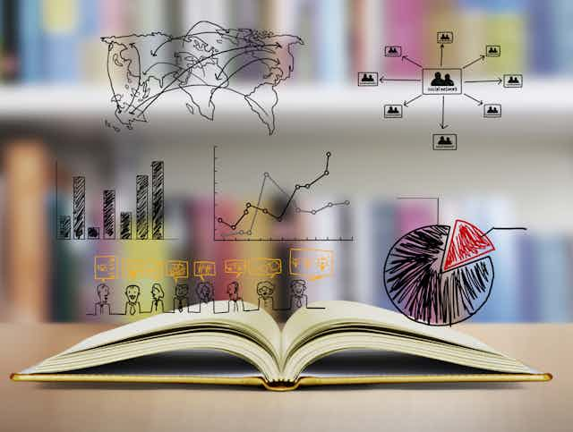

They say a picture is worth a thousand words.
But how much data can a picture capture? Or, more interestingly, how can a picture tell a story that’s hiding in data?
Our eyes can process vast amounts of information rapidly, and we can take advantage of that to make the most of our data.
This is good, because big data is producing more data than ever before. Data analytics are being deployed in many domains and for applications that did not exist even a couple of decades ago.
More than just a simple picture, visualisation helps humans explore and understand data, and to communicate that understanding to others. Here are a few examples.
Finding the message among the noise
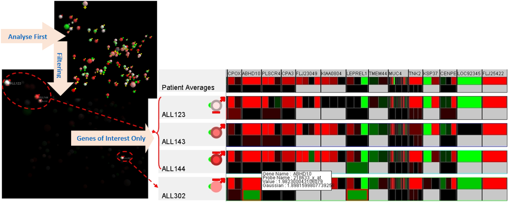
A human genomic data set includes thousands of genes from individual patients with a variety of health conditions and diseases.
Simply presenting this information as a heat map of the entire genomic information from hundreds of people gives a result that is too crowded to comprehend.
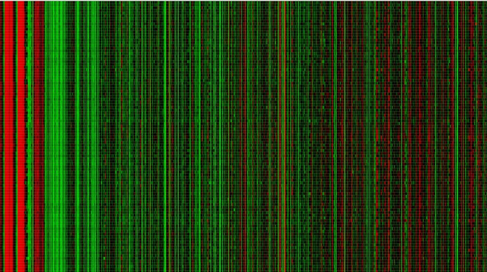
But there are other ways to present genomic data that focus on the relevant information by synergising the automated analysis with visualisation and interaction.
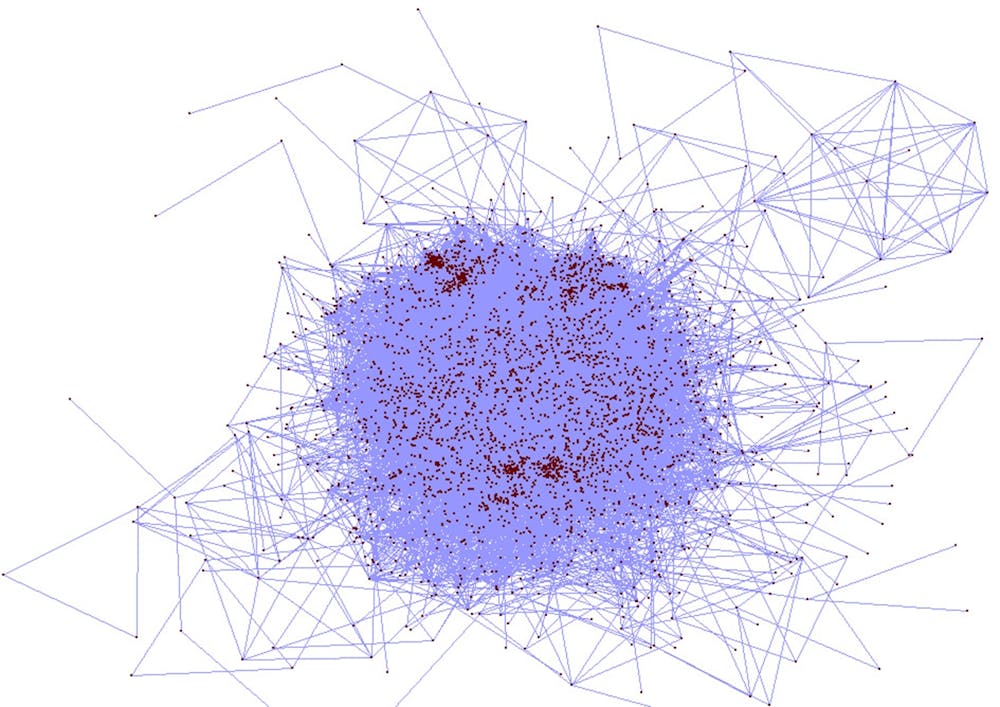
Likewise, a social circle from Facebook includes thousands of people, and hundreds of thousands of connections. The image below shows a “hairball” view of a highly connected network. It is far too complex to comprehend at this level.
But here is another kind of visualisation that highlights interesting groupings of relationships. In this case, it’s a social network of 1,000+ friends that illustrates the context of the various social connections, and also displays the compactness of the interconnections. The different colours are used to show socioeconomic backgrounds.
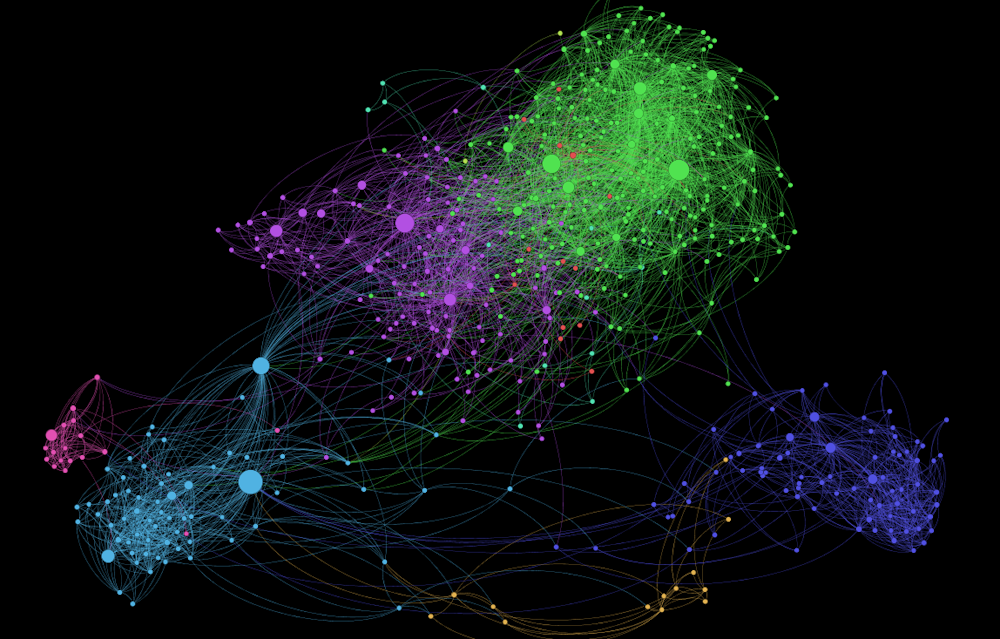
A good visualisation should embrace the complexity of information, while presenting it in a comprehensible and meaningful form. Simplicity and authentic presentation also help with perception and interpretation of the information.
Diagrammatic visualisation of Sydney ports
Diagrammatic visualisation is an approach that uses the simplicity and familiarity of diagrams and symbols to represent complex information.
Presented below is an example of diagrammatic visualisation used to represent logistics operations and trends in productivity for both the land side and the wharf side at Port Botany in Sydney from September 2000 until December 2010.
Our challenge was to include the following information in our visualisations:
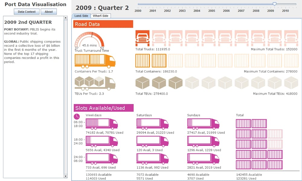
Land-side activities, including truck turnaround time, total number of trucks, total number of containers and slots available and used
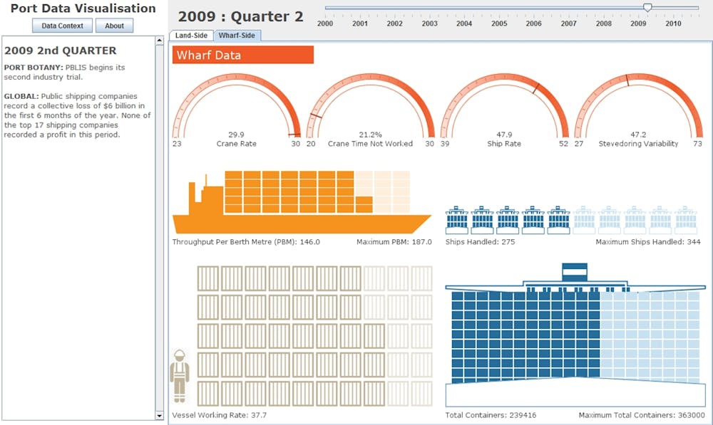
Wharf-side activities, including crane rate, ship rate, crane time not worked, stevedoring variability, throughput per berth meter (PBM), ships handled, vessel working rate, and total number of containers.
The most important aspects to cover were container loading and unloading times, truck turnaround times, and other factors that convey information on performance, labour productivity and efficiency.
We followed the visual information-seeking mantra of “overview first, filter and zoom, details on demand”, to provide an illustration of the Sydney ports’ performance.
The visualisation illustrates:
The land-side performance with truck icons and 20-foot equivalent unit container (TEU) icons, and
The wharf-side performance with ship icons and container icons.
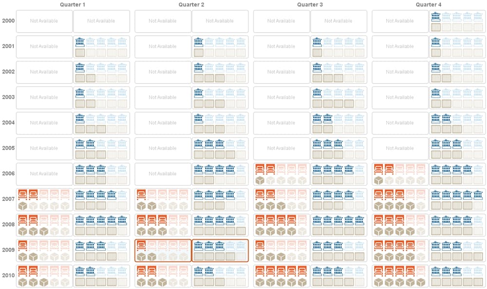
The figure indicates the steady improvement in the overall performance over the years. This is clearly visible in the increasing numbers of icons at each quarter across the years.
But you can also see that the performance got worse in the first three quarters of 2009 (as a result of the global recession).
A zoom at the following images indicates the low total number of trucks and containers (land-side visualisation), as well as the low number of ships and containers handled at the port (wharf-side visualisation).
After the Port Botany Land-side Improvement Strategy was trialled, there was an improvement in crane and ship rates.
This is just one example of how data visualisation can be used to highlight important information and trends.
Visualisations have already played an important role in data analytics, in collaboration with machine learning, data mining and statistics and other techniques.
Future visualisations will have more intelligence and visual elements in their designs. They will deliver most appropriate visualisations can be produced for different users, environments and data sets. And then we can truly make the most of the big data era.