
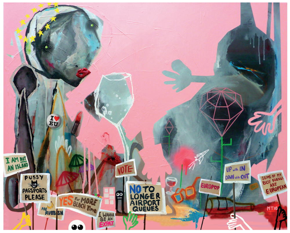
Artists have risen to the challenge of making posters for political motive throughout history. Now we approach a referendum that could divide Britain from the EU and change the face of Europe; an important enough issue to raise the creative juices if ever there was one. Accordingly, contemporary artists and designers have been commissioned by Britain Stronger in Europe to create new works, a series of posters that can be seen adorning many a window.
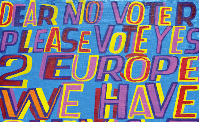
The works are suitably varied. There’s a sanguine illustration by Axel Scheffler, an intriguing but tasteful drawing by Antony Gormley, and a painting by Micheal Tierney that appeals in subject to the lowest common denominator in the debate: ease of holiday travel for those in Europe.
Meanwhile, Jefferson Hack and Ferdinando Verderi, international gurus on creativity and collaboration, have taken the title of their retrospective book, We Can’t Do This Alone, and rendered it as a drifting slice of text approaching a black void. While acknowledging the apt thrust of their philosophy on collaborative partnerships and how this relates to all structures of society including the EU, the poster itself is visually bland.
With colour entering the black bars of a two dimensional space, Eva Rothschild has gone for a dynamic and upfront statement that has a clear retro feel, calling to mind the previous in-out national referendum in 1975. The message and text is simple: vote Remain.

Michael Craig-Martin has opted for a similar effect with his signature-style work. Instantly recognisable as by the artist, it could well be a limited edition print. The light bulb is a typical object from Craig-Martin’s repertory of shapes, tinged with environmental concerns, hinting at the widespread ramifications this referendum will have in all areas of policy.
Ewan Mitchel and Wolfgang Tillmans, on the other hand, compel us to think about wider issues. Mitchel references the unity of Europe that has been established for the past 60 years, his black and white mosaic landscape mingling awkwardly with yellow text.
The first Tillmans poster (of two) is straightforward, an island illustrated by an aerial photograph of shoreline from a non-British looking landscape. We are not an island, he tells us, rightly compelling us to act if we are “in” and register to vote. This has proven to be crucial in the debate following the extension of voter registration after the online meltdown on June 7. Tillmans hits on the right message but seems to lack a visual interpretation of the issue, relying on cliché.

Words, not images
Unfortunately (from an artistic perspective), many of the posters hold little visual edge with an overreliance on text. Posters are also rarely viewed in isolation and need an image design that will catch the attention above the visual noise symptomatic of contemporary culture.
It’s a shame that the simple power of images isn’t capitalised on more. Our visual sophistication is arguably advanced – but there’s little evidence of this in these posters. Rankin is one of the few to deal with the issue visually, with a heart shaped union jack fragmented centrally by a dividing crack. But even here the end result is formal and uninspiring.

There is no art without context: in a sense, all art is political. When it becomes directly about an issue the visualisation of that issue become paramount and the strengths of one artwork/design/poster against another will be tested by the implications and meanings of its constituent parts.
In 1978, German artist Hans Haacke created A Breed Apart. A reference to UK national car giant British Leyland’s involvement with apartheid South Africa, Haacke established a series of disturbing yet stylish juxtapositions of corporate advertising and military action shots. With multiple images, text and logos (with blazon infringement of corporate copyright), the complex messages hit home.
This was unabashedly political art at its best. In comparison, one is left reflecting that our contemporary posters against Brexit could perhaps have struck on the seriousness of the situation with more potency.

With the Britain Stronger in Europe commission, artists and designers have risen to the challenge conscious of their practice and profiles, of being true to their established voice and at the same time communicating an important political message. The artists seem to waver between their artistic identity and the need to get the message across. In deciding to opt for a poster design in their individual studio styles and make work that could become signed editions of 100, many of the posters are ineffective. They say more about the artist than the message. The effectiveness of the poster as political persuasion is therefore compromised.
The result of the referendum on June 23 will impact on our wider society and culture for many decades to come. While it is so encouraging to see the artists that have come out in support of the Remain campaign, the portfolio is mixed. An overreliance on established practice and varying levels of visual dynamic means that they may be overlooked when surrounded by other posters in the window of the local cafe as Britain contemplates how to vote next week.