
Taken at face value, David Cameron’s warning this week about risks in the global economy sounds like it might be wonderfully prescient. Here’s the country’s economic chauffeur, carefully checking his instrument gauges, and sure enough, sees the same signs today that should have given us warning of the crisis of 2007-08. Time to apply the brakes.
There’s only one problem: the economic dashboard that Cameron relies upon did not warn of the crisis before it happened. Instead, that dashboard advised Cameron and other leaders around the world that everything was looking rosy, and that going full throttle was entirely safe.
The OECD’s Economic Outlook, published in May 2007, stated that its “central forecast remains indeed quite benign” as it predicted “a strong and sustained recovery in Europe”. Some dashboard that turned out to be.
Motor skills
Politicians are fond of car analogies when talking about the economy, because they’ve actually driven cars, and they know how they work. Press the accelerator, you go faster; hit the brake, you slow down; the tachometer tells you whether the engine is flat out or idle; the fuel gauge tells you whether you need to call into a petrol station. Car controls work because they are designed by engineers who actually built the car in question, and the dashboard tells you all you need to know, with no serious omissions and no distracting false signals.
But the economic dashboard that Cameron relies upon today was horribly wrong in 2007: the signals it focused upon – mainly the rate of unemployment (low and falling), the rate of inflation (low), the government deficit (heading towards a surplus), and the rate of interest (low but rising to cool the economy down) – gave absolutely no warning of the biggest economic crisis in a century.
This mainstream dashboard gave no warning of the crisis because it was built by economists whose theories have more in common with Alice in Wonderland than with engineering. And one Mad Hatter assumption their dashboard makes is that the level of private debt can be ignored.
Debt wish

If that sounds crazy to you, that’s because it is. Some influential economists argue that private debt has “no significant macroeconomic effects”, to quote Ben Bernanke. Only mavericks who follow the then-ignored but now famous American economist Hyman Minsky disagree, and regard the level and growth of private debt as vital economic indicators.
I am one of those mavericks, and the signs I saw back in 2005 led me to be one of the handful of economists who did warn of the crisis before it happened.
Since then, the American philanthropist Richard Vague – who made his fortune in banking – has examined all major economic crises since 1850, and concluded that the two key signs of an imminent crisis are private debt exceeding 1.5 times GDP and that ratio rising by 17 percentage points or more over five years. Both those signals were clearly “flashing red” in 2007.
Signals, noise
Private debt in Britain rose from 135% of GDP in 2000 to 180% when the crisis began in August 2007 – a 45% rise in less than eight years. In the US, it rose from 125% to 160% – a 35% rise. Both these levels and the rates of change were unsustainable: the growth in private debt had to stop, and when it did, I expected that the biggest economic crisis since the Great Depression would follow – which is what actually happened.
So what are those reliable but neglected indicators telling us today? In the US, private debt fell from 1.7 times GDP in 2010 to 1.45 times in 2014. It’s been rising since 2012 and was now growing at 5% of GDP per year in mid-2014, which is spurring economic growth – but the headroom for continued credit-driven growth is limited because the aggregate level is still so high. We are nudging back closer to Vague’s danger zone.

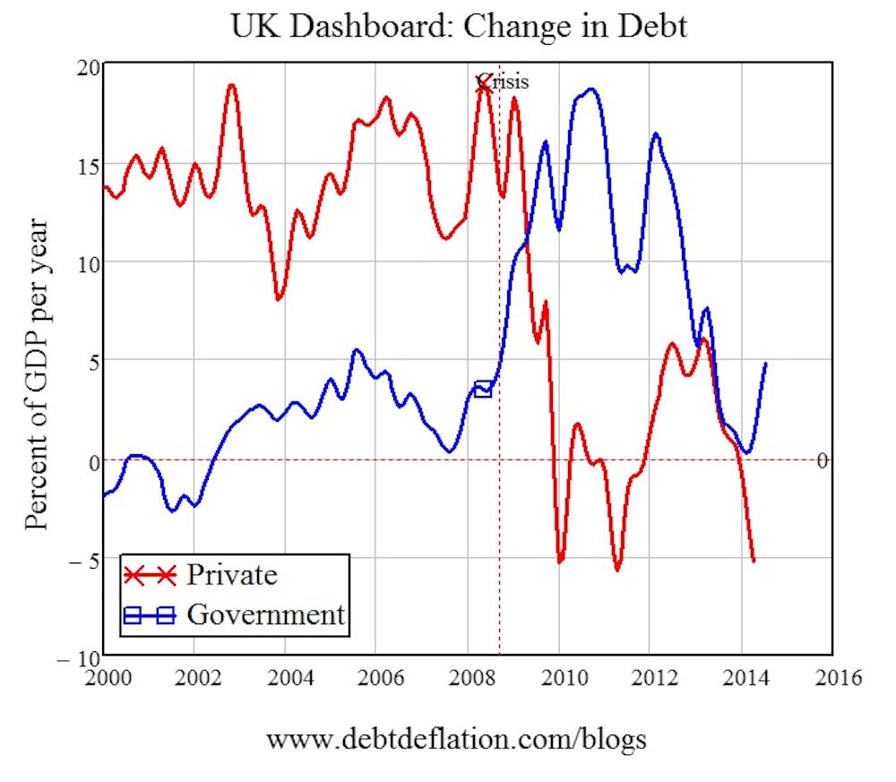
In the UK, private debt peaked at more than twice GDP in 2010. It has fallen to 170% today, but between 2012 and 2014 it rose – stimulating economic growth. Now it is falling again – by as much as 5% of GDP a year. That implies that a credit contraction – however welcome it might be in stopping at least one warning light flashing – is likely to reduce British economic growth in the near future.

So Cameron is right to worry, but he’s worrying about the wrong thing: panicking about a rising level of government debt, when at 91% of GDP, it’s 80 percentage points below the level of private debt. If Cameron thinks reducing government spending when private credit is contracting is good economic policy, then he’s ignoring the biggest car crash in economic history – the European Union, where government austerity turned the crisis into a second Great Depression.
The key indicator I use to anticipate where the economy is headed is the acceleration of private debt. Just as the rate of change of private debt indicates what’s going to happen to the level of economic activity, the acceleration of debt indicates whether activity is likely to rise or fall. That indicator, which was trending up from mid-2010 until mid-2012, has been headed down ever since. Debt acceleration was strongly negative as of mid-2014, running at minus 10% of GDP.
That, combined with Richard Vague’s indicator that crises occur when private debt exceeds 150% of GDP (tick at 170% in mid-2014) and has grown by 20 percentage points or more over five years (in fact it’s shrunk by 30 percentage points since 2010), points to stagnation rather than crisis being the likely outcome for the UK economy.
In this scenario, an attempt to pare government spending back could make the stagnation worse – just as it has done across the Channel.
All in all, I would recommend Cameron gets his economic dashboard fixed, or he risks steering the UK in the direction of Europe.
Hard Evidence is a series of articles in which academics use research evidence to tackle the trickiest public policy questions.