

People with standard vision can see millions of distinct colors. But human language categorizes these into a small set of words. In an industrialized culture, most people get by with 11 color words: black, white, red, green, yellow, blue, brown, orange, pink, purple and gray. That’s what we have in American English.
Maybe if you’re an artist or an interior designer, you know specific meanings for as many as 50 or 100 different words for colors – like turquoise, amber, indigo or taupe. But this is still a tiny fraction of the colors that we can distinguish.
Interestingly, the ways that languages categorize color vary widely. Nonindustrialized cultures typically have far fewer words for colors than industrialized cultures. So while English has 11 words that everyone knows, the Papua-New Guinean language Berinmo has only five, and the Bolivian Amazonian language Tsimane’ has only three words that everyone knows, corresponding to black, white and red.
The goal of our project was to understand why cultures vary so much in their color word usage.
Is it about which colors stand out the most?
The most widely accepted explanation for the differences goes back to two linguists, Brent Berlin and Paul Kay. In their early work in the 1960s, they gathered color-naming data from 20 languages. They observed some commonalities among sets of color terms across languages: If a language had only two terms, they were always black and white; if there was a third, it was red; the fourth and fifth were always green and yellow (in either order); the sixth was blue; the seventh was brown; and so on.
Based on this order, Berlin and Kay argued that certain colors were more salient. They suggested that cultures start by naming the most salient colors, bringing in new terms one at a time, in order. So black and white are the most salient, then red, and so on.
While this approach seemed promising, there are several problems with this innate vision-based theory.
Berlin, Kay and their colleagues went on to gather a much larger data set, from 110 nonindustrialized languages. Their original generalization isn’t as clear in this larger data set: there are many exceptions, which Kay and his colleagues have tried to explain in a more complicated vision-based theory.
What’s more, this nativist theory doesn’t address why industrialization, which introduced reliable, stable and standardized colors on a large scale, causes more color words to be introduced. The visual systems of people across cultures are the same: in this model, industrialization should make no difference on color categorization, which was clearly not the case.
How do you describe this color?
Our research groups therefore explored a completely different idea: Perhaps color words are developed for efficient communication. Consider the task of simply naming a color chip from some set of colors. In our study, we used 80 color chips, selected from Munsell colors to be evenly spaced across the color grid. Each pair of neighboring colors is the same distance apart in terms of how different they appear. The speaker’s task is to simply label the color with a word (“red,” “blue” and so on).
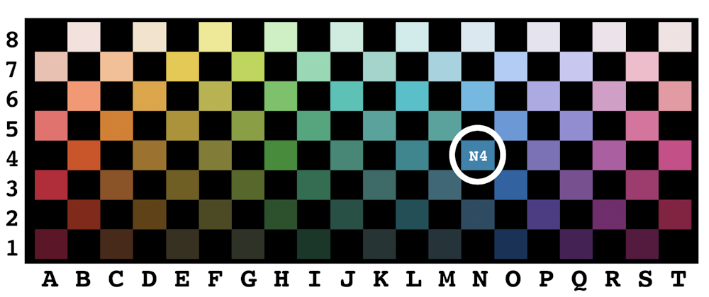
To evaluate the communication-based idea, we need to think of color-naming in simple communication terms, which can be formalized by information theory. Suppose the color I select at random is N4. I choose a word to label the color that I picked. Maybe the word I choose is “blue.” If I had picked A3, I would have never said “blue.” And if I had picked M3, maybe I would have said “blue,” maybe “green” or something else.
Now in this thought experiment, you as a listener are trying to guess which physical color I meant. You can choose a whole set of color chips that you think corresponds to my color “blue.” Maybe you pick a set of 12 color chips corresponding to all those in columns M, N and O. I say yes, because my chip is in fact one of those. Then you split your set in half and guess again.
The number of guesses it takes the ideal listener to zero in on my color chip based on the color word I used is a simple score for the chip. We can calculate this score – the number of guesses or “bits” – using some simple math from the way in which many people label the colors in a simple color-labeling task. Using these scores, we can now rank the colors across the grid, in any language.
In English, it turns out that people can convey the warm colors – reds, oranges and yellows – more efficiently (with fewer guesses) than the cool colors – blues and greens. You can see this in the color grid: There are fewer competitors for what might be labeled “red,” “orange” or “yellow” than there are colors that would be labeled “blue” or “green.” This is true in spite of the fact that the grid itself is perceptually more or less uniform: The colors were selected to completely cover the most saturated colors of the Munsell color space, and each pair of neighboring colors looks equally close, no matter where they are on the grid.
We found that this generalization is true in every language in the entire World Color Survey (110 languages) and in three more that we did detailed experiments on: English, Spanish and Tsimane’.
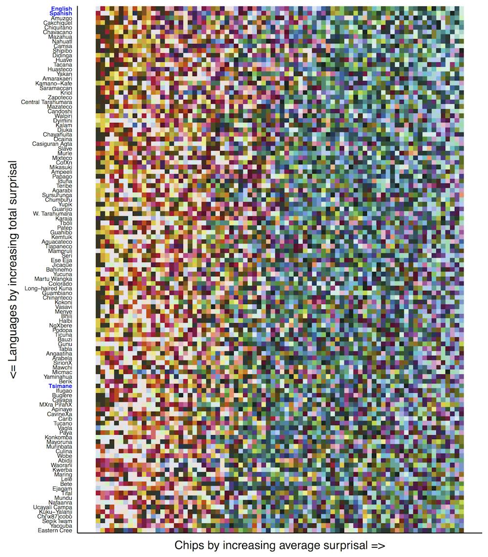
It’s clear in a visual representation, where each row is an ordering of the color chips for a particular language. The left-to-right ordering is from easiest to communicate (fewest guesses needed to get the right color) to hardest to communicate.
The diagram shows that all languages have roughly the same order, with the warm colors on the left (easy to communicate) and the cool ones on the right (harder to communicate). This generalization occurs in spite of the fact that languages near the bottom of the figure have few terms that people use consistently, while languages near the top (like English and Spanish) have many terms that most people use consistently.
We name the colors of things we want to talk about
In addition to discovering this remarkable universal across languages, we also wanted to find out what causes it. Recall that our idea is that maybe we introduce words into a language when there is something that we want to talk about. So perhaps this effect arises because objects – the things we want to talk about – tend to be warm-colored.
We evaluated this hypothesis in a database of 20,000 photographs of objects that people at Microsoft had decided contained objects, as distinct from backgrounds. (This data set is available to train and test computer vision systems that are trying to learn to identify objects.) Our colleagues then determined the specific boundaries of the object in each image and where the background was.
We mapped the colors in the images onto our set of 80 colors across the color space. It turned out that indeed objects are more likely to be warm-colored, while backgrounds are cool-colored. If an image’s pixel fell within an object, it was more likely to correspond to a color that was easier to communicate. Objects’ colors tended to fall further to the left on our ranked ordering of communicative efficiency.
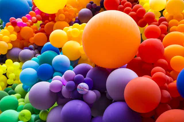
When you think about it, this doesn’t seem so surprising after all. Backgrounds are sky, water, grass, trees: all cool-colored. The objects that we want to talk about are warm-colored: people, animals, berries, fruits and so on.
Our hypothesis also easily explains why more color terms come into a language with industrialization. With increases in technology come improved ways of purifying pigments and making new ones, as well as new color displays. So we can make objects that differ based only on color – for instance, the new iPhone comes in “rose gold” and “gold” – which makes color-naming even more useful.
So contrary to the earlier nativist visual salience hypothesis, the communication hypothesis helped identify a true cross-linguistic universal – warm colors are easier to communicate than cool ones – and it easily explains the cross-cultural differences in color terms. It also explains why color words often come into a language not as color words but as object or substance labels. For instance, “orange” comes from the fruit; “red” comes from Sanskrit for blood. In short, we label things that we want to talk about.