
A print designer by trade, I resisted eBooks until a single publication won me over: an edition of T.S. Eliot’s The Waste Land designed for the iPad, jointly produced in 2011 by publisher Faber and Faber and digital publishing innovators Touch Press.
It’s what’s known as an “enhanced eBook” because the central text (the poem) is packaged with additional rich media – audio, video, written texts and still images that “enhance” the poem.
Despite all the additional content, it is a beautifully restrained and subtle book. Spending 10 minutes with it, I knew this was the future.
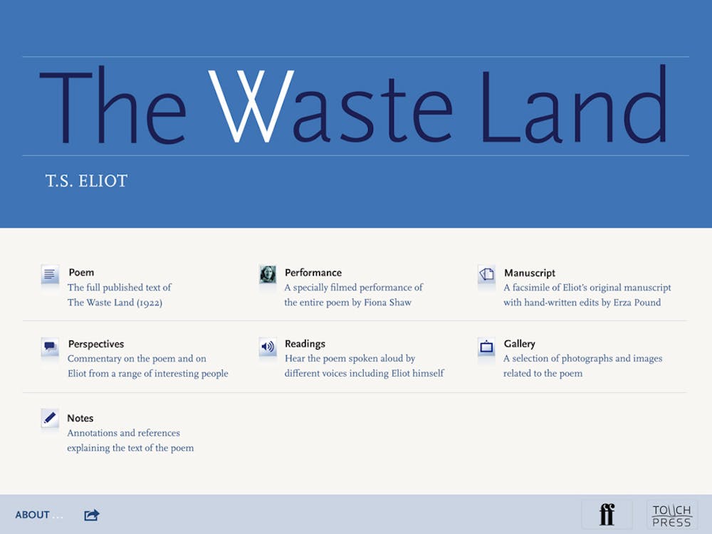
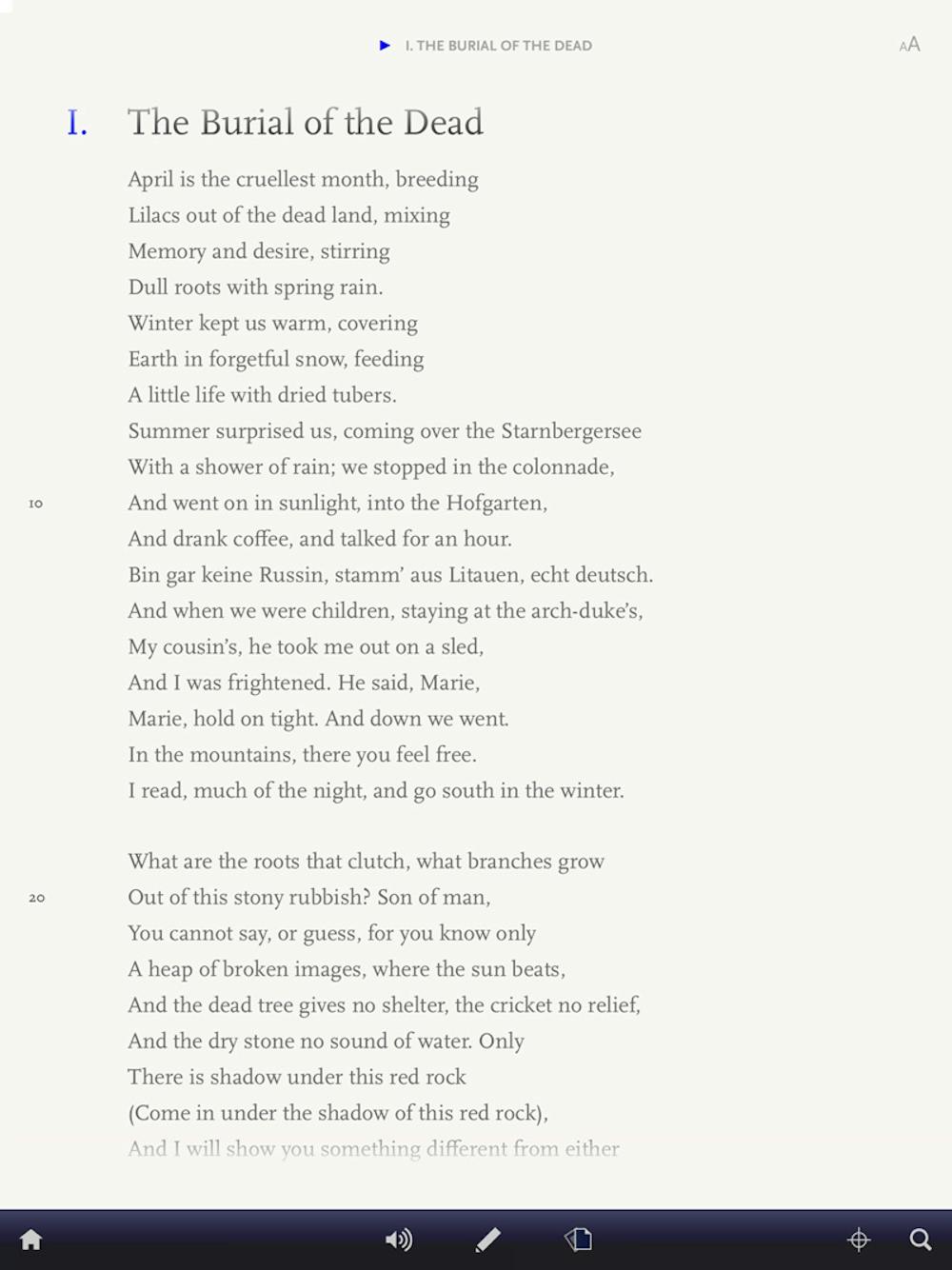
The poem is presented classically: typeset in a serif typeface (Scala, for those who care), dark grey on an off-white background, with a simple drop-down menu to jump between the five sections of the poem and Eliot’s notes.
The subtlety of the design is perfect. To enable readers to slip into the world of a book, the typography should be so restrained it quickly becomes “invisible” – we look past the letter-forms and lose ourselves in the language.
This iPad edition allows for a more seamless reading experience than print; it can be read as a continuous scroll, never interrupting the flow of reading with the turn of a page.
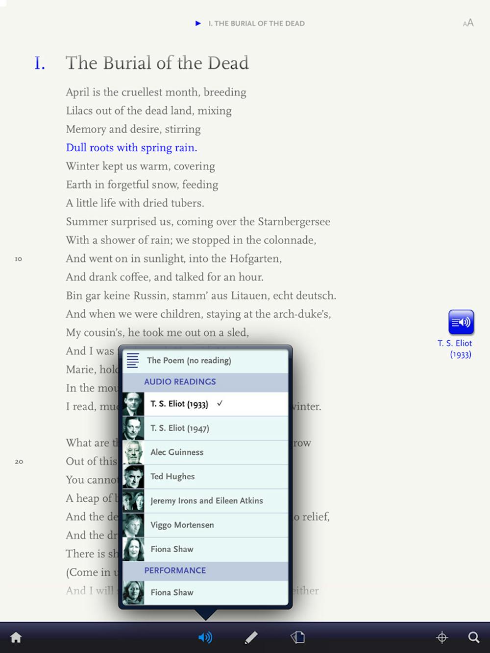
An unobtrusive tool bar is nested in the bottom of the screen. Selecting a volume icon, a menu of readings pops up. Choose to have the poem read by Alec Guinness, Jeremy Irons and Eileen Atkins, Viggo Mortensen, Fiona Shaw, Ted Hughes or Eliot himself, from recordings made 1933 and 1944 (his voice changes distinctly).
With a narrator selected, you can tap any line of the poem and the audio will begin, or let it play the whole way through reading and listening in sync. Listening to a poem expertly performed brings out nuance and rhythm the regular reader can struggle to find. It is an experience only afforded by a digital edition.
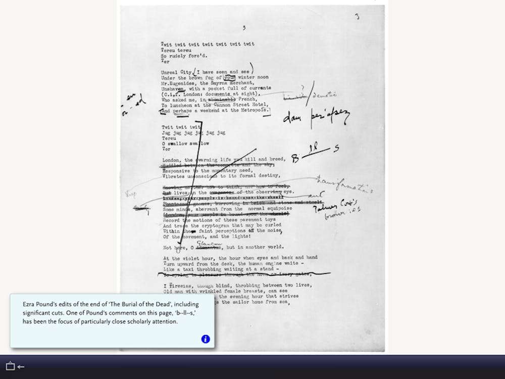
Tapping a page icon reveals a facsimile of Eliot’s typewritten manuscript, including fellow poet Ezra Pound’s extensive, grubby pencil edits. Swiping between the clean final poem and the rough manuscript offers insights into Eliot’s writing process and relationship with Pound.
Pop-up notes point to vast chunks of deleted text, or lines and phrases retained. It also illuminates how laborious the writing process is, even for one of the greats.
Tapping a pen icon brings up a sidebar of interactive notes. Compiled by Faber and Faber, the notes explain the dense references and historical allusions. Each note aligns with the section of the poem it relates to, allowing for simultaneous reading - a superior experience to flipping to the endnotes in a book or squinting at footnotes. A second note section is provided to type your own notes, a valuable feature for students and scholars.
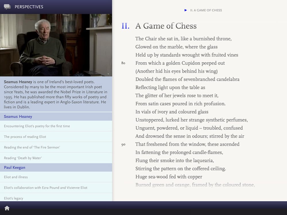
Packaged around the poem is an archive of audio-visual material: 35 filmed ‘perspectives’ show writers, actors, theatre directors, musicians, academics and publishers discussing Eliot’s life and work; and a gallery of still images – photographs, paintings, ephemera – with annotations relating them to the poem. Readers can dip into the archive to make links between the poem and social and cultural events of the time.
There’s also a highly produced performance by Irish actor and director Fiona Shaw, filmed specially for this edition by the BBC.
The amount of additional content included is remarkable, and made the app worth the $13.99 purchase price. The publication took a year to create and cost roughly $150,000 to produce, but was in profit in its first week on the iTunes Store.
For me, craftsmanship is what sets this publication above other eBooks I’ve experienced. Designer Hilary Kenna worked on the project as part of her practice-led PhD in typography.
The subtle but refined typography and simplicity of the interface design show this is a publication designed for readers, not an experiment in new media.
A rationale written for the 2012 Interaction Awards (it won) states:
Our aim was to bring the poem to a new audience and to use the special capabilities of the iPad to give that audience the tools to appreciate perhaps one of the greatest works of 20th Century literature. […] But at the core of the iPad edition is the poem itself, beautifully typeset and, with a quick turn of the device, uncluttered and carefully presented without embellishment. […] The net effect of this is to minimise distraction from the reading experience.
As eReaders and tablets such as Apple’s iPad, Microsoft’s Surface, Sony’s Xperia and Samsung’s Galaxy continue to evolve, the rich-media publications they house will continue to change the way we read and interact with texts.
It is an exciting time for readers, and designers who care about reading.