
In the developed world where many people happily post their current locations on Facebook and can look up the exact locations of buildings online, it is often overlooked how poor locational information on people and settlements can be for lower income regions.
The Democratic Republic of Congo has gone without a population census for 29 years, and estimates of the number of people currently living in Angola can range between 13m and 20m. These are extreme examples, but uncertainties remain common for many of the most vulnerable and disease burdened countries of the world, where such information is most needed.
How many children are at risk of malaria? How many pregnant women do not have access to maternal healthcare facilities? How many people would be affected by extreme flooding? We need to answer these questions to be able to effectively intervene and plan mitigation strategies. But that also requires up-to-date information on where people are and how many are there.
Natural disasters
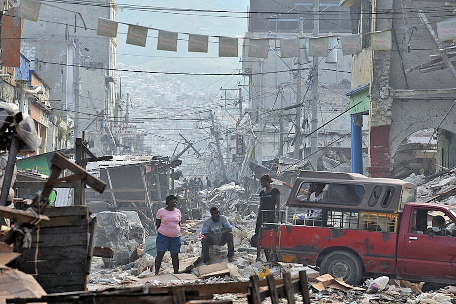
Large-scale natural disasters such as typhoon Haiyan in the Philippines or the 2010 earthquake in Haiti can bring stark reminders of the importance of knowing how many people are living in which locations in order to rapidly assess and provide relief. These disasters have also shown that a range of existing datasets can be used to rapidly improve available information on where people live.
The donation of extremely detailed satellite imagery and aerial photos by private companies, the efforts of “crowdsourced” volunteers all over the world who converted these images into maps of buildings, villages and road networks and the sharing of all of this through online portals such as OpenStreetMap have made Haiti, and now the Philippines, two of the best mapped countries in the developing world.
Such efforts massively improve the quality and availability of data on human population distributions that we can see remotely from satellites and aerial photos. It shows what we can do when we combine disparate datasets and expertise to tackle specific problems.
The numbers game
The increasing volumes of detailed digital map data are a first step in improving our understanding of how populations are distributed in low income regions. But working out the number of people living in different locations is still a challenge.
The recently launched WorldPop project aims to tackle this, by building an accurate picture using rapidly changing digital map data and combining it with detailed data from population censuses, household surveys and satellite imagery. The idea is to provide open access estimates of numbers and demographic characteristics of people living in each 100x100m grid square across low income regions around the world.

The value of accurate population estimates in health and development work has been shown in assessments of the impact of the recent Somalia famine, the numbers at risk of malaria and also people’s access to financial services.
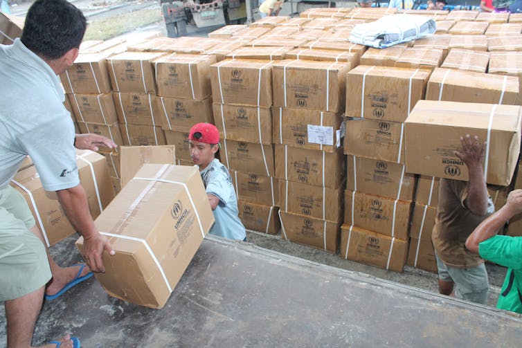
Substantial WorldPop downloads and requests for Philippines data by aid agencies after the recent typhoon also underscore the value of detailed population maps to measure the impact of disasters.
But population maps are far from perfect. Even when built using the best available data available, they still remain limited by often poor information on how many people live in each location for many low income countries.
So researchers on the project are now exploring new digital data sources to add extra information that gives more detail about population distribution. These include anonymised mobile phone call records, which were invaluable to working out where displaced people were after the Haiti earthquake.
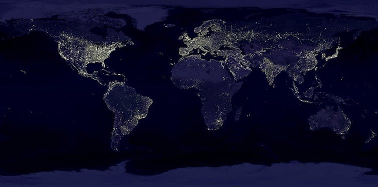
Population density indicators are also being found from sources such as Twitter – which is widely used in countries such as Indonesia and Saudi Arabia – and satellite images of the Earth at night.
These digital datasets not only show potential for improving estimates of the densities and absolute numbers of people in different locations in resource-poor areas, but they also open up the possibility of the ultimate in terms of mapping people: information on how they change location seasonally or between day and night.
Being able to measure and map typical daily movement patterns could be vital in keeping up with a rapidly evolving natural disaster or even something as simple as working out exposure to disease-spreading mosquitoes.