
Don’t worry — you’re not seeing double.
Everything looks the same … well, certainly in mass market products such as consumer electronics.
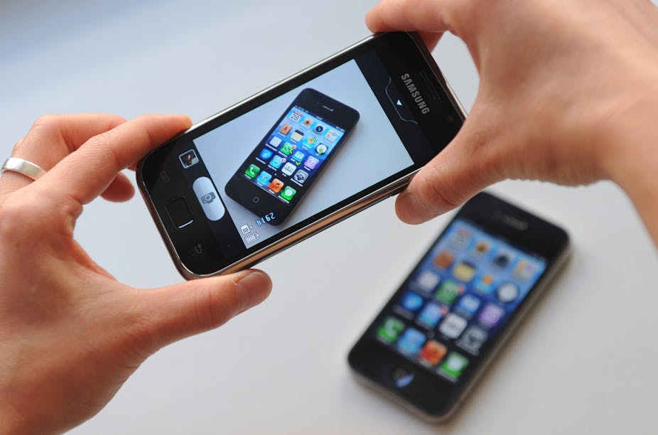
The high profile litigation between Apple and Samsung is just one of many intellectual property disputes that have evolved from similarities in product appearance.
But where does this trend stem from?
The power of the brand
The major representatives of brands are the products they sell, and nowadays it isn’t necessarily the functional values of products that represent brands.
Research into strategic use of appearance has shown that for many mass-market products the difference in technology between competing companies has become smaller. Where companies once competed for better performance of their products, they are now forced to create competitive advantage elsewhere. A major point on which to differentiate from competition has become brand name/image and a certain style that goes with it.
In turn, image has become the way in which consumers look to form a bond with products.
But it isn’t just the importance of product appearance to brands (and their reliance on it) that has led to products looking alike. There’s also a third major contributor: the design process.
Designing new products
In the design and development of new products or a new model, potential designs and alternatives are constantly reviewed by designers and other stakeholders as to whether they meet the requirements specified. This is usually fairly straightforward when considering factors like cost, size and manufacture.
However, judging the potential success of products becomes a little more complicated when considering more subjective factors, such as appearance and brand. The heightened importance of these factors makes this decision crucial.
It is extremely hard to prove and communicate whether or not the way something looks suitably embodies the brand, or will be well-received by potential consumers.
The most common and logical way to review the appearance of potential products is by comparing them with previous models, other products produced by a brand and/or their competition.
Thus, the way that products look is not necessarily reviewed on individual “design merit”, but rather on how similar it looks compared to the last model — or even in comparison to a competitor’s model.
The effect of this is that it becomes a lot more tempting for a brand to play it safe and make their new products visually align with their previous successful products (or indeed those of their competitors).
For established brands, it’s believed to be safer to “go with what you know”, rather than push boundaries with a product’s appearance “just to be different” and risk a lack of recognition and poor reviews, and the subsequent damage to brand image. The negative response and subsequent loses suffered by juice-maker Tropicana after a packaging redesign in 2009 is a case in point.
Meanwhile, for newcomers such as up-and-coming Chinese brands, it is risky to produce something radically different for fear that consumers will find it completely unfamiliar — and all to easy to draw on successful established brands.
The solution
Market research is a staple of any branding activity, but it usually focuses on the consumer and their reaction. Research into product appearance (a relatively young research area), and particularly the aspects that consumers associate with a given brand, should be of great value to companies.
Having this means features essential to a brand’s identity are distinguishable and maintained. Secondly, and perhaps more importantly, this knowledge means the remaining elements of a design can be freely changed to create novelty and variety without the fear of being “too different”.