
Staring at a blank page is daunting. Where to make the first mark? As designers have known for centuries, one way is to start with a grid.
A grid is a structure of lines used by designers to help organise graphic elements (images and typography) on the page. A grid sets margins around the edge of the page, but also guides the designer as she or he arranges graphic elements in relation to each other.
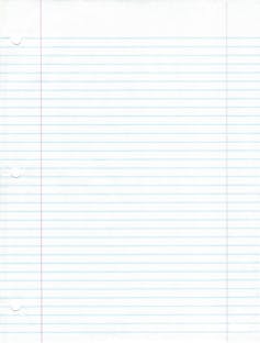
We use grids all the time without noticing them. Ruled paper is a basic grid, as are calendars and forms with spaces for us to fill in.
At some stage, someone designed the standard width between the lines of foolscap paper (see left), according to the size of most people’s handwriting – or, in setting a standard line-width, most people now write at this size.
Similarly, software programs such as Microsoft Word or Pages have a standard grid (margins) preset. A designer somewhere determined the most effective grid for writing a page of continuous text, so you don’t have to consider this every time you start a new document.
Designers cannot always rely on the default grid, so they start projects by setting a unique grid that suits the page/ screen size and type of document being designed.
A well-considered grid is particularly important for multi-page documents such as books, magazines and web sites. Consider turning the pages of a book in which every page is set with different margins – your eye doesn’t know where to settle. When flipping through a magazine, our eyes seek a page with many small blocks of text and images, or a cleaner page with a large text block, depending on what we feel like reading.
The grid helps a designer structure content, and a reader find hierarchy on a page.
A brief history of grids
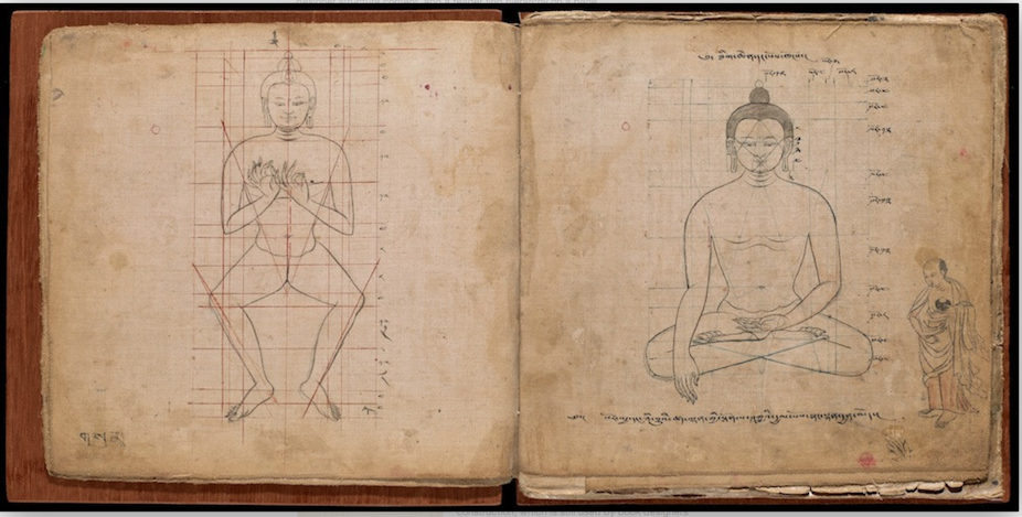
The use of grid systems to compose images dates back centuries. The Tibetan Book of Proportions (main image) produced in Nepal during the 18th century shows ideal proportions to accurately depict Buddha and Bodhisattva figures in religious texts. These books, developed as far back as the 4th Century, also instructed how many teeth to depict, eye colour and direction of hairs. This is the equivalent of a contemporary style guide used by magazine designers.
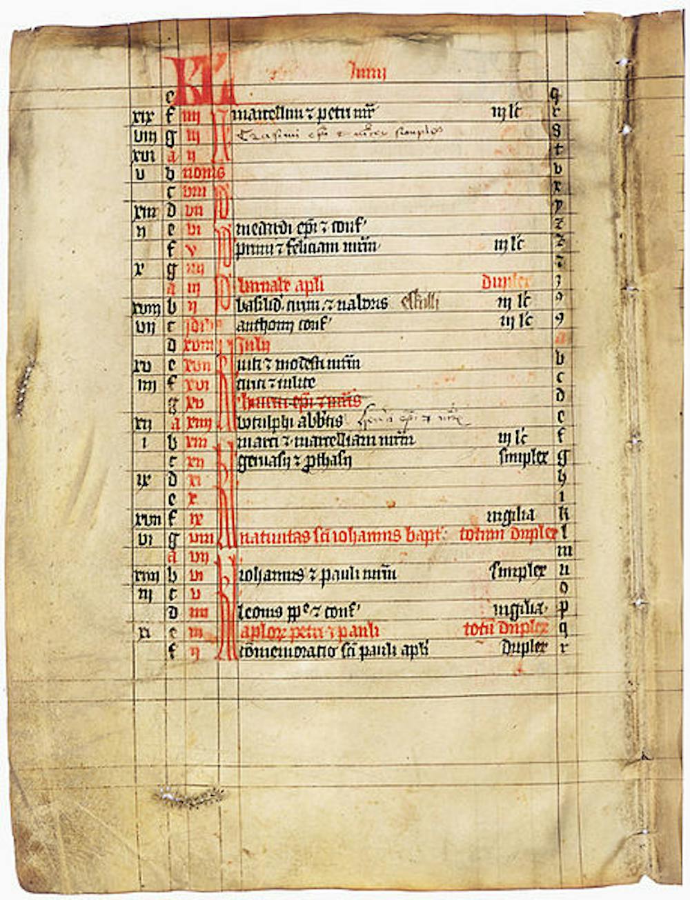
Medieval scribes composed pages of illuminated manuscripts (such as the one to the right) using a grid system that was later borrowed by German printer Johann Gutenberg to produce the first mechanically printed bible in 1455 (previously all books in the Western world had been hand-written by scribes).
In the 1940s, Dutch book designer J.A. Van de Graaf drew up a formula for recreating these “canons” (or rules) for page construction used in medieval manuscripts and the Gutenberg bible. The Van de Graff canon is still used by book designers today:
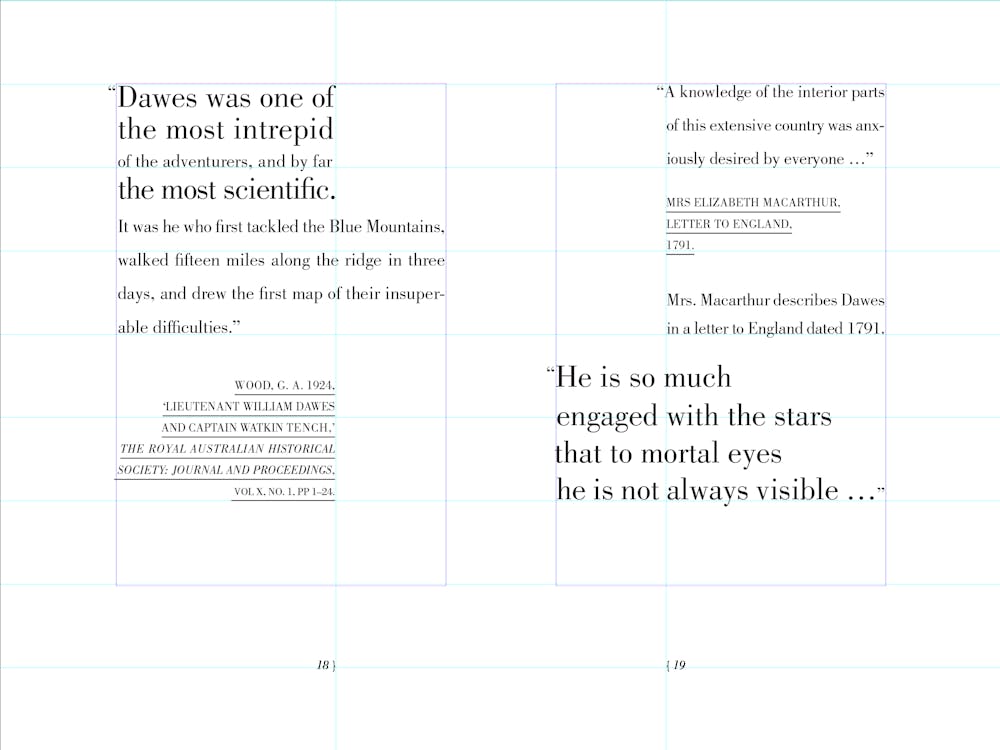
Like many designers, I came to understand the “canons of page construction” through the writing of Swiss typographer Jan Tschichold (see my own example below). Despite writing in the mid-20th century before desktop computers fundamentally changed graphic design, Tschichold’s writing endures.
Tschichold drew together ideas of his predecessors, including Van de Graaf and Argentine typographer Raul Rosarivo, and clearly explained them to a broad audience. Most importantly, Tschichold stressed that clarity of communication should guide typography and page layout. In other words, design for the reader.
This sentiment was echoed by Swiss designers of the 1950s who started the International Typographic Style movement. Josef Müller-Brockmann, a key figure in this movement, endorses the grid but also warns:
The grid system is an aid, not a guarantee. It permits a number of possible uses and each designer can look for a solution appropriate to his personal style. But one must learn how to use the grid; it is an art that requires practice.
Müller-Brockmann’s Grid Systems in Graphic Design remains a classic text, despite being written before the desktop computer revolutionised the way graphic designers work.
The humble grid is an enduring “design classic” because it provides structure for designers to create order, and helps the reader navigate a document.
Read more articles in the Sublime Design series.
Are you an academic or researcher? Have you got a design classic – industrial, graphic, urban, architectural, interior or landscape – you would like to write about? Contact the Arts + Culture editor.