

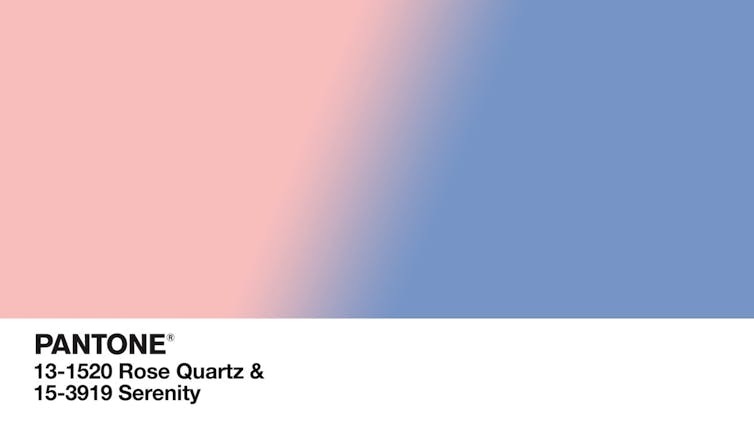
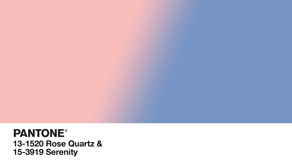
Pantone, the global authority on color standards for the design industries, recently announced its colors of the year for 2016: Rose Quartz and Serenity, which are muted shades of pink and blue, respectively.
It’s the first time Pantone has chosen the blending of two shades instead of one (past choices include Marsala, Radiant Orchid and Emerald). According to the company, by breaking from tradition, it hopes to “transcend cultural and gender norms.”
In its choice, Pantone seems to be suggesting doing away with the practice of associating colors with gender – something that’s actually a relatively recent phenomenon, and can restrict the colors designers use. For decades, pink has been associated with girls and blue with boys. Could Pantone’s decision to focus on gender influence the designs of everything, from clothing to house paints?
Why am I Mr. Pink?
There is nothing intrinsically female about the color pink, nor is there anything intrinsically male about the color blue. Rather, popular culture – and buckets of advertising dollars – have largely dictated how we perceive the color-gender relationship.
In Quentin Tarantino’s Reservoir Dogs (1992), five strangers chosen to commit the perfect crime sit together, presumably meeting for the first time. Each is given a colorful alias to conceal his true identity, leading to some complaints from Mr. Pink (Steve Buscemi), who’s perturbed about the name’s effeminate connotations (“Why am I Mr. Pink?”).

A century ago, viewers would have been confused by Mr. Pink’s reaction. At various points in history, these gender-color connections have actually had opposite roles. The color pink, which is a shade of red (the color of blood and wartime), has historically been a masculine color. Blue, a color that is associated with the Virgin Mary, was historically considered feminine – and still is in many parts of the world.
The color order that we’ve become accustomed to wasn’t established until the 1940s, when gender-specific clothing began being dictated by manufacturers and retailers. Eventually, boys and girls required different clothes, different toys – even different interior designs in their rooms and nurseries. Popular products like Barbie (primarily marketed to young females) would end up playing a role in shaping our color stereotypes. (In fact, Barbie has her own Pantone color: Barbie Pink!)
With the arrival of the women’s liberation movement in the 1960s, fashion shifted away from gender-specific clothing as girls embraced more masculine styles. A decade later, fashion moved toward a more neutral palette. There was even a two-year stretch in the 1970s when no pink clothing appeared in the Sears, Roebuck and Co. catalogue. Many argued that little girls should be dressed more like boys to encourage them to be more assertive.
In the 1980s, we witnessed a shift toward gender-specific color purchases, especially for children. With the advent of prenatal testing (along with more discretionary income), families could now plan farther in advance – and spend significant amounts on products – in preparation for the expected baby girl or boy. Even disposable diapers were sold in pink and blue.
Colors in a gender-blurring world
Today we’re more connected than ever – and more skeptical about the advertising we’re exposed to. Consumers have become increasingly sensitive to the methods used to reinforce these social conventions in order to bolster profits.
We’re also in the midst of a movement to narrow the gender divide, particularly in fashion. The burgeoning trend of genderless fashion is being dictated by a new generation of individuals who accept styles without the traditional boundaries of previous generations. They recognize that their role as a consumer is not just about the product, but rather about being a part of a larger movement.
The combination of Serenity and Rose Quartz was featured on the runways for both men and women and highlighted in the Pantone Fashion Color Report Spring 2016. This will inevitably bleed into other areas of design, from interiors to product design. When conveying meaning and purpose to consumers, products and packages may abandon the use of traditional gender-color associations. As an alternative, designers could employ colors associated with emotions and lifestyles in order to to entice and connect.
As we’ve seen, the color-gender link isn’t concrete. The boundaries built by generations before us could soon be knocked down. With this year’s selection, Pantone is among a select few wielding a hammer. By recognizing the cultural and “societal movements towards gender equality and fluidity,” Pantone is paving the way for future generations to be less concerned about being typecast or judged for embracing unexpected and unique colors.
And perhaps being called Mr. Pink won’t be so insulting after all.