


This year’s Archibald prize has gone to Ben Quilty’s portrait of Australian artist Margaret Olley.
It’s an award often criticised for being populist or irrelevant, and there’s no reason to think that this year will be any different.
But the prize is the subject of fascination for both the media and the public, and undoubtedly the most well-known event in the Australian arts calendar.
So what’s all the fuss about? Why are we so obsessed with, and divided over, a portrait prize?
What do you think of this year’s winner?
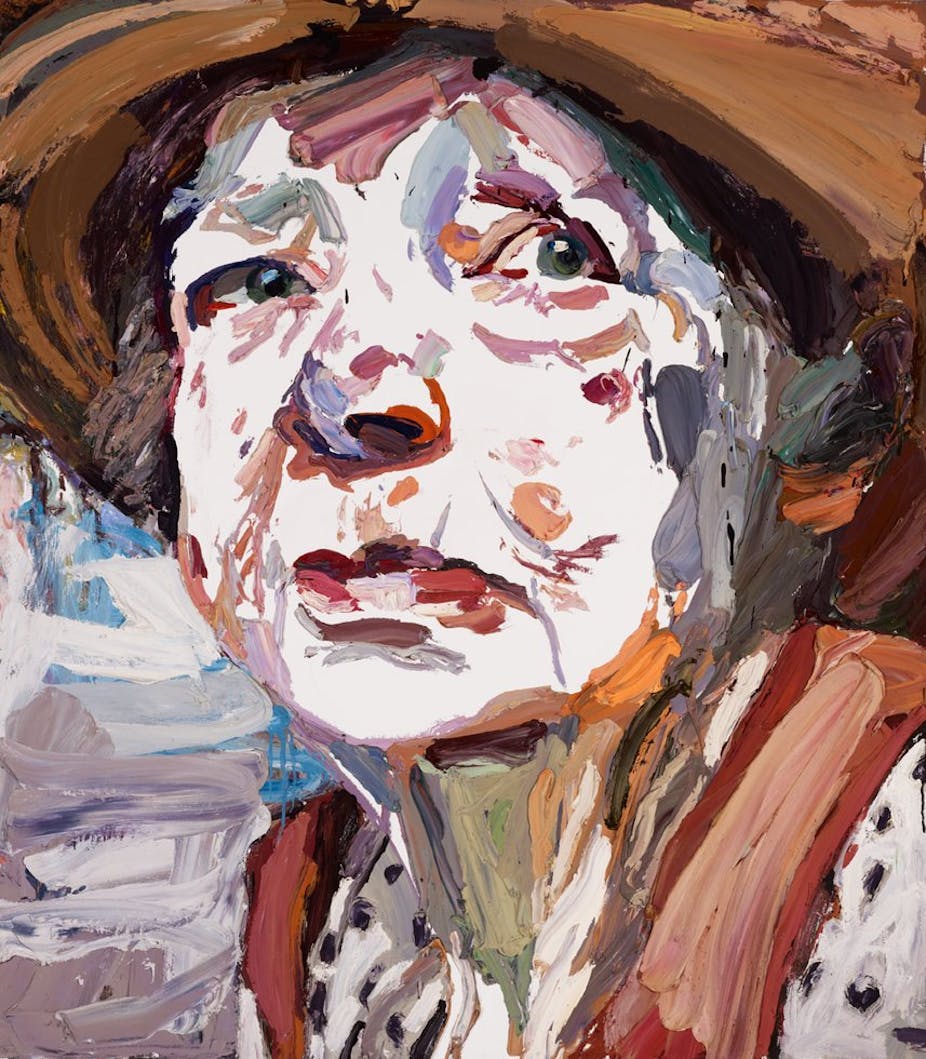
Chris McAuliffe: This decision reinforces suspicions that the selection is driven by the art world’s reflection on its own a-list. In a very schematic, crude sense it really is the Young Turk portraying the grand dame of Australian art.
The painting has the hallmarks of an Archibald “type”: a blown-up cropped face, an attempt to make the painting appear to be more about abstraction than representation. Quilty has piled on the paint in a way an almost compensatory way that tries to “beef up” the painting.
It’s deferring the big questions of portraiture – What is representation? What is likeness?
Ian Howard: Good painting, great subject, good timing. It ticks all the boxes. The young and old, the male and female, it’s a perfect combination. Even if there wasn’t strategy behind it, it’s a great combination that’s produced a good painting.
It’s an endorsement of Margaret who’s given an enormous amount of money back to institutions. It’s a crowning event for her. She will make good press because it’s a good story.
Su Baker: I’m delighted it’s Quilty. I’m a bit biased because he’s a former student of mine, but he’s a terrific artist and I think it’s a great decision. He creates such a clarity from such simple strokes, it’s a pared back use of paint but it’s so accurate.
The closer you get, the more it looks like a painting, the further away you get, the more it looks like Margaret Olley. It’s like the reverse of intimacy.
Is the Archibald Prize still relevant in 2011?
Chris McAuliffe: If the motivating force in art and museums is to attract the general public’s attention and compete in the 24-hour news cycle, it’s relevant. If the role of art is to challenge its own history and expand its own boundaries, then it isn’t.
There’s nothing wrong with any art prize that engenders productive debate and really expands the horizons, but there’s something in the Archibald that’s not achieving that.
Ian Howard: It’s great cultural event and for that purpose, it’s interesting. But in terms of picking a great artist, and in the sense of a prize going to the best painter, then it’s not very useful or effective.
The person the prize is given to each year is not necessarily the standout or even best artist in the group, but the phenomenon of the Archibald is culturally significant.
Su Baker: The prize has changed its status over the years as art has broadened its base. So now it’s almost quaint in some people’s minds because it makes the assumption that this relationship between artist and sitter has some special, almost magical quality.
But in each iteration it picks up something of the currency of the time. The history of the Archibald very much reflects the history of thinking about painting.

Has the prize become too populist?
Chris McAuliffe: There’s a school of thought, and I’m an adherent to this, that says the idea of celebrity has crept into the prize. So it’s narrowed and even rendered a little shallow. The original principle of the prize, which is that the portraits ought to be of an Australian of some distinction, has been lost.
That’s almost a moral criticism: there’s something thin and superficial about what we regard as important these days.
It’s almost like you’re saying “Who’s had the most Google hits this year?” There’s this sense of trying to be up to speed with the popular imagination, or being able to spot the headline-grabbing front-pager.
You don’t get the feeling that the artists are deeply connected with their subject. The engagement with the portrait is about your regard for another human being, it’s not just a picture of someone.
Ian Howard: Why wouldn’t you have an extremely popular, extremely successful exhibition each year about Australian personalities and characters?
There’s so much hype in the media about international characters now, and there are so few occasions when Australian characters are celebrated, but the Archibald does that. I think that’s a major contribution that the prize makes.
That contribution is part of the reason why it’s so universally popular. The subjects of the painting are close to us because they’re Aussie.
I sound like an apologist for the Archibald. I work in a cutting edge art school but I still think there is a role for shows like this taking one slot in the gallery’s yearly schedule.
Su Baker: There’s a balance between it being a popular circus and it being a serious look at painting and these things don’t need to be mututally exclusive.
It’s a successful public event, and public galleries are funded to communicate with the public, so I think it’s justifiable.
Why is the prize so controversial?
Chris McAuliffe: The Art Gallery of New South Wales is very good at making sure that it is controversial, and I dip my lid to director Edmund Capon. He is a master of that.
I also think that for some bizarre reason it has encouraged artists to be litigious. I think that’s the tragedy of the Archie. You encourage artists to over-invest, to stake so may of their aspirations on winning that they will actually sue someone who wins in their stead.
But no painting ever made the front page of the newspaper for being a good painting. Paintings make the front page for being stolen, forged, obscene, disputed or controversial, so what are you going to do?
Ian Howard: I think the controversy is that the winner takes all. In a horse race, one horse is faster and that’s the winner. But one artwork is not clinically better than another in the same way.
You’ve got a collision here between one process, which is scientific, and another based on content and subject matter, which is interpretive. With the first-past-the-post decision-making process you’re going to get one winner and 49 losers, who can claim to be equal winner with some legitimacy.
That’s a good thing for publicity and newspaper headlines, of course.
Su Baker: I suppose it’s because people feel different levels of ownership of it. Originally, painting had a sense of hierarchy in the lexicon of art. It was seen particularly as a measure of virtuosity and skill. All of those ideas have been challenged over the years, every generation has its own value set, and not everyone changes their mind at the same time.

When have the judges really got it right?
Chris McAuliffe: A couple of years ago when Del Katheryn Barton won it, I thought that was a good choice. She hadn’t deviated from her own personal style, which is quite a strange combination of Arthur Rackham’s fairy tale illustration, and Gustav Klimt after a very bad night out. She’s got her own style and she didn’t retreat from that.
In his glory days when Brett Whitely was taking it off, I think they got it right. He was nagging at the idea of portraits very forthrightly. He was really pushing it.
Ian Howard: I think Del Katheryn Barton’s 2008 winner was classic example of someone who is really genuinely pushing the boundaries of portraiture. She doesn’t just mimic a photographic image but gives us deep insights, not only into the personality of the person sitting there, but also their life experience.
Su Baker: A lot of the time they have got it right. I liked Craig Ruddy’s David Gulpilil in 2005. It hd a soulfulness about it – it was very impressive.
Who should’ve won?

Chris McAuliffe: If it were me, I would’ve picked Jeremy Kibel’s portrait of Robert Jacks.
Ian Howard: I’d include Ben Quilty on my card, but think Del Katheryn Barton’s Mother (a portrait of Cate) and Michael Lindeman’s Portrait of Wilfred are the best works.
Su Baker: I really liked Ben’s piece. It was a bit of a mixed bag this year, but with some very good entrants.

What do you think? Was Quilty a deserving winner? Who would you have picked?