

Getting a test result from the doctor is usually more than a yes or a no answer. More often than not, test results come in tables of numbers with information about ranges and unfamiliar units, all formatted to be understood by trained eyes.
In the US, many electronic health record (EHR) systems in hospitals and medical practices have enabled patients to have direct access to laboratory test results. Patients can log on and see their results from home, often well before they see or speak to their doctor.
In principle, seeing their data can help people manage chronic diseases like diabetes or high cholesterol and better prepare for visits with clinicians. Patients also have an ethical right to know their medical information, which includes these test results.
As more countries look at giving patients direct access to their electronic health record, we need to consider whether formats designed for doctors are the best choice for patients – and how data visualisation can help.
A good or bad test result?
But what exactly do patients have a right to know? Is it enough to know, for instance, that your haemoglobin A1c result is 8.4% even if no one explains to you what that means? Being given results and understanding them are two different things.
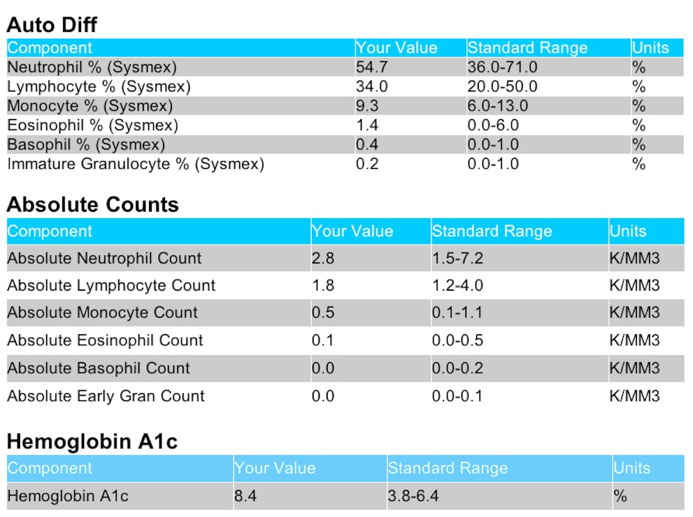
The haemoglobin A1c result above relates to blood glucose levels. The first thing a doctor would do when considering a result of 8.4% would be to look at whether this value fell inside or outside the standard reference range for a particular patient (what is “normal” for one patient is not the same for another). A doctor would know what the range is – for haemoglobin A1c, for example, the standard range might be 3.8%-6.4%. They would also know that each 1% change in this value means a big change in risk. So if someone with type 2 diabetes changes their haemoglobin A1c from 9% to 8%, they will have greatly lowered their risk.
Most patients are likely not to know any of this.
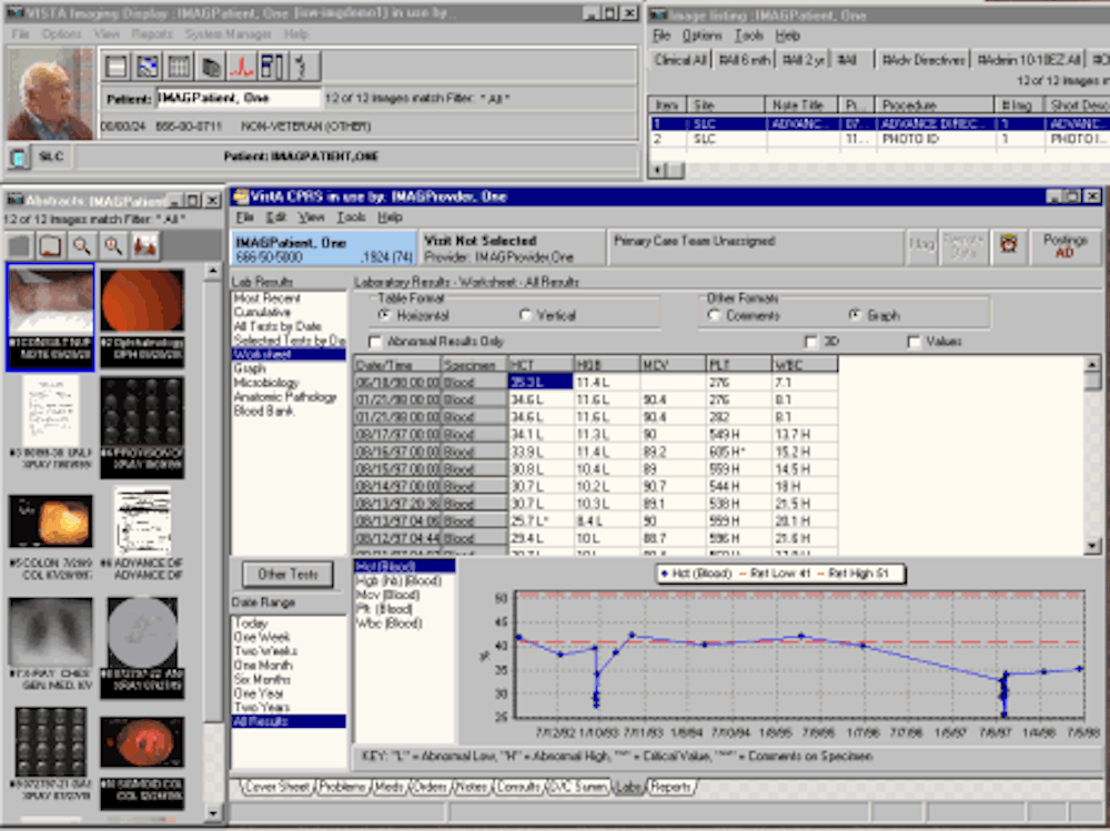
Along with colleagues Holly Witteman and Nicole Exe, we published a study in the Journal of Medical Internet Research that looked at what people can and can’t do when they are given their lab test results numbers.
We gave people a table of lab test results formatted exactly as shown on the electronic health record system used by a major US hospital. These tables included the standard reference range information next to the test values.
To start with, a lot of people had difficulty recognising if their haemoglobin A1c result was outside the standard range. More importantly, people who had the most difficulty were those with lower health literacy skills and lower numeracy skills, who were less able to think about and transform medical numbers.
We estimated that only about a third (38%) of people with low numeracy and literacy skills could tell when haemoglobin A1c was outside the standard range, compared to 77% of people with high numeracy and literacy skills, even though they were given the reference range information. People with low numeracy and literacy skills were also not sensitive to how bad the test result was in thinking about whether or not to call their doctor.
Yet all of these people had the test result numbers in front of them in the standard table format that medics have been using for decades. We in the profession can certainly do better.
Data visualisation

Data visualisation has transformed the way in which health information can be presented, viewed and understood.
In the US, there has recently been renewed interest in designing better information displays for patient use. For example, the Visualising Health project designed visualisations of health risk data to make them more intuitively meaningful. In 2012-3, the US Office of the National Co-ordinator for Health Information Technology and the Department of Veterans Affairs received more than 230 submissions after it hosted a design challenge to re-imagine the patient health record. Another design prize competition is underway to develop new visualisations of behavioural health data to inform personal and policy decisions.
Yet all of this work will be meaningless if electronic health record systems continue to use the same tried (but not helpful) formats in their systems. The present situation, in which patients are given direct access to their lab test results in highly numerical tables is a poor status quo. If we are going to spend money making sure that patients can see their results, we have an obligation to change the way we display them by making the format more intuitive.
Patients have a right to understand what their data means, not just to know what their numbers are.