

When the Productivity Commission reported in 2009 that average chief executive pay tripled from 1993 to 2009, you could have been forgiven for shrugging your shoulders and moving on. What else is new? The rich get richer and the poor get poorer, right? Well, no. At least, not all the time.
The great compression and divergence in the US
In the United States, studies of inequality have found evidence of a “great compression” in inequality from around the Second World War, as the relative gap between rich and poor shrank. That declining trend was reversed in the 1980s, when inequality started rising again (a “great divergence”), creating a U-shaped trend.
For example, the figure below shows the median earnings of the top three officers of the top 50 US firms, relative to average American earnings, based on data used by Frydman and Saks (2010).
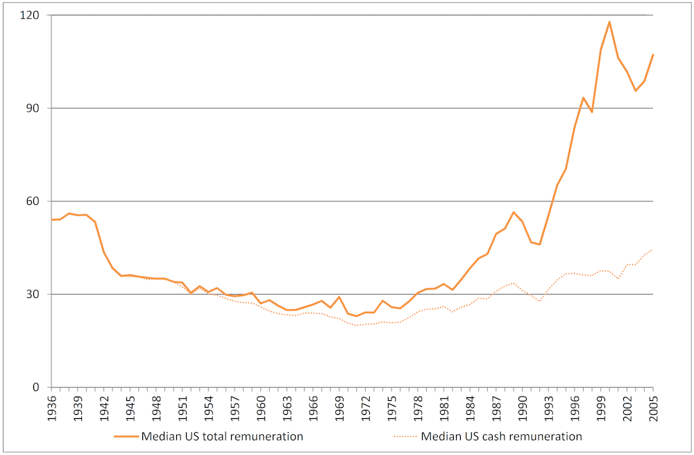
Note that the decline didn’t mean that the rich were getting poorer in absolute terms. Rather, their income relative to the average American declined. It’s possible for the rich to get richer while the poor get richer too, and if the poor get richer at a faster rate, then this relative measure of inequality will fall.
Was there a great Australian compression?
In the absence of large sets of long-run data on executive pay across the country, how can we determine whether or not Australia has seen a similar pattern? In addition to being one of the world’s biggest miners and among Australia’s longest-running companies, BHP Billiton has publicly available annual reports stretching back to its early operations in 1887. So in a recent research paper, former ANU professor (now Parliamentary Secretary to the Prime Minister) Andrew Leigh and I looked at this data to see if it supported the theory that a great compression occurred in Australia.
We used the data in these reports to plot average BHP director earnings and to estimate BHP CEO earnings (up until the point where actual CEO earnings was included in the reports). We then compared this with the salary of an average worker. What we found broadly parallelled the story of the great compression in the US.
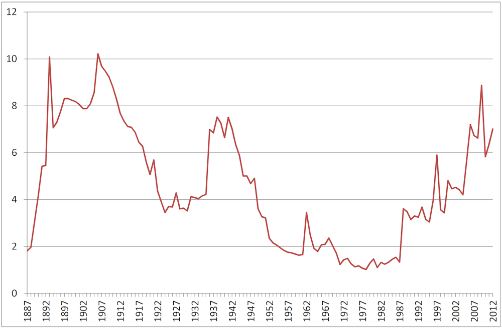
The earnings of an average BHP director (see above) fell from around eight times the average Australian income in the early 1900s to around 1 to 2 times the average in the late 1970s (interrupted by a sharp spike during the Second World War) before rising back to around a ratio of 6 to 8 in the 21st century.
How great an Australian divergence?
By combining our estimates of the likely range of CEO pay up to the mid-1980s with the actual remuneration reported by the company from then on, we found that patterns in BHP CEO remuneration tell a similar story of an Australian great compression. In recent decades they show an even more pronounced divergence.
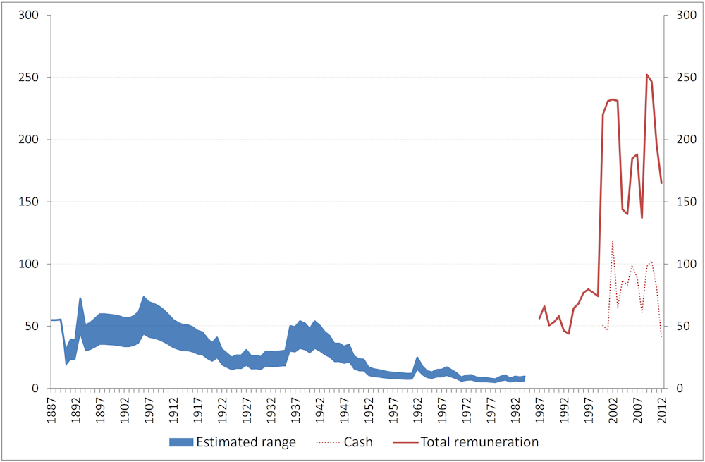
Our data (above) showed that BHP CEO earnings fell from around 40 to 50 times average Australian earnings in 1900 to as low as 6 to 7 times average earnings in the late 1970s before rising in to 50 to 100 times the average Australian earnings when measuring just salary and bonuses in the last decade (and 150 to 250 times average earnings when including long-term incentives such as share options).
Is it reasonable to assume that trends in BHP CEO pay are reflective of trends in executive remuneration Australia-wide, given that BHP is Australia’s biggest company? Comparisons with data on the top five non-executive directors of Australia’s top 100 companies and with data on average CEO remuneration across Australia’s top 100 companies showed broadly similar trends. This suggests that trends in executive remuneration at BHP can help us understand the broader pattern of executive pay across Australian firms.
Reasons for the rise
Moreover, our results aren’t merely a result of the mining boom. While BHP executive pay tracks the company’s share price and market capitalisation reasonably closely, the rise in remuneration preceded the boom, and grows almost 7% per annum faster than the mining sector’s gross value added.
The globalisation of the market for CEOs is likely to be a factor. In the late 1990s BHP made quite clear that they were looking for a “world class” executive to address the company’s perceived shortcomings. Today, large Australian firms routinely conduct a worldwide search for top executives.
Firm size also has an impact. We know from US and Australian research that larger companies pay their top managers more. Put another way, with great power comes great responsibility…and great remuneration.
There’s also evidence to suggest that the majority of Australian companies express a willingness to pay more than or equal to the median salary for their CEO. The result is pressure for competitive bidding that drives up CEO salaries without an effect on their relative standing.
Whatever the cause, the 120-year patterns in BHP director and executive remuneration suggest that in Australia, for a time, the rich got richer but the poor got richer faster, until the 1980s. From that point on, the old adage has been ringing true, at least in relative terms.
This research was carried out with Dr Andrew Leigh, Federal Member for Fraser and Parliamentary Secretary to the Prime Minister. Before this, Dr Leigh was Professor in the Research School of Economics at the Australian National University.