As local authorities set out their budgets for the year, council tax is set to rise in many regions across England. Councils in Lancashire, Coventry, Cornwall and Surrey, among others, have agreed to hikes of up to 4%. But while council tax will be crucial to help local authorities absorb cuts from central government, there are serious doubts as to whether the levy is fit for purpose.
First introduced in 1993, council tax is imposed on properties to help pay for local services, council wages and administration. In general, how much council tax people pay depends on which “band” their property falls into. These bands are allocated by property value, ranging from A (the lowest value) to H (the highest value). But here’s the catch: in England, council tax bands are still based on property values from 1991.
I decided to map out the differences between 1991 council tax valuations and today’s house prices, to see whether the tax is as regressive and arbitrary as some suggest.
The big housing boom
Let’s begin with some numbers. If your house was worth £50,000 in 1991, it would now be worth about double that, if it had risen in line with inflation. If this had occurred uniformly across the country, it wouldn’t be a problem – but we all know that this didn’t happen. Instead, house prices rocketed, particularly in London and the south-east. For example, in 2014 the average price in Burnley was £85,000 (up 166% since 1995), while in Kensington and Chelsea it was £1.2m (up 558%).
The fact that some prices have risen more than others is a major issue, because it means the amount we pay in council tax is increasingly detached from the relative value of our properties. In other words, those whose properties have risen disproportionately in value are paying less than their fair share of council tax.
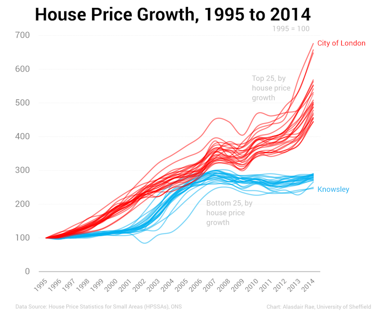
Looking at average house price growth in the top and bottom 25 local authorities in England since 1995, we can see that prices have gone up across the board – but there is now a much bigger gap between the richest and poorest areas.
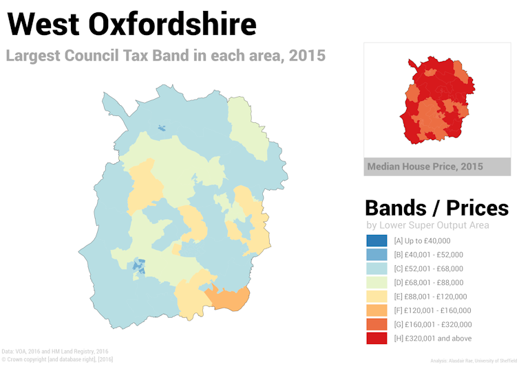
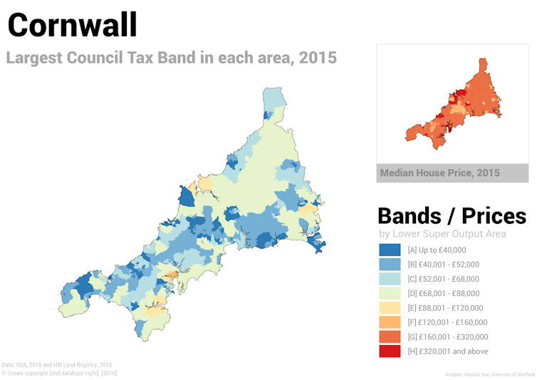
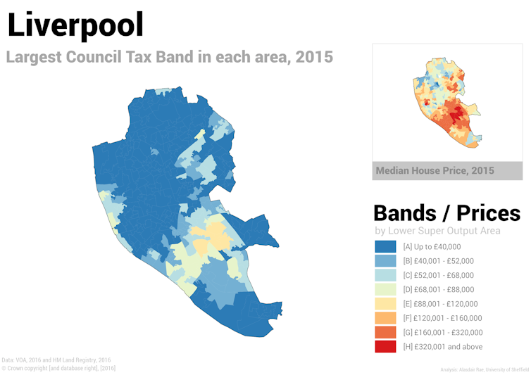
With a little help from colleagues at the Consumer Data Research Centre, I mapped out the differences between house prices and council tax bands. Below, I have shown the biggest council tax band for each area in the borough, alongside a small inset map showing average house prices. Both maps are coloured according to the 1991 council tax banding.
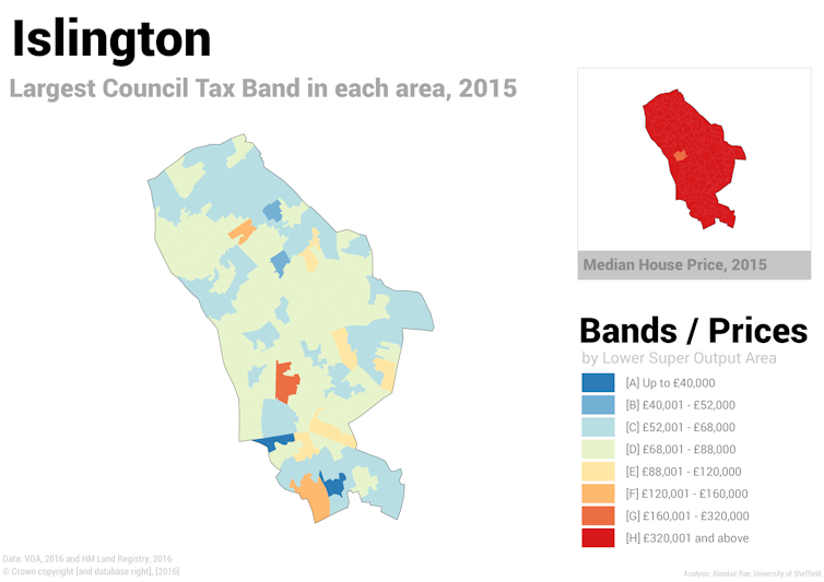
Starting with the London borough of Islington, we can immediately see that the variation in council tax bands sits in stark contrast to today’s average house prices. In 1995, the first year data are available for, the average house price in Islington was £105,000. By 2014 it had reached £533,000. Most properties in Islington belong in the top band of council tax – but, according to the data, there are no areas where more houses fall under band H than any other category.
Perhaps unsurprisingly, this is also the case across much of London.
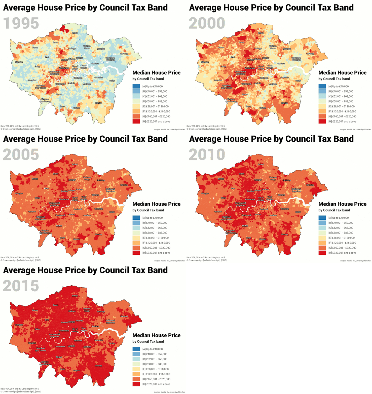
In more rural locations, such as West Oxfordshire, the contrast between council tax bands and current house prices is not as stark. But the variation is now very much out of line with the original 1991 valuations: some areas have gained value more quickly than others.
To take two contrasting examples from elsewhere in England, we can look at Cornwall and Liverpool. In the former, the purchase of second homes has driven up house prices, so much so that the council removed the 10% discount for these properties in 2013, following a change in government regulations.
Meanwhile in Liverpool, where around 60% of properties are in the lowest value band A, the current variation in house prices is also out of line with the 1991 bands. House prices have risen much faster in some areas than others, particularly in well-connected, inner-suburban areas such as Mossley Hill and Aigburth. The effect – as noted by the New Policy Institute – is that “as time goes by, council tax becomes ever more arbitrary”.
When you look at these maps, the absurdity of continuing to use bands set in 1991 is pretty obvious. Naturally, it raises the vexed question of what should be done. Well, we could re-value properties and introduce new bands, like Wales did in 2005. Or, as in Scotland, we could pursue more radical change. There, ideas for reform include property revaluation, a land value tax, and even a local income tax.
Personally, I would favour some form of land value tax, as proposed by leading economists such as Dame Kate Barker and Joe Sarling. But of course this brings its own set of challenges: for instance, unfairly taxing the Islington resident who had the good fortune to buy a house there in 1991, but who lives alone and never seeks to benefit from the value of the land or property.
At the very least, a widening of the bands at the top and bottom to reflect the growing gulf between the richest and poorest areas (and the residents’ ability to pay) would be a start. With detailed data on house prices, and the technology to crunch complex datasets, this should not be an insurmountable problem. The bigger issue is that, politically speaking, such reform is “dramatic and unpopular stuff”.

