
If the type that surrounds us clamours for our attention, then the space that surrounds it is the silent component: ever-present, but only considered when it imposes upon, hinders or muddies type’s meaning or message.
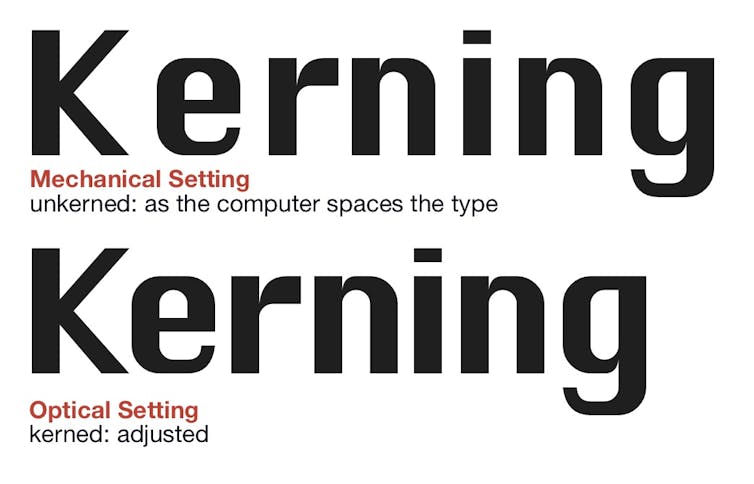
Many people assume a computer will create perfectly balanced spacing between letters, words and lines. Such faith in technology is misplaced.
The use of space requires at least as much consideration as the choice of font, and where the computer fails this task, the typographer assures its success.
The negative space between letters is as crucial as the character of a font in delivering meaning to the reader; to feeling “right”.
This article breaks down three of the hidden elements of good typography: kerning, word spacing and leading. When correctly applied, you won’t notice them. When done badly, they’re the only thing you’ll notice.
Kerning
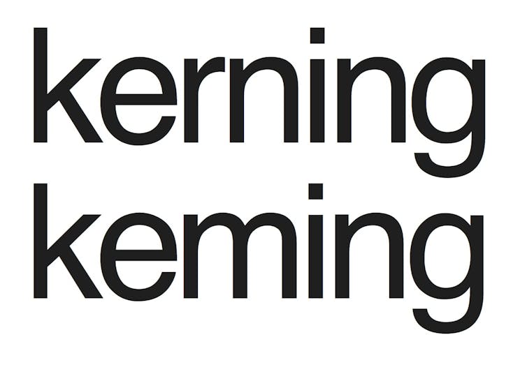
According to the stick-figure web comic xkcd, if you really hate someone, teach them to recognise bad kerning – the adjusted spacing between letters.
Each letter has personal space that brackets it. For a computer, those spaces are defined by the digital postscript settings.
These common settings, though, do not accommodate the space that is formed when particular letters combine, so kerning can become “keming”.
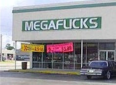
An uppercase A placed next to an uppercase V will require different kerning to an A and E combination. An uppercase T combined with a lowercase e will also require kerning, due to the extreme cutaway of the T.
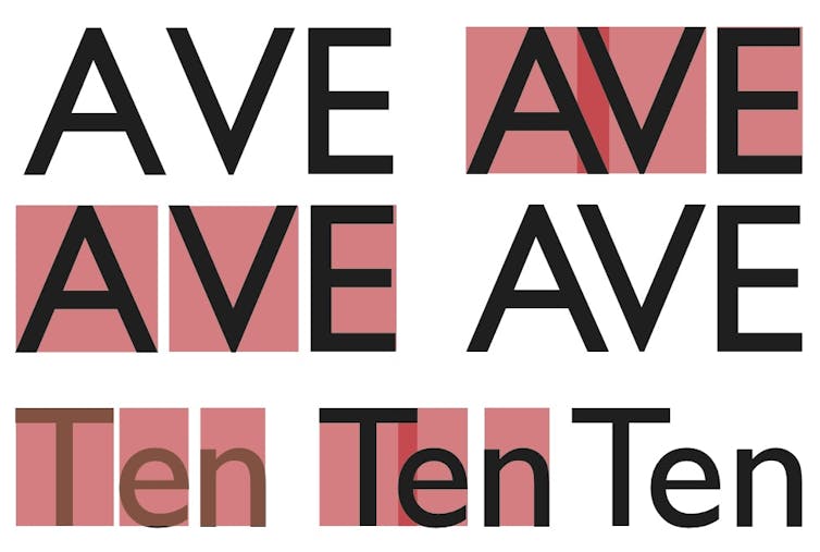
When two or more letters unite, the individual letterspaces that combine sometimes require spatial adjustment. That’s where the typographer’s eye for detail can do what a computer cannot.
Examples of poor kerning abound, usually within signs and pieces of text “designed” by non-designers. The web is littered with examples gathered with typographic amusement, by those who recognise what happens when “good type is forced to do bad things”.
Tight kerning between letters can however be used to great effect in logotypes.

See how cleverly this is exploited by FEDEX, above. (Did you notice the white arrow created by the space between the E and the X?) Examples of others that exploit space can be seen here.
Word spacing
Some years ago, my husband casually asked, “Who’s Tom Braider?”. Initial puzzlement quickly converted to typographic delight, as I saw the Tomb Raider movie poster and understood his question.
Over-separation shifts the focus from the words to the spaces, whilst under-separation causes “Tom Braider”-like misunderstandings.

If words are bricks, and spaces mortar, one hopes to see a wall, not bricks and mortar.
The issue of word separation is often exacerbated by the misuse of justification, one of the four text-setting options offered by the computer (range left, range right, centred or justify).
The temptation to create a clean-edged text block means that the computer can apply arbitrary and often incorrect spacing.
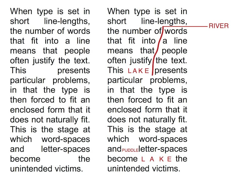
Text set with short line lengths (such as newspapers) creates enforced space in which the spaces often become more prominent than the text. This results in “rivers” (when word spaces join up between adjoining lines, running like liquid through the text), “puddles” (widened word spaces that dominate) and “lakes” (large puddles).
Leading
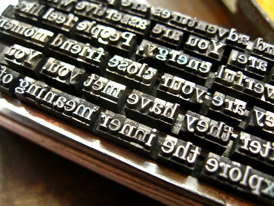
Leading (pronounced “ledding” and named after the strips or slugs of lead traditionally inserted between lines of metal type for printing) provides breathing space between lines of text.
Knowledgeable use of leading creates not just an ease of reading, but can also influence the mood of a body of text.
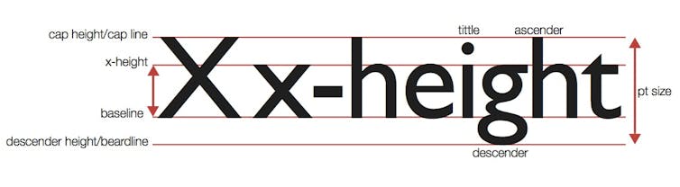
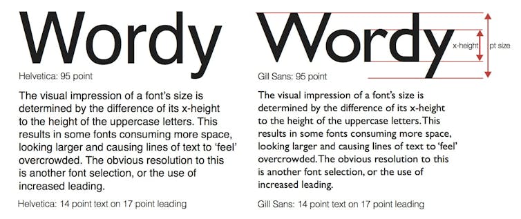
It’s commonly assumed that fonts of the same point size will look the same size. Wrong. Some fonts of the same height actually consume more space, looking larger and causing text to feel overcrowded en masse, as illustrated below.
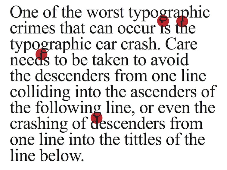
Good leading adjustment also addresses the typesetting car crashes that occur when the lowercase descenders of one line (g, j, p, q, y) clash with the ascenders of the line below (b, d, f, h, k, l) or even the tittles (the dots above the i and j). Font selection and an application of sensitive leading resolves these issues.
Choosing a font is not the end of the story; it is only the beginning.
Understanding the space that surrounds the letterforms and how they combine to make words, lines and text is vital in effectively communicating, rather than typing, a message.
If, as Star Trek’s James T. Kirk states, “space is the final frontier”, then space is the invisible frontier that separates type from typography.
… and, in case you’re wondering, The Conversation has set this article in:
Headline: 42 point Helvetica Neue Bold on 50 point leading.
Text: 17 point Helvetica Neue on 26 point leading.
(Please be aware that this may convert to Helvetica, depending upon the reader’s computer.)
Further reading:
Beyond words: how fonts make us feel