
I almost missed the new tabloid Guardian on the news stand this morning. Without the trademark strap of dark blue colour across the top, I couldn’t spot it immediately. Not that I was expecting a shouty red-top design from Britain’s most stylish newspaper, but I wasn’t anticipating quite such an understated front page either.
Although the new tabloid masthead has a subtle modern blockiness, it seems positively traditional with its two-deck format and return to capital letters. Perhaps this is an attempt to reassure readers that the integrity of its news values has not shrunk along with its size. Or maybe it is just part of what the paper’s editor-in-chief, Katharine Viner, describes as a simple, confident and impactful new font.
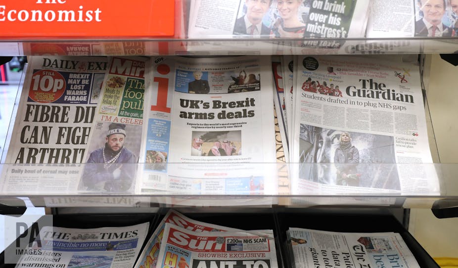
Whatever the rationale, its impact was a little lost on me this morning as I impatiently scanned the news stand. The old masthead, with its lowercase letters and palette of blues, stood out in a sea of black, white and red.
Identity and expectation
But maybe I just find change difficult? And, of course, a redesign should result in significant changes otherwise there’s no point in it. In the shift from Berliner to tabloid format, The Guardian designers have succeeded in making these significant changes while keeping the title’s overall identity.
This is largely down to the fact that the new “Guardian headline” font is not so different from the old, it just has slightly sharper serifs (the little projections off the edges of the typeface). Also, they have maintained their commitment to giving pictures lots of room to shine, including the famous centre spread image, and have kept all that lovely white space around headlines and bylines.
Big pictures and white space are crucial to The Guardian’s identity and its readers’ expectations – and it’s clear these elements have remained a major consideration in the new redesign. It’s no mean feat to fit wide gaps between columns of text, and substantial white space into a tabloid design without impacting on the length of stories and the size of the pictures. And there’s plenty to read in this new tabloid Guardian, maybe even a bit too much for a busy weekday, but readers need some value for money at £2 a go.
In living colour
Much of the redesign effort seems to have gone into the new range of bright, energetic colours throughout the publication and this really shows. The blue detail of the news pages in the main paper has been replaced with red in the bylines, pullout quote boxes, captions and page numbers. And it’s a nice red – bright but not shocking, which I think works well on the news pages.
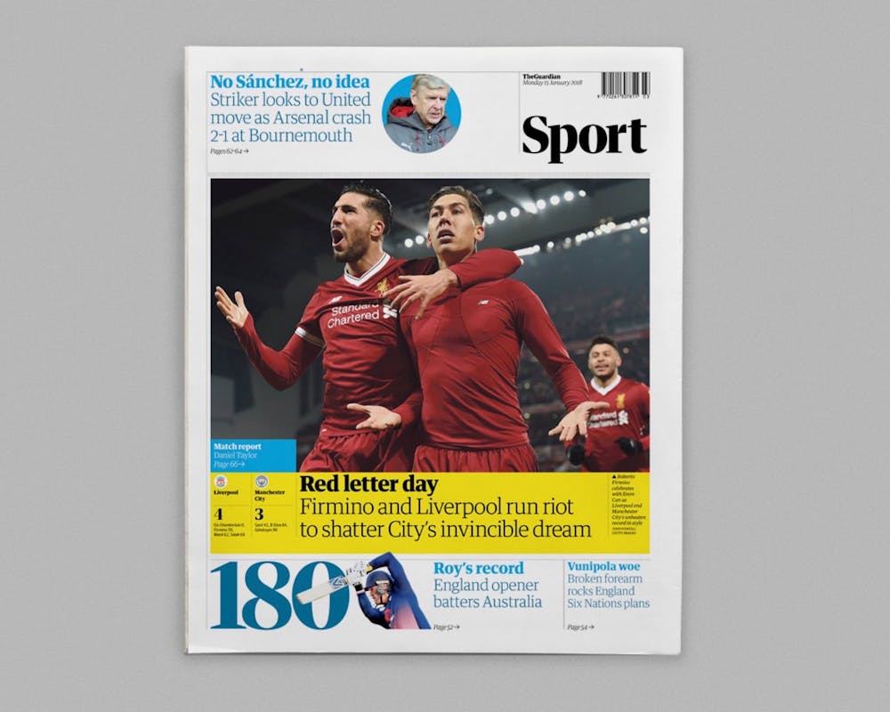
Yellow and turquoise are the colours of the sport pages with blocky black-on-yellow headlines that bizarrely bring to mind the front of Heat magazine. These garish reverse headlines on sport were a bit of a surprise – and I wondered if it was a mistake when I saw the first one. They don’t feature on every page, and I’m still not sure if this randomness is a good or bad thing. They also don’t feature on The Guardian’s new redesigned website, the old dark and light blue colours are still in play on the online sport pages.
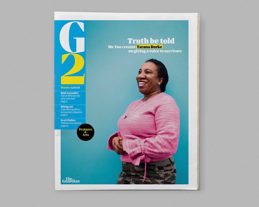
The G2 features and arts supplement is a riot of pink, yellow, orange and turquoise, again somewhat reminiscent of a glossy celebrity magazine. The new bright palette works at its best in G2, the colours are engaging and carry the implicit promise of some interesting reads. They also make it easy to navigate the features, and I particularly like the yellow band highlighting prime-time programmes in the TV listings at the back.
The new Journal supplement – which features long reads, comment pieces and puzzles – is a more sombre affair with pale peachy pages and black or orange fonts, more suited to the opinion pieces and readers’ letters that it features. This pullout is very easy on the eye, it’s got an calm, uncluttered design, and it’s good to see there’s still room for a couple of opinion cartoons too.
It has a very broad content remit – opinions and ideas from across the globe apparently, and only time will tell how this section will fare in the long term. Puzzles have been spread across both the G2 and Journal supplements, making them easier to share, which is a nice touch.
Mixed bag
On the digital front, the redesigned website looks clean and attractive with its colour-coded sections and plethora of pictures standing out against plenty of white space. Navigating the site is very easy, thanks to clear categories and a comprehensive drop-down menu in the “More” section. It’s definitely a worthy partner to the newspaper, or should that be the other way round?
The redesign of the newspaper is a bit of a mixed bag for me, but if it gives The Guardian a new lease of life financially, then it will have served its purpose.