
In 1939, Anton Reichel introduced the early history of printed colour to the English-speaking world in Chiaroscurists of the XVI-XVII-XVIII Centuries, a reduced adaptation of his book Die Clair-obscur-schnitte. It consists of a brief introduction and 100 plates of the first full-colour facsimiles of images made in the earliest colour-printing technique used in the West, all of which are held in the Albertina, Vienna.
These prints turn fundamental assumptions about the history of prints on their head: the images were not described with black outlines, but layers of vibrant tones that create three-dimensional effects. And until noe, this visual overview, itself a tour-de-force of a pioneering new colour-printing technology, was the only fully illustrated guide to these rare and colourful prints in English.

Like Reichel’s ground-breaking work, the Royal Academy’s new exhibition, Renaissance Impressions is a reduced adaptation of a survey of early colour prints at the Albertina. Even though the English-language iteration is a much reduced version of the German — its catalogue has half the pages — the exhibition is nevertheless on a grand scale. More than 150 exhibits illustrate the standard narrative of the emergence, development and disappearance of approaches to printing colour in the 16th century. As the first exhibition in England on colour prints of the (very broadly defined) Renaissance, it re-introduces the English-speaking world to a pivotal, experimental moment in the history of art.
Most prints are drawn from the personal collection of Georg Baselitz, whose own artwork is currently exhibited a short walk away at the British Museum (February-August 2014) and the Gagosian Gallery (February-March 2014), with supplements from the Albertina.
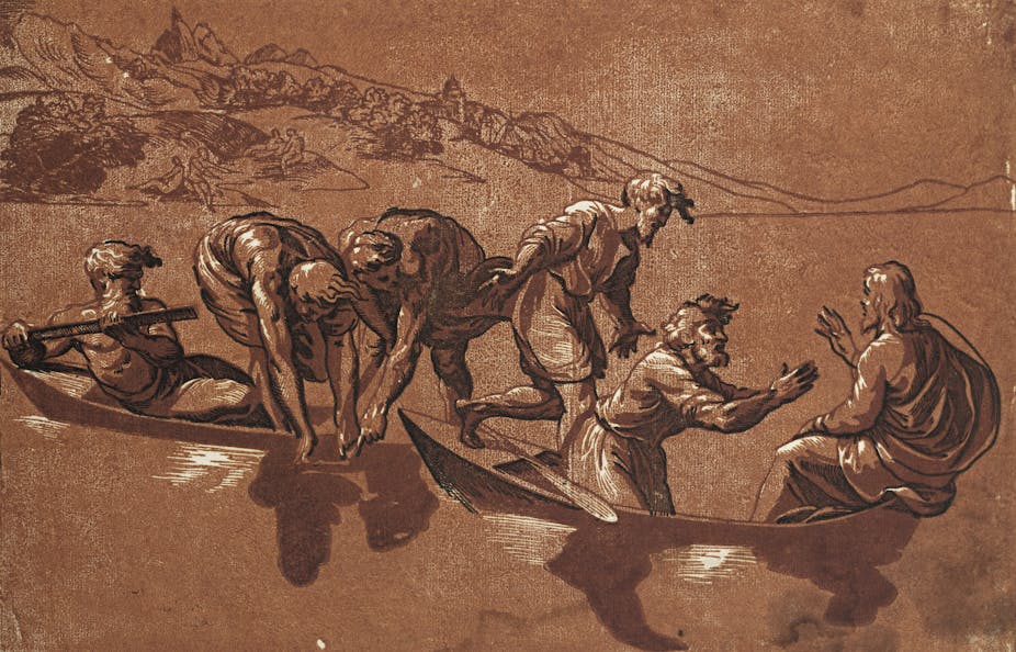
The 16th century saw many experiments with the emerging technology of the printing press. Very early printed images are defined by their essential black-and-whiteness. But rather than black outlines, these woodcuts were made with printed colour. The design processes could be complex: some were built up from overlapping tones alone, like watercolour drawings, and some had highlights cut from the wooden tone blocks to create three-dimensional effects by letting the white of the paper shine through.
The choice of colours of ink was equally important. Although printers were limited to available pigments and may have changed over time, they achieved a striking range of visual effects from the same print by issuing it in vibrant pinks, deep greens or cool blues. The diversity of different impressions of prints are a revelation, especially those by Ugo da Carpi and Giovanni Gallo, not least because this was half a millennium before Photoshop.

The exhibition charts the growth of the ambition of printmakers and the diversification of the markets for these vibrant prints over the 16th century in the German-speaking lands, Italy and the Netherlands. Large-scale works, like Andrea Andreani’s four-metre-long frieze of the Triumph of Caesar (1599), were presumably made to decorate interiors. And perhaps impressions on fabric, like Adriaen Thomas Key’s Nebuchadnezzar and the Fiery Furnace (c.1558), were cheaper alternatives to paintings for 16th century buyers.
Printing colour allowed later artists, printers and collectors to contribute to the original designer’s visions in unprecedented ways. Because each print involves multiple blocks, some only became colour prints significantly later and only through the involvement of others. For instance, two prints are considered here as early German because they incorporate “normal” woodcuts designed by Albrecht Dürer in 1515 and 1523. But, as colour woodcuts, they are actually seventeenth-century Dutch; their tone blocks were created for an Amsterdam-based printer around 1620.

Images had been printed in colour since the 1480s, but in 1516 “chiaroscuro woodcut” (“light-dark” in Italian) was coined to denote multi-block woodcuts imitating the Italian chiaroscuro style of wash drawing. In this exhibition, it is used as a catchall for all single-sheet woodcuts with printed colour, including those produced before the term was coined and those whose design is unrelated to chiaroscuro drawing.
This modern definition may be why no mention is made of the colour-printed book illustrations Hans Burgkmair designed in the 1490s, even though his celebrated “invention of chiaroscuro” in 1508 was a stylistic but not technical advance.
Renaissance Impressions closes with a near-monochrome impression of Hendrick Goltzius’ Demiurge (c.1588) in black, beige and grey, neatly signalling that print culture faded back to black after the first wave of colour printing. But the exhibition itself heralds a sea change in today’s scholarship, marked by the emergence in the last decade of a new school of graphic art research that incorporates printed colour.
As the first of several major exhibitions in the US, UK and Europe that will explore early modern colour prints in the next few years, it is fitting that it is a broad survey. This once-in-a-lifetime opportunity to see these rare, and rarely exhibited, colour woodcuts is not to be missed.
Renaissance Impressions: Chiaroscuro Woodcuts from the Collections of Georg Baselitz and the Albertina, Vienna is at London’s Royal Academy of Art from 15 March to 8 June 2014.