
What makes a design “classic”? That it stands the test of time through continued use, critical recognition and popular approval? Or is it simply that its vision and innovation results in it being regarded as the basis or benchmark for all future designs?
In evaluating innovation it is often difficult to comprehend the quantum leap certain designs made when first created, when in their continued use they are so ubiquitous and accepted as part of the visual culture of everyday life.
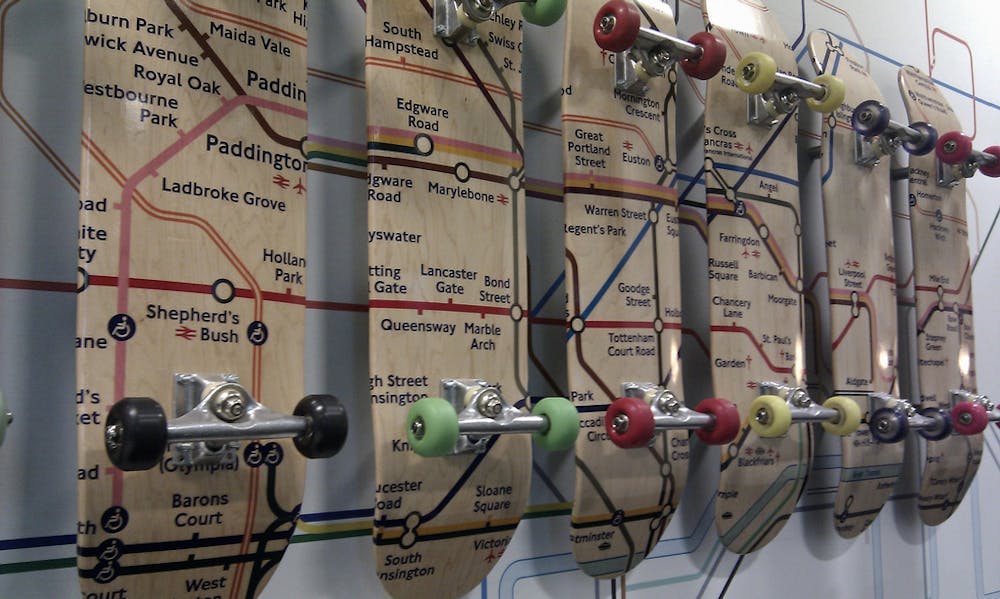
The London Underground map is a classic design – however, probably few people question why. Certainly the fact that it has stood the test of time through its adaptability, and its ease of use are factors in its success. But its impact beyond its original setting should also be considered as a factor, for despite its humble beginnings, it can undoubtedly claim to have influenced information design on a global scale.
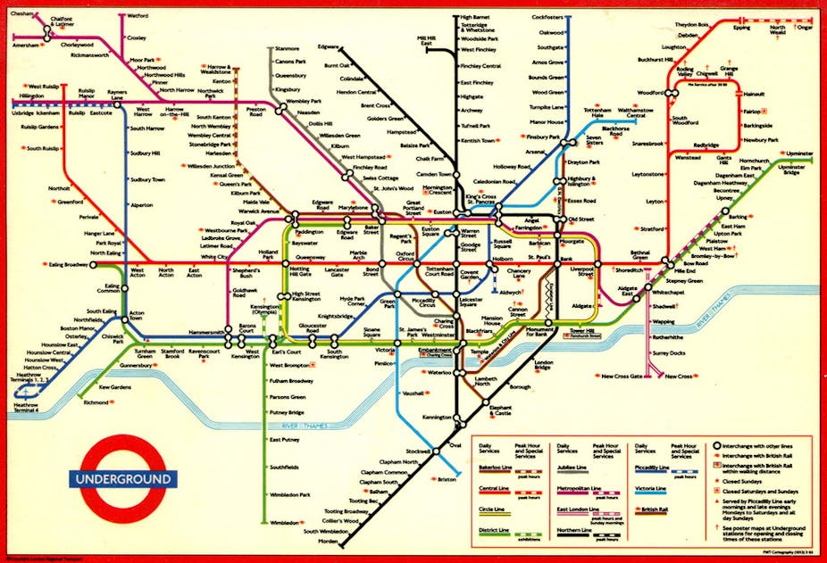
In understanding its design, the first thing to realise is that its popular description as “The Underground Map” is misleading, for it is actually a diagram (or schematic), not a map. Technically it could be claimed that the term “underground” is also erroneous, with 55% of the network’s 270 stations and 402km of track being above, not underground.
Designed and sketched in 1931 upon the double-page spread of an exercise book by the 29-year-old electrical draftsman Harry Beck, the diagram was initially rejected as too radical a departure from traditional mapping and too revolutionary for public adoption.
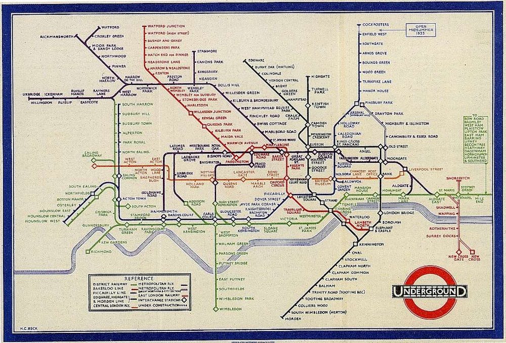
Reconsidered by London Underground a year later, the design was bought for a small sum (reputedly between 5-10 guineas) and publicly released in 1933. For the last 81 years it has formed the basis of all London Underground diagrams, and despite the expansion of the network to accommodate double the lines than the original seven that Beck designed for, the original design has enabled adaptation to occur without significant compromise.
It can be claimed that Beck’s career as an electrical draftsman influenced his design by enabling him to perceive of the individual rail lines as wires, the interchange stations as connectors and to conceive of the entire network as an integrated and interconnected diagrammatic system much like an electrical circuit board.
Beck’s desire to create a “common sense device” relied upon simplification, legibility and ease of use by not only the local population, but also its constant influx of visitors. The conceptual shift from map to diagram essentially created an ease of navigation and connection through graphic rationalisation rather than the tradition of geographic accuracy.
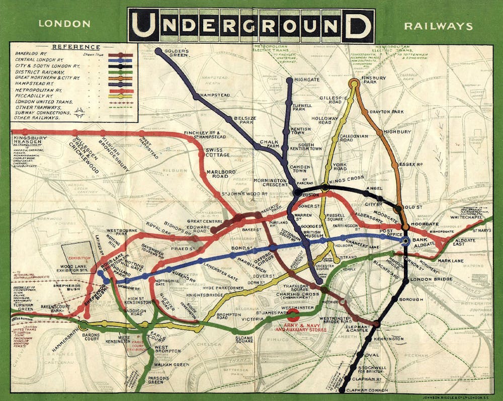
The innovation of this is evident when comparing Beck’s initial diagram to F.H. Stingemore’s map released one year earlier, that whilst geographically accurate, lacked the ease of connection across the system and was as difficult to navigate as a plate of spaghetti.
Seven steps to heaven
Beck understood that his aim was a conceptual diagram, where the clear purpose of ease of navigation to destination was crucial, but above ground features were not.
To achieve this, a modern logical system was created that has proved stylistically ageless with functionality and aesthetics equally balanced, enabling passengers to not only make visual sense of their isolated subterranean journey, but also importantly to memorise it.
To understand the graphic and conceptual impact of Beck’s thinking and design, consider the following design steps – taken from Beck – and applied to most other metro systems in the world in a way that now seems intuitive:
1) Create an octagonal grid that enables connections to be established between lines, and a clear balance between the lines, stations, connections and the space in between them.
2) Simplify the geographical mapping of meandering train tracks into a system of three linear variants: horizontal and vertical lines and 45-degree diagonals.
3) Develop a clear system of graphic devices to clarify line interchanges.
4) Suppress all topographical features other than a graphic representation of the River Thames (in the case of London) that defines the north-south divide of the city. With the central section of the network being underground and majority of stations named after locations (eg. Oxford Street, Piccadilly Circus) and landmarks (eg. Westminster, St. Pauls etc.), geographic locations are unnecessary.
5) Prioritise order over distance. When differences in distances between central stations are minimal (the shortest being the 20 second journey between Leicester Square and Covent Garden), accurate representation is unnecessary.
6) Recognise and address the need for clarity in a network where the central stations are geographically congested within a small area, compared to the relationships of outer suburban stations over greater distances. Beck did this by applying a graphic magnifying glass, enlarging the centralised area and compressing the distances between outer stations, enabling ease of use over physical accuracy. This of course was of benefit to London Underground, by subliminally enhancing the perception that central London was quickly and easily accessible.
7) Apply colour coding to each rail line. Although this had already occurred in other London mapping systems from at least 1911 (and even earlier in other above ground railway networks), the creation of the defining colours and graphic shapes of each line facilitated an ease of recognition, navigation and interchange not previously achieved.
These all seem so obvious now. To consider that there ever was or might ever be another way of designing a metro map is akin to questioning the design of the paperclip.
In designing a schematic alternative to the map, in 1931 Beck created a design template for the vast majority of metro maps that exist throughout the world in 2014 … if still unconvinced, simply select a major city and Google its metro “map”.
For 8 million Londoners, the underground “map” is embedded within them, like the name of a seaside town through a stick of rock. It is their blueprint, their organiser, their connector: the subterranean guide to the arteries of the body of the city. I suspect more Londoners could successfully produce a fair approximation of the underground map, than an accurate drawing of the outline of their country.
If asked to draw a map of London and its districts, many would do so not based on any geographical knowledge, but simply from a schematic coding of the proximal relationships between the neighbourhoods based on the vision of Harry Beck.
Read more articles in the Sublime Design series.
Are you an academic or researcher? Is there a design classic – industrial, graphic, urban, architectural, interior or landscape – you would like to write about? Contact the Arts + Culture editor.