Each June BP publishes its “Statistical Review of World Energy”, a compendium of the latest trends in the global energy system. After the June 2012 release, I commented on the remarkable trends in coal consumption indicated by BP’s analysis. In a piece titled “If you think King Coal is dead, think again …”, I speculated that coal seemed ready to resume its place as king of the energy fuels, displacing oil for the first time in 50 years.
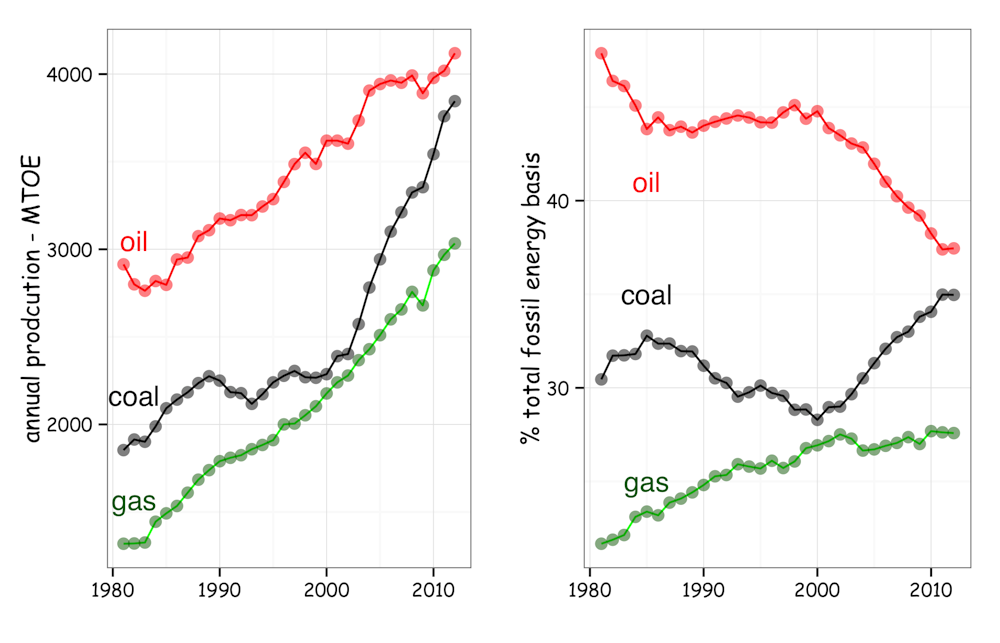
In its latest update released June 2013, BP’s revised estimates show this hasn’t yet happened. As shown below, on an energy equivalent basis the gap between coal and oil remains pretty much the same as last year. Interestingly, despite the hype around the gas boom, BP’s data indicate little change in the relative proportions of gas, coal and oil between 2011 and 2012. If anything, the latest analysis suggests gas has gone back a bit.
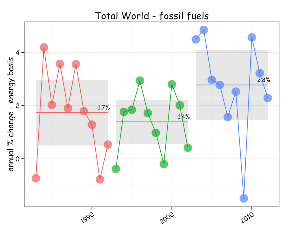
While the rate of increase in fossil fuel energy production has slowed to 2.3% in 2012, down from 3.2% in 2011 and 4.5% in 2010, a key message in the BP data is the continuing above trend growth in fossil fuel production.
And the story of the last decade has been all about the black stuff of coal.
In 2002, coal contributed around 28% of the total fossil fuel energy production. By last year it had risen to 35%. That rise has come almost entirely at the expense of oil, the proportion of which fell from 43% to 37% over the decade.
Since 2002, the energy content of fossil fuel production has risen by 33% from around 8.3 billion tonnes oil equivalent to about 11 billion tonnes. This was contributed by a percentage rise in coal of 55%, gas by 32% and oil by 10%.
At 2.8%, the average rate of increase in fossil fuels over the last decade was twice that of the previous decade, and in aggregate more than a 1% higher than the decade before that from 1983 and 1992.
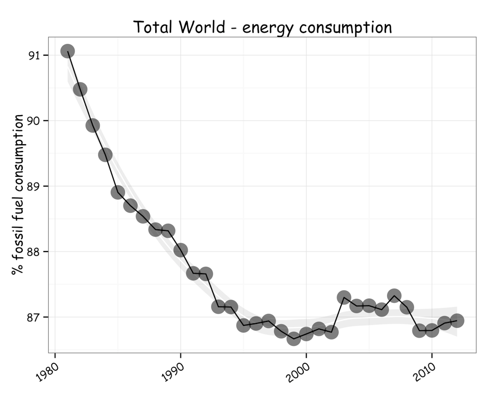
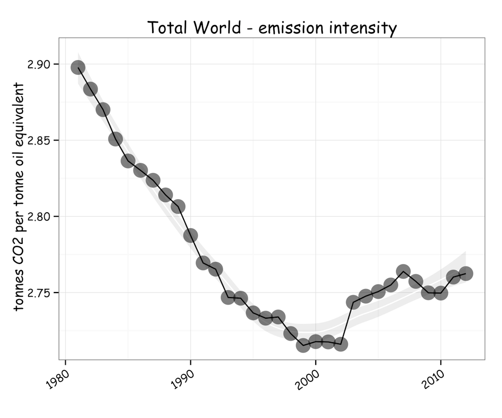
Because the greenhouse gas emissions intensity of coal is higher than oil and gas, the CO2 intensity of the fossil fuel component of our energy system is also rising, making the challenge of reducing emissions by displacing fossil fuels ever more daunting.
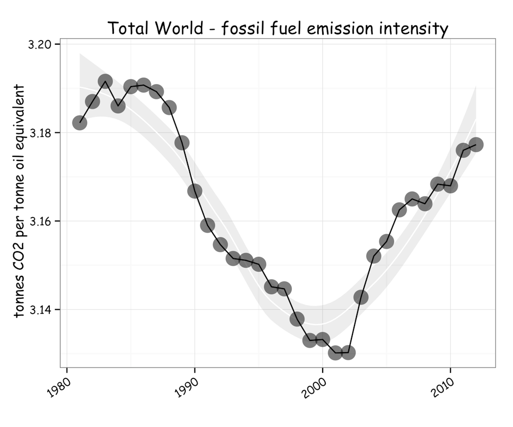
Even though BP shows that the proportion of fossil fuels in our energy mix has pretty much stabilized over the last decade, the consequence of the changing mix in the fossil fuel component is leading to rises in the emissions intensity of our energy system. And that is not good news.
So, in terms of environmental outcomes, the epithet – the black decade – seems all the more appropriate.
What happens if we continue the trend of the last decade?
A growth rate of 2.8% gives a doubling every 25 years. So if we were to continue to expand at this rate for another half century, we will end up with an annual fossil fuel production of about 44 billion tonnes in oil equivalents.
Burning that would release energy at an average rate of 60 trillion joules per second - or 60 trillion watts.
The scale of that is simply unfathomable.
It is a faster rate than released in the process we call “plate tectonics” that shapes our planet Earth. As I outlined in a previous post in accounting for all the mountain building, volcanoes and earthquakes, plate tectonics operates at a rate of about 44 trillion watts.
The energy content released in burning 44 billion tonnes of oil each year would be equivalent to detonating one Hiroshima bomb per second, for which I, and no doubt others, have used the term “the hiro” to give a sense of the stupendous scale or our human energy system.
According to BP’s estimates, and as shown above, our energy system is emitting a bit over 3 tonnes of CO2 for each tonne of oil equivalent fossil fuel consumed - amounting to 34 billion tonnes last year. So if we continue on the trajectory set this past decade, we would end up releasing about 140 billion tonnes of CO2 annually by 2063.
While that is simply unimaginable, and unmanageable, it is the target we are on.
As a species whose destiny is intimately tied to the ecological services our natural world provides, we just can’t afford to go there.
The scale of our energy system points to the hugely problematic issue we face in contemplating change. With a century of investment we have constructed a behemoth that distributes fossil fuels around the globe, releasing energy at the rate comparable to the very processes that have shaped our planet over geological time.
And all our economic systems are tied to it.
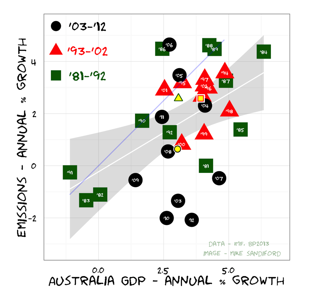
As illustrated below, by combining estimates of our energy related emissions and global GDP growth, we can get a sense of just how tight this coupling is.
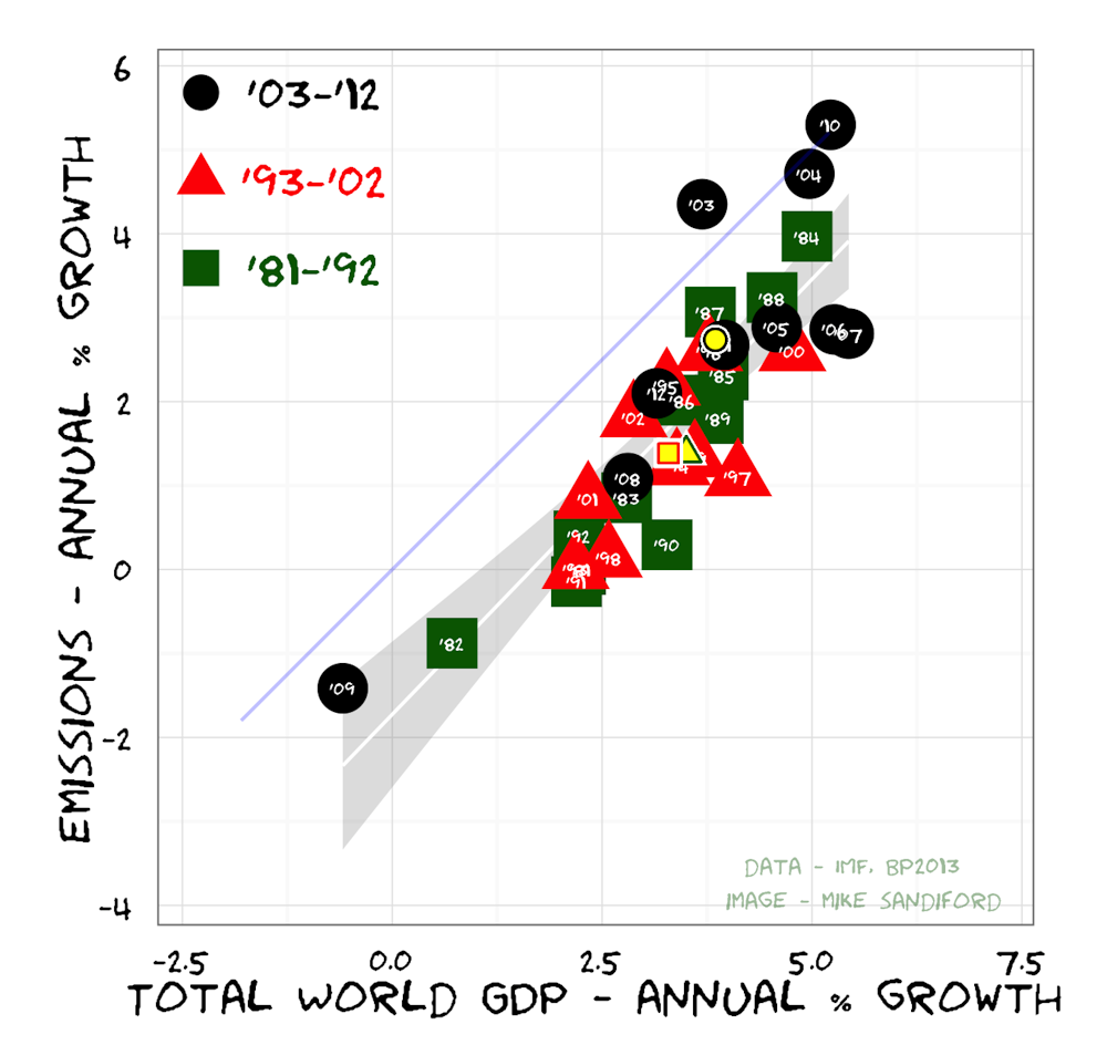
In contemplating the range of issues that define the global energy challenge, including questions around poverty, equity, security, and sustainability, it is easy to feel trapped. Is our existing energy system, and the demands on it, just too huge to change?
If we are to meet the sustainability challenge and address global equity issues, we will need to move our ways of operating so that we can produce beneficial economic outcomes while reducing emissions globally at annual rates in excess of 3%. In effect, we need to find ways to move the global system into the bottom centre of the illustration above.
As alluded to in my last post, and shown in different form below, that is a place that Australia has found itself nudging towards for much of the last decade.
While we are just a small player, and while we may have achieved some of it by offshoring our emissions, it does perhaps provide a ray of sunshine in an otherwise black decade.