

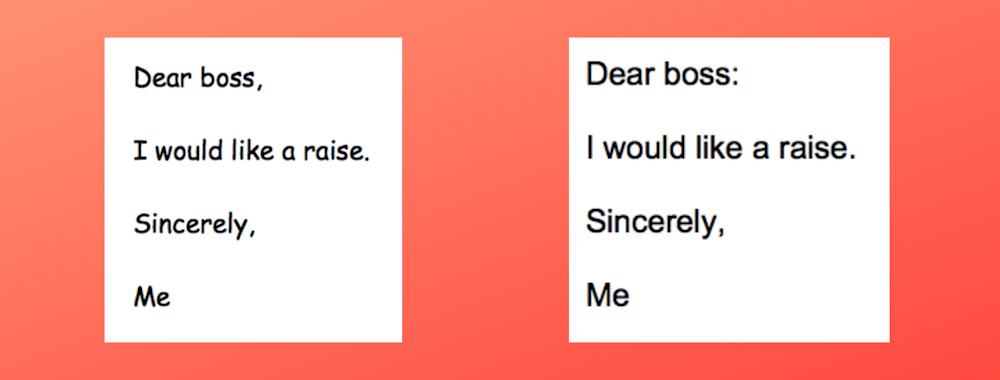
Any graphic designer worth their salt can tell you the best typeface for a new law practice in town is going to be drastically different than the typeface used for the local tattoo parlor.
You probably know this to some degree already – an email to your boss in Comic Sans is likely to be read differently than if it is sent in Arial.
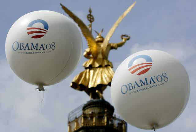
The same can be said for political candidates and their campaign signs. Much ado was made in the graphic design community about candidate Barack Obama’s 2008 logo. The logo and its font, called Gotham, now has its own Wikipedia page, and served as a wake-up call for scholars to begin studying the role typography plays in political communication.
Does the typeface you choose matter?
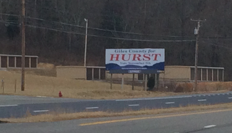
During the 2017 campaign season, one of us, Katherine Haenschen, a researcher and assistant professor at Virginia Tech who studies political communication, saw a campaign sign on Highway 460, which runs through a rural part of southwest Virginia.
The sign – for candidate Chris Hurst, running for election to the House of Delegates in Virginia’s 12th district – was noticeably different from the candidate’s sign in downtown Blacksburg, a considerably more urban and liberal part of the same district.
The rural sign used a serif typeface, the same class of typeface as Times New Roman or Garamond. Those fonts have letters that start and end with small flourishes, or serifs.
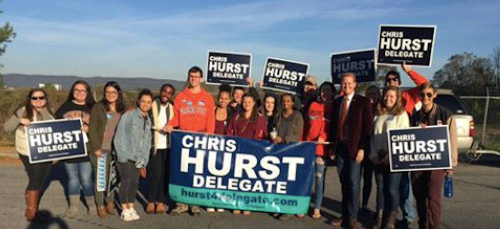
The sign in Blacksburg used a sans serif font that graphic designers generally consider more modern – in part because they were developed relatively recently. Sans serifs (sans means without) do not have those little flourishes. Helvetica is probably the world’s best-known sans serif and even has its own documentary film.
The existence of two typefaces on two different signs for the same candidate raised the question: Does changing the typeface of a candidate’s name actually change something about how that candidate is perceived?
Typefaces can communicate politics
The two of us – Haenschen and Dan Tamul, also a researcher at Virginia Tech, who studies persuasion – designed a study to find out the answer.
We recruited participants from across the United States through Amazon’s Mechanical Turk program and didn’t limit participation to any age or political orientation. The participants are likely very similar to your average user and consumer of typefaces. While MTurk samples are not always representative, they have been shown to produce results that are highly similar to nationally representative samples.
We showed study participants a name written in one of several typefaces. Some of those typefaces were serif fonts, others were sans serifs, and others still were more stylized display fonts like Blackletter, which looks like a newspaper masthead, and Sunrise.

Participants were then asked to rate how liberal or conservative they thought the typeface or the person whose name was printed.
Blackletter was rated by participants as the most conservative typeface and Sunrise as the most liberal. The serif typefaces, Times New Roman and Jubilat, were rated as more conservative than the sans serif typefaces, Gill Sans and Century Gothic.
The perceptions of the typefaces were not uniform for all participants, however. Democrats generally rated typefaces as more liberal than Republicans did, with the exception of the three display fonts (Blackletter, Birds of Paradise and Sunrise).
Typefaces are influential
You might be tempted to throw your hands up in the air and think that this is just one more example of how benign expressions are becoming politicized.
Yet, graphic designers have often treated typefaces as artistic expressions, and past research has shown that typefaces have personalities that can influence not only how we think about them but also how we perceive what is written.
For instance, another study found people will rate scientific abstracts as more interesting, appealing and of higher quality when written in a serif typeface compared to a sans serif typeface. Like real people, then, it shouldn’t be surprising that typefaces are perceived as having ideological leanings.
What this means for graphic designers is that the typeface you use to express your thoughts is something that can potentially shape how people will perceive you or your message. Our study shows such assessments can include political ideology.
What still is not known, however, is whether the personality, sentiment or perceived ideology that people attach to a typeface can override information that they already have about the message or the person whose name appears in a typeface.
For instance, how many people are likely to change their perception of Trump if his name appears in liberal-leaning Century Gothic? Whether you love him or hate him, your mind is probably already made up.
On the other hand, the same might not be true for lesser-known figures. A typeface choice could influence the perception you have of people running for school board seats, the lawyer opening a new law office or the coffee shop you never noticed before.
Our study also found that people rated the fonts they liked as more aligned with their own political ideology.
The key takeaway then may be to consult a graphic designer for any important project to gauge how your preferred typefaces will be seen.
[You’re smart and curious about the world. So are The Conversation’s authors and editors. You can get our highlights each weekend.]