
Airbnb’s new logo prompted a torrent of response as soon as it was unveiled. Everyone seemed to have a (not very original) opinion about the rebranding – yes, it looks like a vagina. And it doesn’t stop there. I feel like Eve Ensler, author of the Vagina Monologues, as I sift through an abundance of articles, twitter feeds and blog posts about how the new logo looks like a vagina, balls, scrotum or bottom. You can even upload your own skewed or adapted versions of the logo on a dedicated Tumblr site. Not since the public reactions to the 2012 Olympic Logo have we had such a furore.
Airbnb’s CEO and founder, Brian Chesky, thinks otherwise:
I feel our brand of yesterday was starting to hold back our ability to go mainstream, and limiting people’s idea of what it could become. This new branding changes the whole identity and expression of the company.
The time is certainly right for a corporate rebranding exercise. The company now describes itself as a “global hospitality brand” and has experienced rapid growth since its conception in 2007. More than 11 million guests have found places to stay since then. This exponential growth has attracted investors, leading to recent valuations of the company in the region of US$10 billion. Not bad for a company which started in an apartment in San Francisco by two friends who wanted to supplement their income.
The combination of this swift rise to success and fiscal input has led to the current rebranding exercise led, in part, by the fact that the original logo was created in a haste by the founders. Rebranding is a common corporate pastime and there is a tendency to assume that changing a company’s identity will inevitably improve the company’s image. Not so far for Airbnb, if we are to agree with the cynics and gossips’ reactions to the new logo.
Seeing is believing
So is it a vagina? I take another look at the logo. Perhaps it’s an abstract representation of a womb. Sacha Greif, a designer from Paris thinks so. He makes links between the intention that Airbnb’s new logo is all about “belonging” and a mother’s womb, which, he kindly reminds us, is “the ultimate symbol of a safe, warm, and welcoming place”. Airbnb is all about accommodating strangers into our home – perhaps they’ve nailed it with this new identity.
Gizmodo ran a piece titled The New Airbnb Logo Is a Sexual Rorschach Test for Our Time, which was essentially a compilation of some of the more explicit tweets out there.
With this idea in mind, I set about collecting a few responses from my own network of colleagues, friends and family. I sent out the call to action and held my breath and hoped that this very scientific test wouldn’t produce any disturbing psychological disorders regarding the personality defects of my nearest and dearest. Ping! My first response. The Duchess aka “Female in advertising” says it looks like a “symbol for a vagina from a sanitary protection brand”. Likewise, a male MD of a digital advertising agency says it looks like a “logo for a female hygiene product”. A male property developer decodes “phallic connotations” and asks innocently: “Is it aimed at girls or the gay scene?” “It looks anatomical” and “quite disturbing” yelps one male chief creative officer.
What is it with the advertising community? Perhaps my academic contacts would veer from these genitalia-focused replies. Ping! Professor Chris Hackley of Royal Holloway University of London said, “it reminds me of a British standard safety kite mark”. Similarly, a male senior lecturer retorted “Nappy Pin!” (Do we still use them?). Other more printable responses were “an upside down heart” (as Airbnb intended it to look) and, endearingly, “a paper clip” and “inclusive” (thanks Dad for the last one).
A sense of belonging
In order to have a successful brand and maintain a strong market position brand identity is essential. And this is most often exhibited through its external manifestation: the logo. This allows consumers to build a connection with a brand – which can reach fascinating heights. For example, when Ikea changed its font from Futura to Verdana in 2009, it prompted a furious online backlash.
The power of brand connection is exemplified by projects such as Lovemarks, which claims to be “the future beyond brands”, and “reach your heart as well as your mind”. Kevin Keller’s book on the topic explores those brands that seek to resonate with consumers to make a deep, enduring, personal and emotional connection. He stresses the need to have a brand logo that has favourable and unique brand associations.
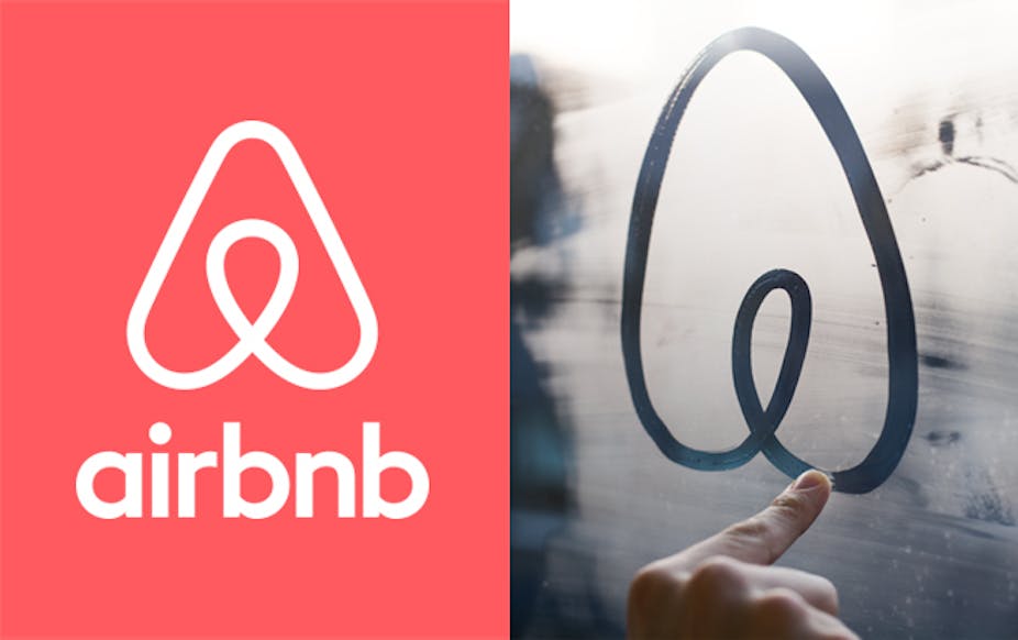
The new brand logo needs to mutually reinforce what Airbnb wants to stand for and what they represent in the mind of the consumer. Its creators The Design Studio attempted to “unlock the power of belonging”. They conducted a vast amount of research into the pre-design of the symbol and revealed that what consumer insight and Airbnb agreed on was that the company was about people, places and love. Through generating symbols for each of these elements the “Belo” (or vagina) was born.
As consumers, we love to “get it” and see innuendo where others might not. In fact, websites are dedicated to the misdemeanours of logo fails. It’s easy to find articles on the phallic extension on the cartoon for Mont-Sat and the very inappropriate logo for the 1973 Catholic Church’s Archdiocesan Youth Commission. The overwhelming response to Airbnb’s logo demonstrates the centrality of brands to our lives and the symbolic representations they reinforce.
More interesting perhaps is what Airbnb and the Design Studio think about all this. Are they bothered? They don’t seem to be. After all, Airbnb want to stand for inclusivity and belonging. A vagina in the crudest sense refers to the birth canal and we as humans, all came from one. What could be more welcoming than that?