
An article in The Australian today has once again raised the question of why scientists, in trying to estimate how the global and regional surface temperatures of Earth may have changed over the past century or so, “adjust” the raw temperature data.
It is important to note, first off, that no data have been “altered” or destroyed in this process – all the raw data remain available for investigation by anyone who has the inclination (as I’ll show below).
But this process can lead to large adjustments to the raw data, and in at least some instances the adjusted data can suggest long-term warming even when the raw data indicate cooling.
This appears to have happened at the Paraguay stations mentioned in the article – the raw temperature recordings suggest cooling over decades, whereas warming appears after the raw data have been adjusted by NASA and NOAA.
The figure below shows this at one station in Paraguay. I have obtained the data from this station (raw and adjusted) from Berkeley Earth, an independent group who have, quite separately from NASA and NOAA, checked global temperature data for these so-called “inhomogeneities” and adjusted the raw data themselves.
Their results provide an independent check for the NASA and NOAA groups doing this adjustment. The raw data (blue line) at this station suggest cooling, whereas the “adjusted” data (pink line) indicate warming.

The problem with thermometers
So why do scientists “adjust” the raw data – why don’t they simply accept that the raw data are the best estimate of how the temperature has changed over decades?
The underlying problem is that whether or not a specific thermometer reading is a good estimate of the air temperature depends on how the thermometer is exposed.
Take a thermometer and attach it to a wall, and then compare the temperature you read from that thermometer with the reading from an identical thermometer in a modern Stevenson Screen located nearby.
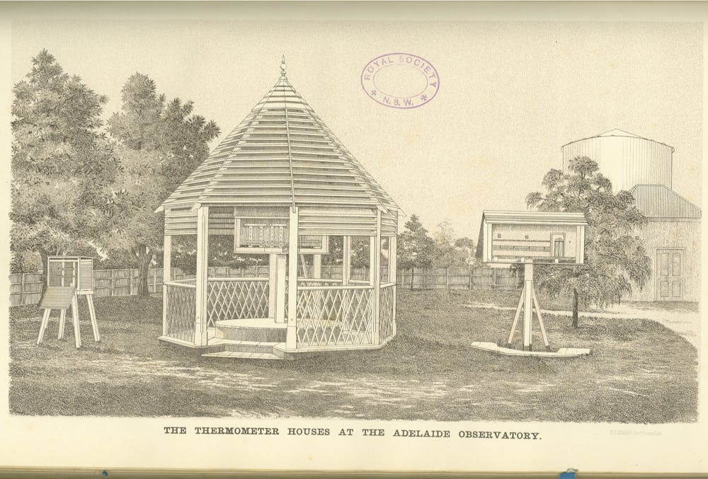
On a warm summer day the thermometer on the wall will usually record higher temperatures than the one in the Stevenson Screen. As well, any trees around the observing site, or buildings or roads or car parks, as well as many other factors, can all affect the recorded temperature.
Because nearly all long-term records of temperature anywhere in the world have been affected by such factors, for instance as a rural station or airport gets surrounded by suburbs and roads, the scientific thing to do is to make sure you take these factors into account when trying to get a picture of how the world may have warmed.
How to adjust data scientifically
It would be nice if we had a compete record of all the changes to all the temperature recording sites around the world, listing in forensic detail when and where stations were moved (even a few metres can make a difference), when trees around the site were planted or removed, when car parks nearby were built, and all the buildings for tens of metres around the site.
And we would need all these details stretching back over many decades.
Unfortunately, no station exists with such comprehensive information for the last century or so. But even if these “metadata” did exist, we could not just use the raw data at a single station alone to work out how much to adjust the raw data for changes in exposure and location.
So scientists identify other “comparison” stations (as many as they can find) with which to compare the raw data at the “target” station (such as the station in the graph from Paraguay). These comparison stations are selected because their temperature variations from year-to-year generally track the changes at the “target” station.
If, however, the target station temperatures change suddenly and that change is not matched by similar changes in all the comparison stations, it is reasonable to conclude that something has happened to corrupt the raw data at the target station. The relationship between temperatures at the target and comparison stations is then used to adjust the raw data at the target station.
The details of the way this adjustment process is done varies between the groups who do this. The result of the adjustments made by Berkeley Earth for a station in Paraguay is shown in the figure above.
Both the raw and adjusted data show warming over the past forty or so years, but before the mid-1960s the data are quite different. Even looking at the raw data alone, a scientist would worry that some change in exposure has corrupted the data, because of the sudden large drop in temperature.
But the Berkeley Earth scientists have objectively adjusted for this drop, through their comparisons with other stations in the region. Their adjustments remove the sudden drop in the mid-1960s, and indicate that temperatures in the region have been warming for more than the 40 years shown by the raw data.
Do it yourself
I encourage anyone who worries about the sort of adjustments made by NASA or NOAA, or in Australia by the Bureau of Meteorology, to go to the Berkeley Earth website, look at their independent results, and perhaps even do some calculations themselves to check what these other groups have done.
But don’t just think that the raw data will tell you much more than that the way the thermometer has been exposed has changed, or a car park has been built nearby, or a suburb now surrounds what once was a rural station.
You need to do the science and adjust for these corrupting factors, if you really want to work out how global and regional temperatures have changed. I’ve never been to Paraguay and I know almost nothing about the station whose data are in the graphs above. But scientists around the world have made these data available so we can do this work from our desktops.
I think this is great fun, but then I’m a nerdy meteorologist, so I would think that, wouldn’t I?