
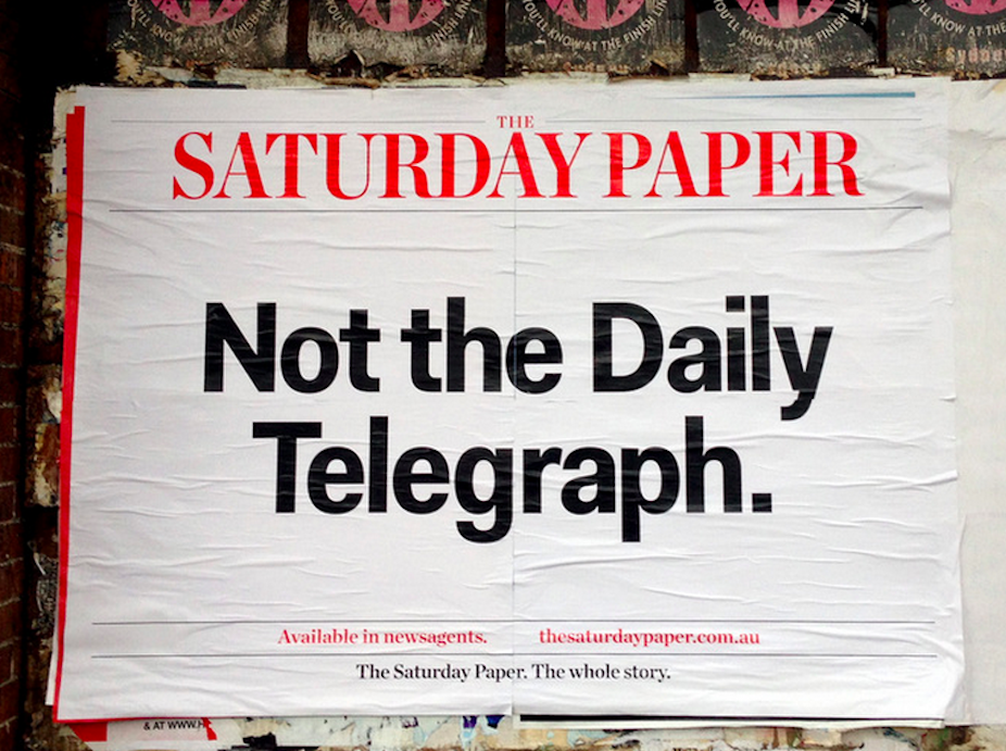
Morry Schwartz, publisher of The Monthly and Quarterly Essay, launched The Saturday Paper on March 1 2014 – the same weekend Fairfax Media downsized its weekend broadsheets to “more compact” sizes.
Launching a newspaper in 2014 is an ambitious venture, especially in print. In response to falling circulation and advertising revenues, established mainstream papers are transitioning from a print-focused publishing model to a digital one. According to Schwartz this is the moment of Fairfax Media and News Corp’s greatest weakness, therefore the right time to enter the Australian newspaper market.
The Saturday’s website positions it as “a quality weekly newspaper, dedicated to narrative journalism”, offering “the biggest names and best writing in news, culture, and analysis, with a particular focus on Australia”.
Its journalistic and editorial merit has been critiqued in mainstream press. After the first two editions, Jonathan Holmes wrote in The Age that the paper fell short of its own lofty hype. In The Australian, Troy Bramston recognised some good writing, but ultimately dismissed it as offering an “ignorant, moralistic and simplistic worldview”.
What hasn’t been broadly discussed is the design of the paper. At a time when publishers are scrambling to retain readers both in print and online, newspaper design is critical.
Newspaper designer Jacek Utko describes a number of case studies from Europe where the redesign of a paper directly resulted in circulation and advertising increases:
But a redesign of an established paper is an entirely different project to designing a new paper from scratch. The challenge of a redesign is to engage new readers with a fresh look, without alienating or confusing existing readers. A new title doesn’t remodel an existing template: it offers an opportunity to challenge and innovate.
I’m not sure what I expected from the design of The Saturday Paper, but four editions in I am underwhelmed.
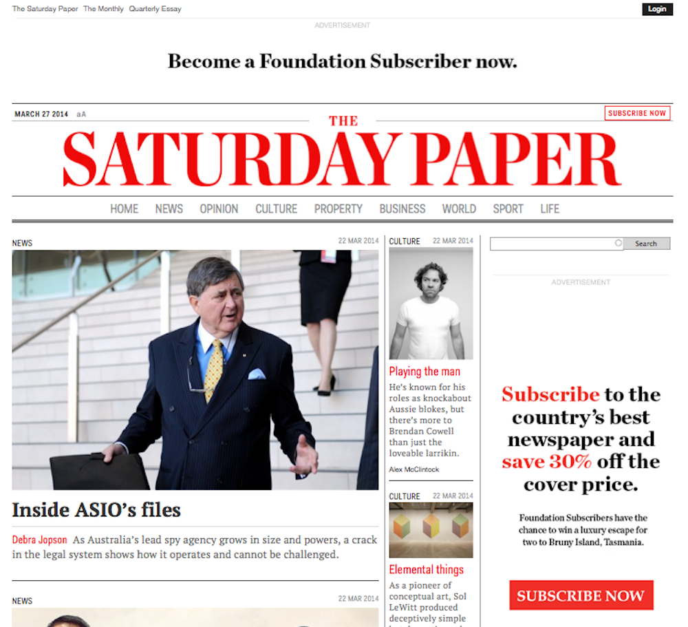
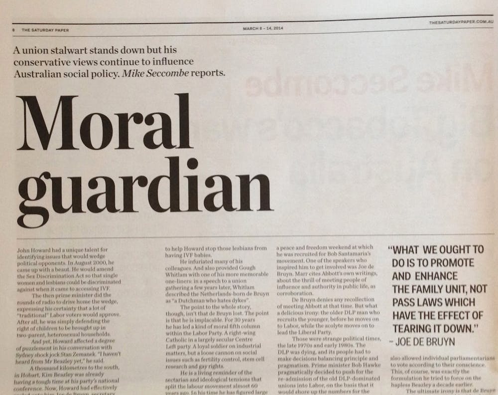
That is not to say the design is bad. It’s clear, elegant and expertly executed. The typefaces are classically appropriate for a newspaper and highly readable. The mix of serif and sans serif works well. There’s distinctive typographic hierarchy; I can quickly tell the difference between a headline, a pull quote and body copy.
My disappointment with the design mirrors Holmes’ issue with the editorial content.
Although well-executed, it doesn’t live up to the hype of being a game changer for Australian newspapers. The Saturday Paper feels like a version of things we’ve seen before – in particular, the relaunched The Independent.
Searching the print and digital editions, as well as the website, I cannot find a design credit.
Lucy Feagins, founder of popular blog The Design Files, edits The Saturday’s Interiors page; and an interview with the paper’s Editor Erik Jensen credits Melbourne studio Round as the design team. Round’s other editorial designs include Architecture Australia magazine and street magazine/ website Broadsheet.
Jensen commented briefly on the design, that:
Every element of the paper has been conceived as part of a bespoke product – it’s like I’ve been able to dream of my ideal newspaper and then bring it to reality. We looked at something like 50 different paper stocks before we settled on the paper we are using. And that kind of hunting has gone into every part of the paper.
In conversation, my design academic colleague Kate Sweetapple describes the graphic style of The Saturday Paper as “contemporary nostalgia”. For other examples of contemporary nostalgia, see Frankie magazine and the Smith Journal, or most advertising targeted at hipsters. This aligns with Jensen’s “bespoke” brief, but isn’t necessarily a compliment.
Sweetapple commented in an email: “the picture editing is largely underwhelming. The images accompanying the news seem to be almost an afterthought, which is disappointing considering the obvious attention to print quality”.
Also notably lacking are editorial illustrations. And here is perhaps the key problem in terms of design. Typography and layout are the skeleton of the design – what’s missing is meat, in terms of images to flesh the thing out. Why bother to source paper stock designed to print colour images at high quality, but not images to show it off?

The author dinki (head shots) are inconsistent and sometimes awkwardly cropped, which makes this feel like street press. The advertisements overshadow the editorial images in a way that I find distracting.
In order to critique the effectiveness of design, we have to consider the audience. Who does it need to appeal to aesthetically, and in terms of readability?
In a Fairfax interview last month, Schwartz was blunt about audience: “We’re not everything to everyone. We know who the reader is: the reader is me.” The paper’s launch media kit was slightly less specific: well-educated young professionals aged 35-49, image-conscious, brand-aware and socially aware, creative with high disposable incomes who see shows and travel frequently.
Minus the high disposable income, this is (as much as I’d like to deny parts) basically me. The media kit continues that I am supposed to read Vanity Fair and the New Yorker. What’s missing for me is visual content that rivals the likes of the New Yorker and Vanity Fair.
Design doesn’t stop at the visual identity and typographic template – it’s an ongoing process and deserves editorial attention.
Further reading:
See the slide show of the five international newspapers the US-based Society for News Design judging panel awarded as the World’s Best Designed Newspapers in 2013.