
As a reader might infer from my photograph, I am a pensioner. I mention this with the purpose of full disclosure, because I shall discuss how the likes of me have fared compared to all of you out there who must work for a living.
We find in both media and research reports many reasons why those who live to pension-receiving age represent a serious burden to society in the UK and elsewhere. Prominent among these reasons are the proclivity of the elderly to use the NHS more (I plead guilty) and the indisputable fact that the retired seem content not to engage in paid work (guilty again).
To these transgressions has been added an additional charged – the alarming growth of “intergenerational wealth inequality”, according to the FT. The Conservatives have also been accused of wooing older voters with a range of benefits denied to the hard working, doing-the-right-thing households.
The poor suffer more
Faced with these allegations, a look at the numbers is warranted. The Office for National Statistics provides quite detailed information on the income of the taxpayer categories “non-retired” and “retired”. It is unfortunate that the latest statistics are two years old, referring to tax year 2012-2013. Nonetheless, this allows a comparison of the pre-coalition result to outcomes three years later.
One of the most important aspects of earnings and pensions is their unequal distribution. The chart below demonstrates the pattern of inequality, reporting the percentage change in “final income” for those retired (blue) and not retired (red), between 2009-2010 and 2012-2013, adjusted for inflation.
“Final income” comes as close as statistics can to measuring material welfare. It includes all income payments, plus cash benefits, minus income tax, minus indirect taxes, and finally, plus all benefits in kind.
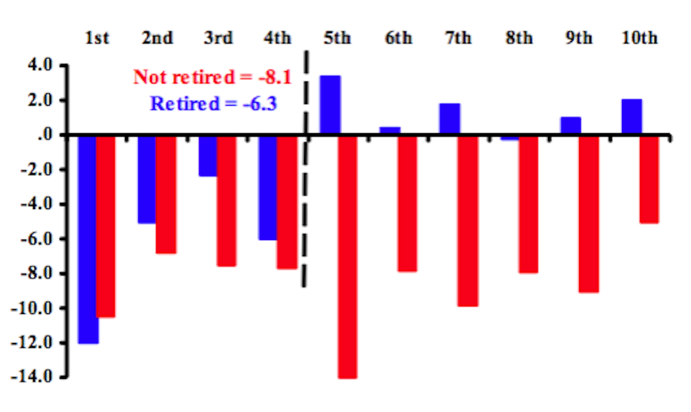
Once we wade through all the categories and numbers, we discover that the average non-retired earner suffered a decline in final income of 8%, while the pensioner almost broke even at -0.7%. For those not retired the losses were quite similar across the board. For example, the poorest 10% of earners suffered a 10% decline, the same as for the seventh worst off, with the fifth worst off suffering a 13% decline. The smallest decline occurred for the top earners – continuing the much noted tendency towards greater inequality over the last three decades.
For the retired the story is quite different. The poorest 40% of pensioners endured a real income contraction of more than 8%. Every other earning category enjoyed an increase with the exception of a tiny decline of 0.1% in the eighth.
A clear message comes from statistics for retired and not retired households – gains and losses have a distributional dimension. Declines were much the same for the employed. In contrast, the bottom 40% of pensioners suffered serious decline, while the top 60% did not.
Private v state pensions
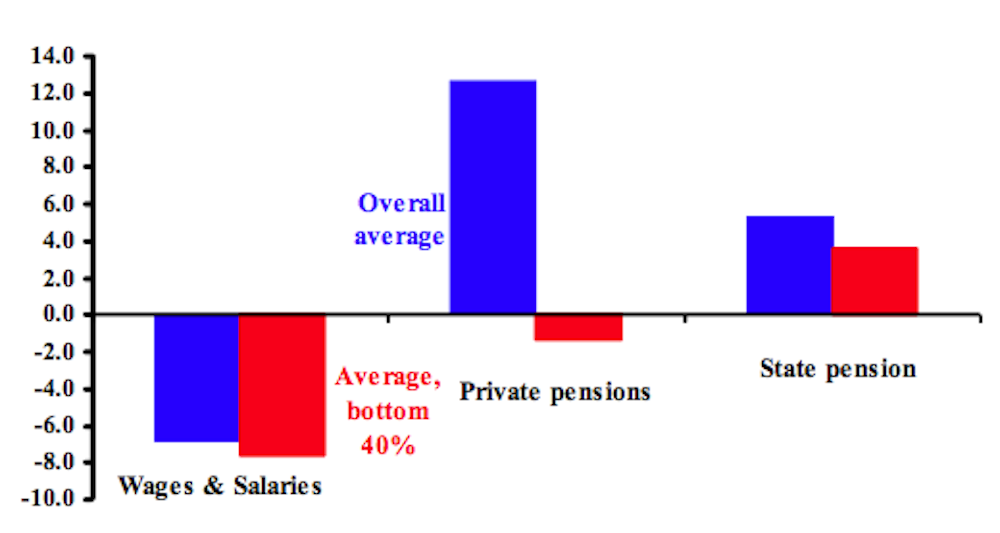
A second chart reiterates the importance of the distribution of pension income. It shows the inflation adjusted change in wages and salaries for the non-retired, private pensions and the state pension over the same years. The wages and salaries of non-retired households declined for the poorest 40% at about the average for all earners.
The private pension story proves quite different. The average private pension rose by inflation adjusted 12%, while the outcome for the bottom 40% was a decline of 1.3%. The state pension increased by almost 4% for the poorest 40% – by far their main source of income – and even this was less than the overall increase (5.3%). Though all state pensioners receive the same cost of living increase, earlier retirement by the more unemployment-prone explains the smaller gain for the poorest 40%.
The statistics convey a lesson in caution about generalisations. Yes, on average pension incomes rose more (or fell less) than non-pension incomes under the coalition government through the tax year 2012-2013. But differences over the income distribution are dramatic – those at the top gained and those at the bottom lost out.
David Cameron and chancellor George Osborne are not attempting to “woo older voters”. Among the retired they woo the same constituency they woo in the country as a whole – the rich.