
The Conversation is running a series, Class in Australia, to identify, illuminate and debate its many manifestations. Here, Peter Whiteford investigates what has happened to income and wealth inequality in Australia in recent times.
Australians like to think of themselves as egalitarian, and for much of our history we believed our income and wealth was spread around evenly. For many years, the world also shared that view. As early as the 1880s, visitors remarked on Australia’s relatively equal distribution of wealth, the lack of visible poverty, the country’s generally comfortable incomes and its relatively few millionaires.
As late as 1967, prime minister Harold Holt could say that he knew of no other free country where “what is produced by the community is more fairly and evenly distributed among the community” than it was in Australia.
From the 1980s onwards, however, this view of Australia came under scrutiny. As historian John Hirst wrote:
‘Egalitarianism – see under myths’: so runs the index entry in a standard sociological text on Australian society.
The most common measure of inequality is the Gini coefficient, which varies between zero and one. If everyone had exactly the same income then it would be zero (perfect equality). If one household had all the income then it would be one (complete inequality).
The most recent figures for OECD countries, from around 2010, show that Australia is the 11th most unequal of the 34 OECD members. Australia has only ever briefly been below the OECD average Gini coefficient: just as the mining boom started in 2003.
Below is a map showing income inequality in OECD countries. Click here to open in new window or republish.

So, was Australia actually never particularly equal? Or have we become more unequal more rapidly than other countries?
Trends in income inequality
Working out what has happened to inequality in Australia over the long term is complex. While there is disagreement about overall trends, according to economists Andrew Leigh and Tony Atkinson, inequality declined between the 1950s and the late 1970s, with Peter Saunders identifying an increase in the 1980s.
These long-run estimates are usually based either on wage trends or income tax data, which means that findings apply to individuals rather than households. Household incomes after benefits and taxes, however, are generally regarded as a better measure of economic resources.
Since the early 1980s, the Australian Bureau of Statistics (ABS) has conducted regular high-quality surveys of household incomes. The most recent survey covers the 2011-12 year.
Research by economists David Johnson and Roger Wilkins found that the Gini coefficient increased from around 0.27 in 1981–82 to around 0.30 in 1997-98. Subsequently, the official ABS income statistics show that the Gini coefficient increased to 0.34 just before the global financial crisis in 2008, then fell to 0.32 in 2011-12.
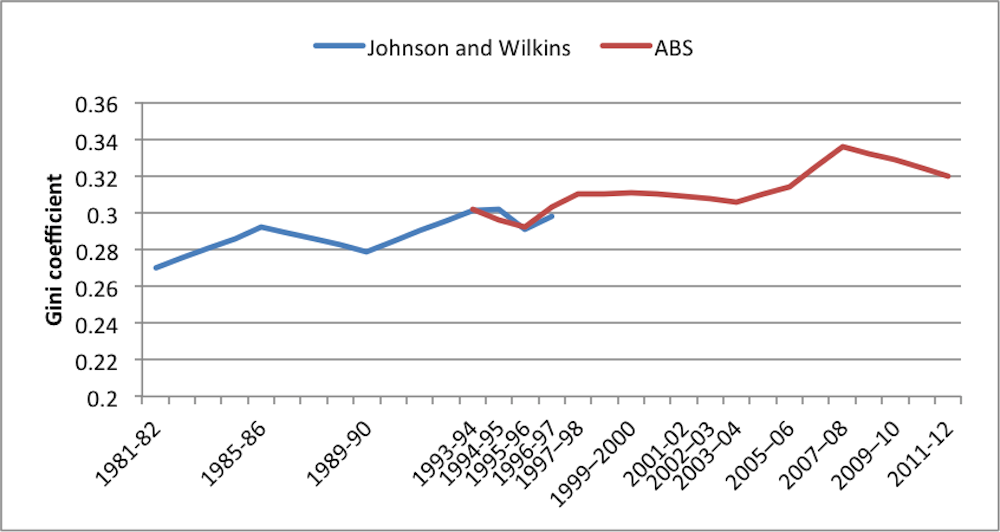
The ABS points out that changes from year to year are sometimes not large enough to be statistically significant. Yet the cumulative picture is of an upward trend, punctuated with periods in which inequality has fallen. Whether the most recent fall continues or is reversed remains to be seen.
Trends in wealth inequality
For many years, statistics on the distribution of wealth were even sparser than comprehensive statistics on the distribution of income. The improvements in income statistics achieved by the ABS were more recently matched by the collection of information on wealth – or more precisely on “net worth” (assets minus liabilities).
According to the ABS, the wealthiest 20% of Australian households, with an average net worth of A$2.2 million per household in 2011-12, accounted for 61% of total household net worth. The poorest 20% of households accounted for 1% of total household net worth, and had an average net worth of $31,000 per household.
This means that the wealthiest 20% of Australian households had net worth that was 68 times as high as the least wealthy 20%. In contrast, the 20% of Australian households with the highest disposable income were about five times better off than the poorest 20%.
So, it seems pretty clear that wealth is much more unequally distributed in Australia than income. Or is it? This depends on how you look at it.
The most recent Credit Suisse Global Wealth Report, prepared by Anthony Shorrocks, one of the most highly respected world experts on wealth distribution, estimates that the distribution of wealth in Australia is the second least unequal (after Japan) of 27 major countries and the 12th least unequal of 174 countries.
It is also notable that the Credit Suisse report finds that Australia has the second highest average level of wealth in the world and the highest median wealth.
Below is a map showing wealth inequality across the world. Click here to open in a new window or republish.
The ABS survey – used by Credit Suisse – also presents two ways of looking at the distribution of wealth: first, by ranking households simply by the amount of wealth they have; second, by ranking households by how much income they have.
When the ABS ranks households by their incomes, the 20% with the lowest incomes have an average net worth of around $437,000, while the 20% with the highest incomes have about $1.3 million in net worth. This means that the poorest one-fifth of households, measured by income, hold 12% of net wealth, while the richest one-fifth hold 36%, a ratio of about 3 to 1.
These figures suggest that wealth is actually more equally distributed than income when the joint distribution of income and wealth is used - which is a more comprehensive measure of total household resources.
These two approaches yield remarkably different pictures of wealth distribution. This reflects the fact that people accumulate wealth over the course of their life. Young people starting off in their first job generally don’t have much in the way of wealth, but as they grow older they will purchase homes – which have been the great wealth “equaliser” in Australia – and accumulate superannuation and other savings.
As a result, older people have much higher average wealth than younger people, but older people generally have lower incomes than younger people.
So, why did we think that income was equally shared in Australia if it wasn’t? The answer is that most of the earlier studies were based on a limited income measure: usually wages before tax and usually full-time wages for men.
In the past, Australia’s wage-fixing system compressed the wage distribution. As late as 1999, Australia had the highest minimum wage relative to the median in the OECD.
If you are a full-time employed male wage earner in Australia, then you have a lower level of income inequality than in Denmark, otherwise one of the lowest inequality countries. The most important source of inequality in Australia is whether you have a job or not.
So the pillars of egalitarianism in Australia were high wages, high home ownership and low unemployment. If we want to regain this position, we need to ensure that unemployment remains low and that low-income earners are able to buy into affordable housing.
See the other articles in the series Class in Australia here.