Once upon a time, mathematicians imagined their job was to discover new mathematics and then let others explain it.
Today, digital tools like 3-D printing, animation and virtual reality are more affordable than ever, allowing mathematicians to investigate and illustrate their work at the same time. Instead of drawing a complicated surface on a chalkboard, we can now hand students a physical model to feel or invite them to fly over it in virtual reality.
Last year, a workshop called “Illustrating Mathematics” at the Institute for Computational and Experimental Research in Mathematics (ICERM) brought together an eclectic group of mathematicians and digital art practitioners to celebrate what seems to be a golden age of mathematical visualization. Of course, visualization has been central to mathematics since Pythagoras, but this seems to be the first time it had a workshop of its own.
The atmosphere was electric. Talks ran the gamut, from wildly creative thinkers who apply mathematics in the world of design to examples of pure mathematical results discovered through computer experimentation and visualization. It shed light on how powerful visualization has become for studying and sharing mathematics.
Reimagining math
Visualization plays a growing role in mathematical research. According to John Sullivan at the Technical University of Berlin, mathematical thinking styles can be roughly categorized into three groups: “the philosopher,” who thinks purely in abstract concepts; “the analyst,” who thinks in formulas; and “the geometer,” who thinks in pictures.
Mathematical research is stimulated by collaboration between all three types of thinkers. Many practitioners believe teaching should be calibrated to connect with different thinking styles.
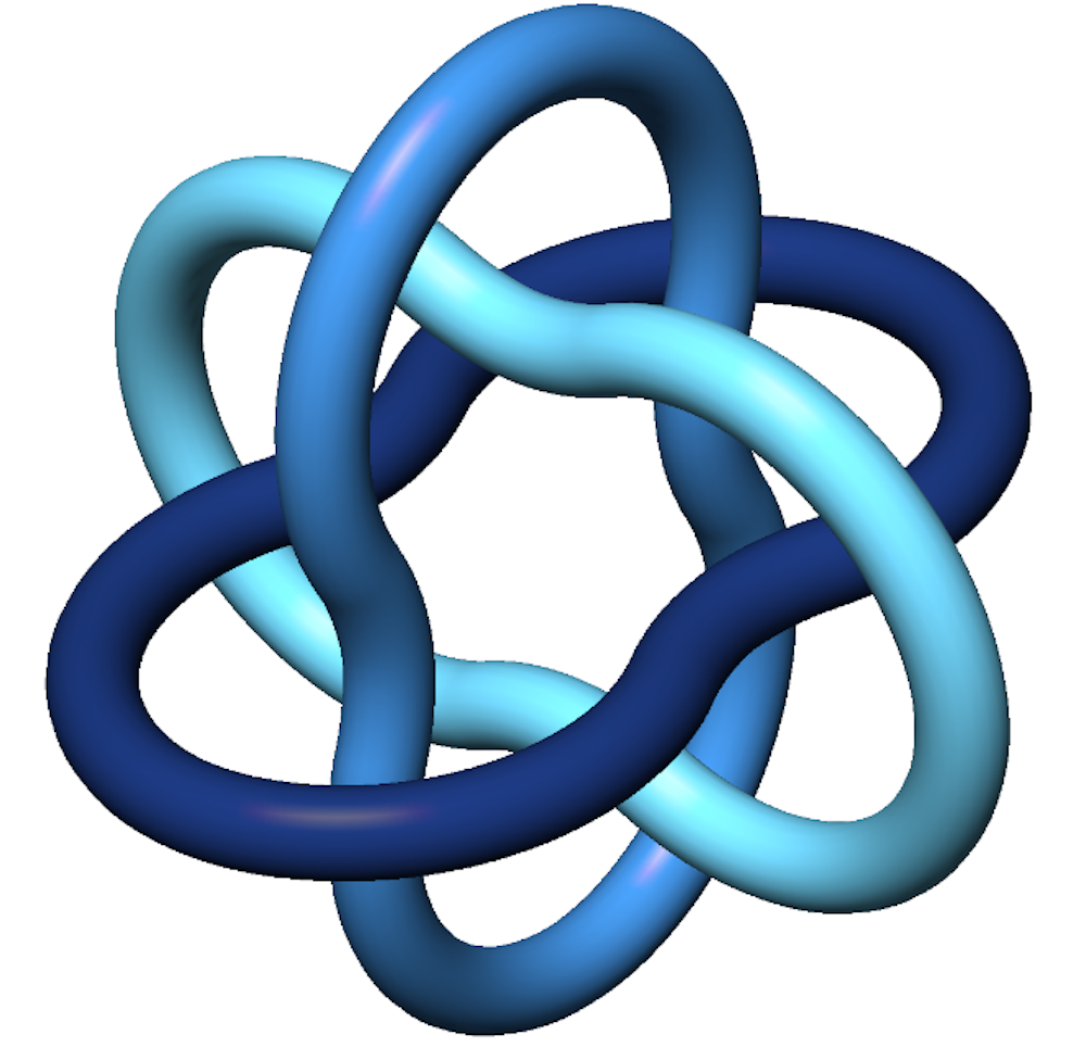
Sullivan’s own work has benefited from images. He studies geometric knot theory, which involves finding “best” configurations. For example, consider his Borromean rings, which won the logo contest of the International Mathematical Union several years ago. The rings are linked together, but if one of them is cut, the others fall apart, which makes it a nice symbol of unity.
The “bubble” version of the configuration, shown below, is minimal, in the sense that it is the shortest possible shape where the tubes around the rings do not overlap. It’s as if you were to blow a soap bubble around each of the rings in the configuration. Techniques for proving that configurations like this are optimal often involve concepts of flow: If a given configuration is not the best, there are often ways to tell it to move in a direction that will make it better. This topic has great potential for visualization.
At the workshop, Sullivan dazzled us with a video of the three bands flowing into their optimal position. This animation allowed the researchers to see their ideas in action. It would never be considered as a substitute for a proof, but if an animation showed the wrong thing happening, people would realize that they must have made an error in their mathematics.
The digital artists
Visualization tools have helped mathematicians share their work in creative and surprising ways – even to rethink what the job of a mathematician might entail.
Take mathematician Fabienne Serrière, who raised US$124,306 through Kickstarter in 2015 to buy an industrial knitting machine. Her dream was to make custom-knit scarves that demonstrate cellular automata, mathematical models of cells on a grid. To realize her algorithmic design instructions, Serrière hacked the code that controls the machine. She now works full-time on custom textiles from a Seattle studio.
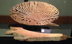
Edmund Harriss of the University of Arkansas hacked an architectural drilling machine, which he now uses to make mathematical sculptures from wood. The control process involves some deep ideas from differential geometry. Since his ideas are basically about controlling a robot arm, they have wide application beyond art. According to his website, Harriss is “driven by a passion to communicate the beauty and utility of mathematical thinking.”
Mathematical algorithms power the products made by Nervous System, a studio in Massachusetts that was founded in 2007 by Jessica Rosenkrantz, a biologist and architect, and Jess Louis-Rosenberg, a mathematician. Many of their designs, for things like custom jewelry and lampshades, look like naturally occurring structures from biology or geology.
Their first 3-D printed dress consists of thousands of interlocking pieces designed to fit a particular model. In order to print the dress, the designers folded up their virtual version, using protein-folding algorithms. A selective laser sintering process fused together parts of a block of powder to make the dress, then let all the unwanted powder fall away to reveal its shape.
Meanwhile, a delightful collection called Geometry Games can help everyone, from elementary school students to professional mathematicians, explore the concept of space. The project was founded by mathematician Jeff Weeks, one of the rock stars of the mathematical world. The iOS version of his “Torus Games” teaches children about multiply-connected spaces through interactive animation. According to Weeks, the app is verging on one million downloads.
Mathematical wallpaper
My own work, described in my book “Creating Symmetry: The Artful Mathematics of Wallpaper Patterns,” starts with a visualization technique called the domain coloring algorithm.
I developed this algorithm in the 1990s to visualize mathematical ideas that have one dimension too many to see in 3-D space. The algorithm offers a way to use color to visualize something seemingly impossible to visualize in one diagram: a complex-valued function in the plane. This is a formula that takes one complex number (an expression of the form a+_b_i, which has two coordinates) and returns another. Seeing both the 2-D input and the 2-D output is one dimension more than ordinary eyes can see, hence the need for my algorithm. Now, I use it to create patterns and mathematical art.
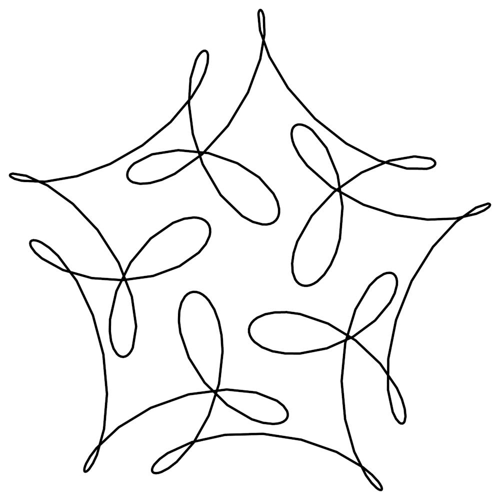
My main pattern-making strategy relies on a branch of mathematics called Fourier theory, which involves the superposition of waves. Many people are familiar with the idea that the sound of a violin string can be broken down into its fundamental frequencies. My “wallpaper functions” break down plane patterns in just the same way.
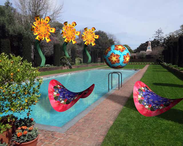
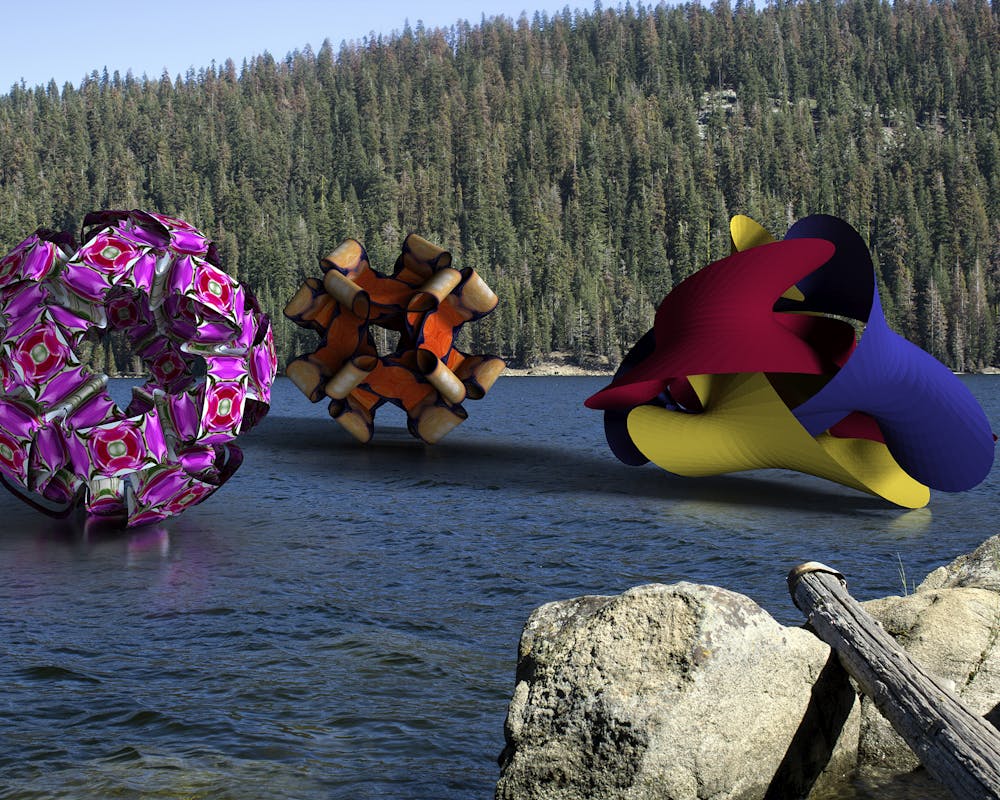
My book starts with a lesson in making symmetric curves. Taking the same idea into a new dimension, I figured out how to weave polyhedral solids – think cube, dodecahedron, and so on – from symmetric bands made from these waves. I staged three of these new shapes, using Photoshop’s 3-D ray-tracing capacity, in the “Platonic Regatta” shown below. The three windsails display the symmetries of Platonic solids: the icosahedron/dodecahedron, cube/octahedron and tetrahedron.
About an hour after I spoke at the workshop, mathematician Mikael Vejdemo-Johansson had posted a Twitter bot to animate a new set of curves every day!
Mathematics in the 21st century has entered a new phase. Whether you want to crack an unsolved problem, teach known results to students, design unique apparel or just make beautiful art, new tools for visualization can help you do it better.
This article was updated on April 5, 2017 with the full name of Mikael Vejdemo-Johansson.