
Maps can be many things: colourful, or dull; complex, or very simple; helpful, or very difficult to read. They also have the potential to support the public’s knowledge of environmental and social issues, and to lay out paths towards behavioural changes and conservation consciousness.
This potential is already being explored in some parts of the world. For example, the FishWerks App uses maps to highlight the barriers to fish movement in the Great Lakes region of the United States. Based on the ongoing work with a map of southern African rivers that went viral two years ago, the same potential exists to drive conservation awareness and action in the southern African region.
Read more: What we learned when our map of southern Africa's rivers went viral
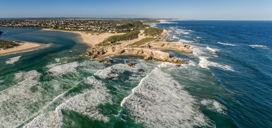
Two years on, people are still engaging with that map through the survey that goes with it. There were between three and 147 downloads a month during 2019 and 2020. As a water researcher, I wanted to understand how people’s interest in the map might be turned into action around conservation and a better awareness of South Africa’s many water issues. These issues include water pollution, which affects the quality of river water, microplastics and their impacts on plants and animals, and invasive alien plants and animals that negatively affect water availability and biodiversity.
In the previous article, three themes emerged from the initial responses to the map. These themes parallel the characteristics of popular internet memes. First, the data in the map was genuinely useful to people. Second, it was aesthetically pleasing. Third, it interested people.
Now, based on learnings from the 2,593 responses to the survey that accompanies the map, I have gained a deeper understanding of public interest and how public driven science – specifically around the use and content of maps – might bridge the gap between policymakers, citizens and scientists.
Respondents’ insights
In the survey, over 82% of people (from 66 countries across six continents) stated that they were downloading the map for personal use. This was followed by “educational purposes” (27%). Only 8% of respondents wanted it for professional use.
Overwhelmingly, respondents found the map aesthetically pleasing. They were struck by the colourful representation of just how expansive southern Africa’s river systems are, as well as how many there are. People felt that the visuals helped them better understand geographic relationships – how rivers and catchments fit together.

One respondent said:
It has made me realise how the river system is so vast and interconnected. All previous maps have shown one blue line saying “this is the Orange river” and then saying “it is a vast, important river” but only this map shows why that is the case … It made me think of the rivers as a system, rather than just lines on maps, that looked like a living, breathing structure like coral.
This greater understanding of interconnectedness could influence people to become more engaged with conserving river systems.
Bringing the public on board
Another important learning that comes out of the survey is the potential for publicly driven mapping. Science communications expert Dr Marina Joubert has highlighted the communications gap between scientists and public, and the new South African policy that expects scientists to engage with the public. Publicly driven mapping could allow easier or greater public engagement with scientific findings as scientists can gain insights into public interests.
Some of the respondents queried whether additional data – river names, towns, aquifers, mountain ranges – could be plotted on the map, which would increase their understanding.
Respondents suggested, among other things, that the map could visually represent the degree of contamination and sustainable flow for each river, or that the map could be colour coded from “most stressed” to “least stressed”.
More than one respondent indicated an interest in a map of river permanence. One wrote: “I was surprised to see how much of South Africa is covered by rivers, it would be interesting to add a layer to indicate perennial and non perennial rivers”. Another respondent said:
The other maps I have seen didn’t show as much detail and left the impression that there wasn’t as much drainage and yet I know from hiking that there is usually a perennial river everywhere you go. So this map matches my experience of Cape Town instead of my basic high school geography which didn’t match my personal experience.
Following these suggestions, I have created a map of perennial rivers in South Africa using data available from the Department of Water and Sanitation. Although the perenniality map is an estimation derived from the probability of groundwater contributing to river flows, it gives useful information for citizens who are interested in understanding river ecology instead of just seeing it as a line on a map. A river’s perenniality indicates the natural state of a river and its seasonaility, which can be disrupted by human development, including small dams and culverts.

Creating such maps, and others based on the public’s input, is possible. Many of the datasets that would form the basis of the maps suggested by the survey respondents already exist, since the South African government funds research which generates open source data, such as the recent National Biodiversity Assessment.
The power of maps
With the power of digital technology, maps with a 3D effect can further promote greater understanding of land and water connections. I recently took a class in digital storytelling and created a video that shows a local river’s journey to the sea using a flyover created with a couple of clicks in Google Earth.
My hope is that the story of the rivers map, combined with digital technology and storytelling, can inspire others to use their potential to raise the public’s environmental awareness and to create bridges between government agencies, citizens, and scientists.