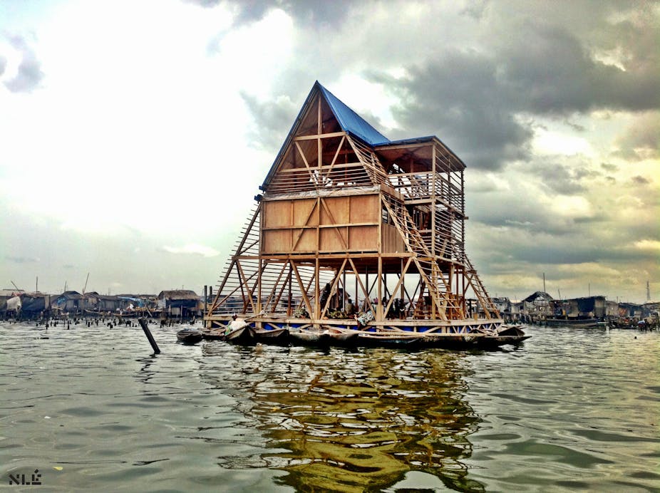
I have a golden rule, which is never to review a building unless I have been to it. Architecture is at heart about use and experience, and this simply cannot be conveyed through pictures, words and drawings.
So, when I was asked to preview the Designs of the Year exhibition my initial response was to say no. How could I preview such a diverse range of stuff when the only evidence available at that stage were links to pictures and a set of sound bites, many lifted directly from the designer’s own website?
Should I, and then you, really be expected to make judgements based on puff (“conceived by the architects as both a landscape and a topographic surface, this faceted pavilion of concrete and aluminium conveys a perpetual flow of digital information”) and nonsense (“the signature of the caatinga, the natural scuffing of the cattle that the market considers a defect, becomes a sign of sophistication in this collection”)?
But then, I thought, this evidence is all the selectors for Designs of the Year have to hand in order to filter down the recommendations of a range of nominators. If the process of selection is based on this puff and nonsense, then it might be an interesting exercise to preview the finalists in that manner, too.
What does this method of selection say about the way contemporary design is perceived and valued? This is a serious question. Take the case of architecture. If all we have are the rhetorical statements of the author-architect, and some static images, then what is a perpetuated is a culture of disengagement and spectacular display. Issues of use and experience are suppressed and the values of authorial control and aesthetics privileged. Here architecture merges with fashion, and one sees a David Chipperfield museum in much the same way as a Rick Owens show presentation (both shortlisted designs).
This elision is not healthy, reducing architecture to merely a matter of taste and commodity. For this reason it is impossible to judge which is the “best” architectural design in the shortlist, because to do so would either foreground my taste over yours or else pander to the mechanisms of the market in determining architectural value.

Is there any sense in even having the discussion about whether a new shopfront for Paul Smith is any “better” than a cultural centre in Azerbaijan by Zaha Hadid, except to note that the human rights record of Ilham Aliyev, the President of Azerbaijan, should have been enough to rule this one out from inclusion in the first place? But to make such exclusions would have been to bring the political to architecture and design, and the words and images in the catalogue do everything they can to shake off such messy associations.
This architectural condition is symptomatic of a wider issue for the other categories represented (digital, product, furniture, graphics, transport and fashion). Through foregrounding the image of the object, isolated and fetishised, design is reduced to something that it isn’t. The frozen, flat object suppresses what came before (in terms of context, process and production) and what comes after (in terms of use and social engagement). More than this, the image of the object places design firmly as part of the desire-making machine which capitalism first constructs and then feeds off.

There are some designs here that simply create want (but don’t address need), and so contribute to the unnecessary production of stuff and consumption. Does anyone really need “a tactile timepiece that allows users to not only see what time it is, but to feel what time it is”, (and no, it is not designed with the visually impaired in mind)? Design is here complicit in the construction and proliferation of scarcity, at exactly the time when, faced with diminishing resources of every kind and with the need to consider a post-growth world, designers should be working with the context of scarcity rather than producing it.
In this light the most interesting category on the shortlist is that of digital design, because the digital is always restless and cannot fall back on the stasis of the object. Although digital design is often associated with the spectacular and gimmicky, many of the designs here use the process and purpose of design to address societal issues, expanding the role and relevance of the designer far beyond the production of a refined object or system.
Overall, there are many interesting ideas hiding under the puff. But my advice when looking at them online or (much better) at the exhibition – which in previous years have been very well curated and presented – is not to accept them at pretty face value, but to interrogate them in terms of what came before and what might come after.
Designs of the Year 2014 is at London’s Design Museum from 26 March 2014 – 25 August 2014, 10.00-17.45 daily.

