

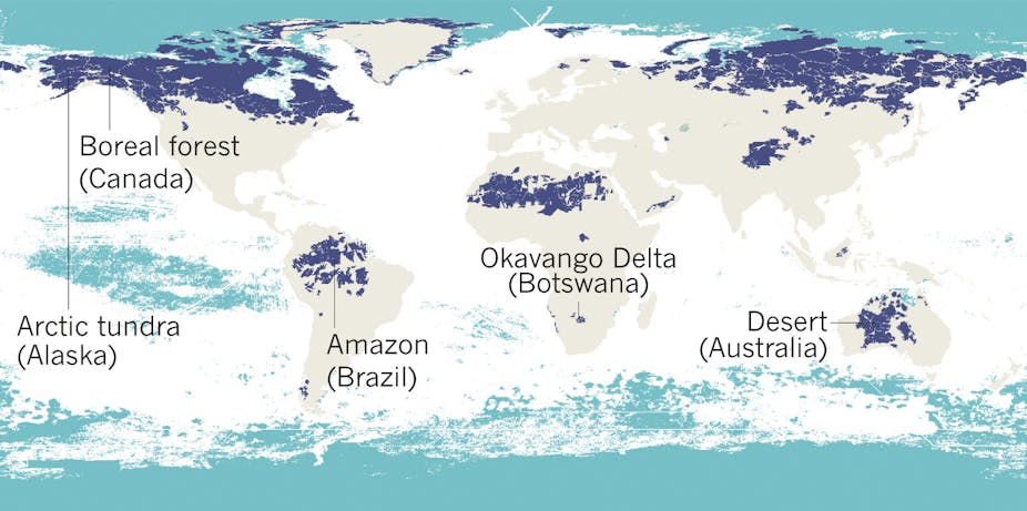
There aren’t many corners of the world left untouched by humanity. Recent research has highlighted that just 23% of the planet’s land surface (excluding Antarctica) and 13% of the ocean can now be classified as wilderness, representing nearly a 10% decline over the last 20 years. And more than 70% of what wilderness remains is contained within just five countries.
Researchers from the US and Australia recently produced a global map to illustrate this decline, made by combining data on things such as population density, night-time lights and types of vegetation. The problem with such an approach is that the question of where wilderness begins and ends is not as simple as it may first seem.
The data used to map wilderness is often collected in different ways for different parts of the world. For example, some datasets map roads all the way down to farm and forest tracks, while others may only record primary road networks. The definition of how far land has to be from these roads to be classified as wilderness can also vary. Meanwhile, knitting all this data into a single map often leads to compromises that reduce its usefulness, such as not including any blocks of wilderness below a certain size.
So while global maps are useful for drawing attention to the attrition of wilderness areas, only the greater detail of national and local maps can really help us understand and respond to the threats that face our remaining wild areas.
Scotland

Scotland is perhaps the country with the most detailed wilderness mapping in the world today. It has been mapped at global, continental, national, regional and local scales, each one showing progressively more detail, and higher levels of accuracy and reliability. The Scottish government has been able to use these maps to define what should count as protected “wild land” in the most effective way.
Early maps showed most wilderness was in the uninhabited highlands and suggested there were almost no wild areas around the main cities of Glasgow and Edinburgh. But by zooming in and reducing the size threshold of what counted as wilderness, the government identified smaller areas of wild land nearer to cities that are just as important for recreation, and landscape, habitat and ecosystem conservation.
China

China is following suit with a similar approach and using national level mapping to define wilderness areas and help develop a new national park system. The country can be neatly divided in two as highlighted by what’s known as the “Hu Line”, a simple straight line that connects Ai-hui in the north-east to Teng-Chong in the south-west. East of this line, the country is densely populated and intensively farmed. To the west, human population is sparse and the land remains largely wild.
Chinese geographers are now developing methods to cope with this marked polarity in the distribution of the country’s wilderness. As with Scotland, they need to identify those smaller pockets of wild ecosystems that remain within the otherwise fragmented and developed landscapes of the east.
Amazon

One thing that wilderness maps are particularly good at illustrating is how wild land is being lost to the demand for food, fuel, water, timber and minerals as the human population increases. Maps show that this mainly happens through the road construction associated with logging, oil and gas and mineral extraction. Images of the ongoing fragmentation of the Amazon rainforest provide a good example of how roads, once constructed, open up the landscape for agriculture.
Europe

Despite the problems of global wilderness maps, there have been some attempts to overcome the impact of cross-border assumptions and inconsistencies. The variations in wilderness quality have been consistently mapped across Europe as part of an EU project to develop a register of the EU’s remaining wilderness areas. One thing that this map highlights is just how common it is to find wilderness areas at more northern latitudes that are too cold and dry for agriculture or forestry and at high altitudes where the land is too rugged to work. So we shouldn’t be surprised to see a similar pattern on the global map.
The scale of these kind of maps affects both the patterns we see and how we understand wilderness destruction. This in turn influences how we might respond to and manage the threats to the world’s remaining wild areas. While global maps grab the headlines, they also risk masking the detail in the underlying causes and so have limited use. They may be great for highlighting the problem, but should only be a starting point to encourage us to look deeper and help us appreciate the underlying drivers of these lost wilds.