

On October 12, New York City’s Museum of Modern Art unveiled its exhibition of Henri Matisse’s cut-outs. This came on the heels an exhibition of the cut-outs at the Tate Modern in London, which displayed the works from April to September. Harriet Senie, Director of Art Museum Studies at the City College of New York, and Fran Lloyd, Professor of Art History at London’s Kingston University, compared notes about their respective visits.
Harriet Senie: Framed by the entrance-way to signal its importance, the first work in the MoMA exhibition, Two Dancers, is a study for a ballet stage curtain design.
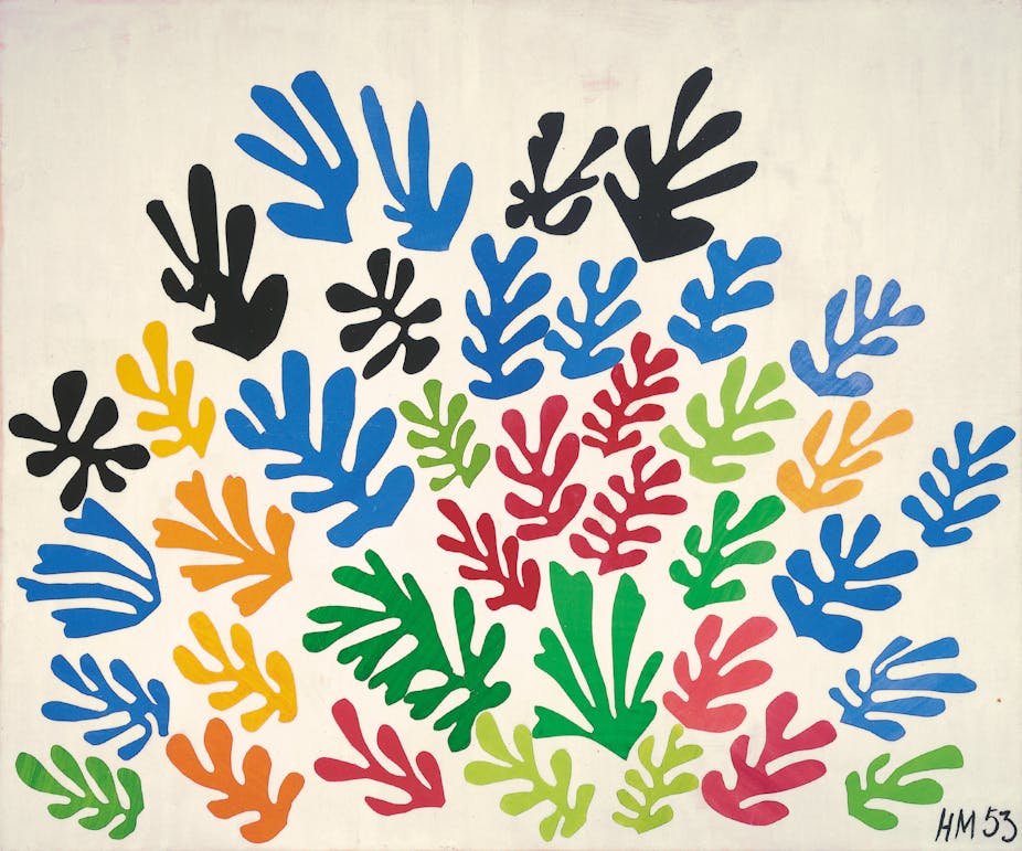
Surprisingly, the apparently two-dimensional technique of creating the cut-outs creates a subtle spatial effect, because each distinct shape is tacked on separately and is precisely layered. The resulting three-dimensional quality was very important to Matisse. Earlier in his career he would use cut-outs as a device to develop other projects that would exist in actual space.
Fran Lloyd: By contrast, at the Tate Modern in London, the intimate opening room focused on Matisse’s act of making the cut-outs. Taking his oil painting Still Life with Shell (1940) as a starting point, the adjacent cut-out work of the same title shows Matisse using pasted collage shapes and pieces of string to re-think the painting’s composition. Opposite, the mesmerizing one-minute color film by Adrien Maeght from 1945 captures the dynamic and assured actions of Matisse cutting large painted paper shapes in midair: one hand on the hanging paper, the other wielding the scissors.
Harriet Senie: It sounds as if the installations were quite different, with process emerging slowly in the MoMA show, while being foregrounded at the Tate. In New York, the installation of the Maeght film (a very important contribution, to be sure) was somewhat problematic, as it provided no seating. However, since the paper cut-out technique emerged gradually for Matisse, I preferred its location about halfway through the exhibition, where it was embedded at a chronological point in his stylistic evolution. The Materials and Process section of the exhibition revealed that Matisse was not able to cut in a single line at first but gradually developed this facility.
As an installation technique, I appreciated the cases that made it possible to leaf through the artist’s published books. I have seen it used before with medieval manuscripts and always marvel at how much it adds to the experience of the work as a whole.
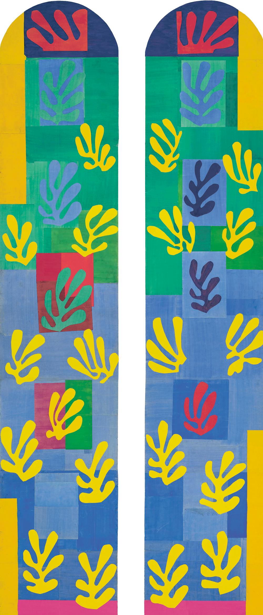
Similarly, this technique of allowing the visitor to “leaf” through different views was used to great advantage with the Chapel at Vence cut-outs, allowing the visitor to visually experience the cut-outs as they existed in the chapel.
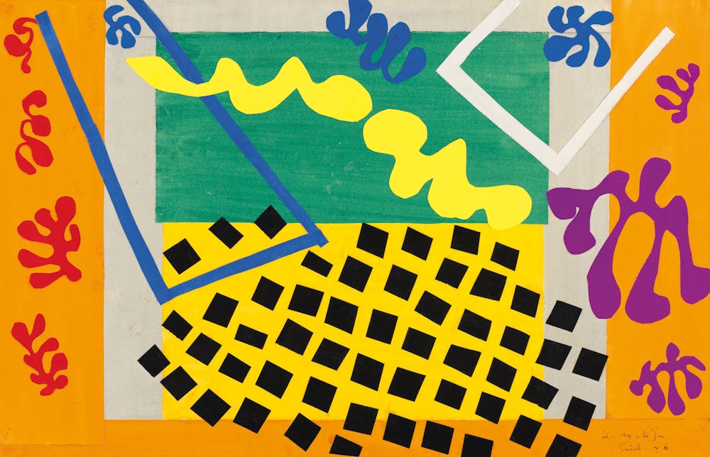
Fran Lloyd: Jazz was beautifully displayed in a large space with the original 1943-44 maquette cut-outs on paper (loaned from the Centre Pompidou) alongside two copies of the published volume from MoMA and the National Galleries of Scotland, Edinburgh. The Vence Chapel walk-through sounds excellent; this was an element that was missing in London.
Harriet Senie: Visitors were mesmerized by the five-year conservation effort of restoring the Swimming Pool. This type of technical information conveys the significance of every artistic decision (even accidental ones) – how the slightest shift of any detail alters the appearance and experience, sometimes dramatically. This is especially significant for Matisse’s work, where every color is extremely specific and each cut-out composition appears locked in place, as if it were the only possible solution.
I was unaware that Matisse also worked on designs for textiles, carpets and ceramics. It seems worth emphasizing that aside from the Bauhaus, artists did not make distinctions between what came to be seen as “high” and “low” art. It also made me think about Calder – who worked in both realms – and his relationship to Matisse. Calder was a close friend of Matisse’s grandson, Paul, and was undoubtedly familiar with the older artist’s work.
Fran Lloyd: I was struck by the way the studio and the home literally became one, especially with the London room installations that showed the two Oceania works of 1946 and the Vence pieces of 1947. The former was created in Matisse’s Montparnasse studio in Paris just after the war, the latter in his apartment and studio in the south of France.
Harriet Senie: The care Matisse took to create his own environment reminded me of Monet’s garden. Most famously, Matisse created The Swimming Pool to line the walls of the dining room at his apartment in Nice, France.
In terms of broader art historical considerations, the exhibition makes clear when Matisse first had an idea and when he actually realized it. This is evident in the evolution of the Barnes mural. Realized over the course of 1932 and 1933, it depicts figures based on Matisse’s earlier dance compositions, which date back to the first decade of the century. Making the distinction between the conception of an idea and its execution is significant not only for the history of the artist, but also for the history of art in general, which typically assumes the date of a work to be when it was completed.
Fran Lloyd: Indeed, this opens up the way that an exhibition, like the Matisse Cut-Outs – particularly as it is re-shaped for different sites – enables a new encounter and fresh ways of seeing and thinking about the works, which includes their context and shifting meanings. Through the cut-outs we can envisage other shows yet to be.
Harriet Senie: Matisse uses letters as compositional elements, rather than foregrounding their significance as text (although they can certainly be read). It would be interesting to see an exhibition that traced the use of text in a variety of artists’ works from early in the twentieth century to their later iterations.