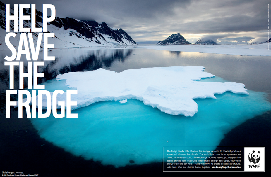
Can the design of a climate change message change someone’s beliefs? Absolutely, and with a surprisingly powerful correlation.
My research found climate change messages that spark fear and disgust were more likely to be seen as trustworthy by some audiences, compared to a graphic perceived to come from a corporate source.
Read more: Science by stealth: secret missions of a visual science communicator
Digital technology has surged, and we are exposed to a much higher degree of designed visual messages than we used to be. But climate change is incredibly politicised – especially in Australia – and despite a wealth of literature on climate change communication strategies, little is understood about how visual communication contributes to uptake of the message.
My findings show critical components of visual communication, such as colour, imagery, logos and how they all work together, can convey unintended meanings and lead to distrust, even when the viewer believes climate change is real.

Interpreting ‘authority’
A CSIRO study from 2015 showed while 81% of Australians agree climate change was happening, more than half weren’t concerned about the implications. And less than half attributed climate change to human influence.
These statistics are alarming, so it’s important effective climate change communication is rolled out, with trustworthy designs.
And it matters who or what authority is perceived to be behind the climate change message: whether they are perceived as originating from a grassroots or a more corporate end of the spectrum.
Previous studies have suggested a clear understanding of which type of organisation is speaking can engender trust in a climate change message, particularly in an era when trust in corporate authorities has diminished.
Read more: How TV weather presenters can improve public understanding of climate change
However, my study showed the situation is more nuanced than this.
Even a grassroots message can be misinterpreted due to its visual design, leading to a loss of trust in what could otherwise be considered compelling evidence.
What makes a design trustworthy?
Over a month, I asked a group of participants from the UK and Australia to discuss examples of real-world visual messages on climate change.
These participants were chosen based on their relatively good exposure to media, and stated a range of attitudes towards climate change. I showed them a selection of climate change visuals and focused on how they interpreted its meaning.
Emotion was one of the conditions viewers used to judge the visuals.
Fear and disgust campaigns are typically thought to obstruct communication of more complex issues, prompting viewers to turn away and avoid the message. But this study highlighted that viewers have come to expect a level of emotion in climate change messages, using it to signify a more grassroots-based message than a corporate one.
Emotive imagery triggering disgust, like the image in “Keep Buying Shit” pictured above, actually promoted trust.
More importantly, imagery that wasn’t emotive indicated the message was from a corporate origin for some viewers, corresponding to distrust. This was shown in the image below, which actually came from a more grassroots, pro bono campaign (The Consensus Project).

Another way the viewers judged the message was through the visual identity, or logo.
Where a logo was visible, the ability to judge trustworthiness was simple. Where there was no logo, or a logo they had not seen before, several viewers moved directly to a position of distrust.
Read more: To get conservative climate contrarians to really listen, try speaking their language
Others relied on aesthetic style indicators like colour, typeface, or decorative elements to determine who the author of the message was.
One study participant, a climate change believer, lost trust in The Consensus Project message (above), even though it promoted compelling evidence.
She perceived the colours to be too “corporate”, and what was intended to be a decorative image of an oil well furthered the distrust. She said:
Well, it looks like a corporate website, so it could be a corporation who are trying to justify their position. I mean, it’s got the little oil wells down here, so to me that looks like it perhaps […] could be someone like Texaco or Shell
Read more: Living data: how art helps us all understand climate change
Understanding these findings is critical to tackling the most important issue of our time. Knowing our audiences better and being informed about how we deploy colour, imagery, logos and other elements in the graphic design of climate change communication helps boost our understanding and engagement.
Without that understanding, we all lose.

