
This article is part of The Conversation’s series examining Australia’s cost of living crisis. You can read the other articles in the series here.
Cost of living pressures are acute for some, but in different ways for different types of household.
The Australian Bureau of Statistics consumer price index has climbed by 6% per year for each of the past two years.
In the decade before that, it only climbed by an average of 1.8% per year.
So, on the figures, cost of living pressures suddenly became acute, but if you had been paying attention to the media for those previous ten years you would have thought Australia had been in a cost of living crisis the entire time.
Some people have been under financial pressure the entire time, but it’s instructive to look at whose living costs have increased the most.
The best guide is a different set of indexes to the consumer price index, also produced by the bureau.
Called selected living cost indexes, they are better because they include mortgage costs, which the consumer price index does not, measuring the cost of home ownership by the cost of purchasing a home instead of the upfront cost of building a new home.
The bureau presents living cost indexes based on the spending patterns of:
employees
beneficiaries on pension-like payments
beneficiaries on other payments including JobSeeker
age pensioners
self-funded retirees.
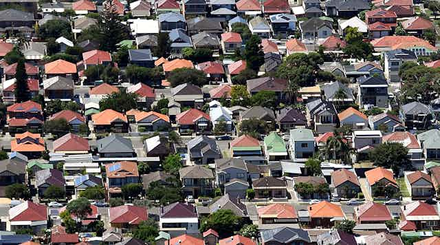
But it turns out the main factor that differentiates the new price pressures facing households is whether or not they have a mortgage, and in particular how recently they bought their first home.
At the Australian National University, my team has used the Bureau of Statistics’ methodology and data to calculate cost indexes based on the spending patterns of different types of households including those headed by:
first homebuyers and recent buyers who’ve bought in the past three years
all homeowners with a mortgage
outright owners
renters.
Homeowners with a mortgage turn out to have experienced a very large cost increase over the past two years of 17.5% – much more than renters who have had an average increase of “just” 10.8%, and outright owners who’ve had 11.7%.
First homebuyers who bought within the past three years faced the biggest living cost increase, of 20.5%. Those who bought within the past three years but were “changeover” buyers had an increase of 18.4%.
Younger Australians (under 35) are more likely to rent than have a mortgage. As a result, their costs increased by “only” 13.1% over the past two years, whereas the living costs of older Australians (aged 50–64) increased by 15.1%.
Perhaps for the same reason, the living costs of group households increased by “only” 13.1%, while the living costs of couples with children increased 15.2%.
Those on benefits are best protected
We found very little difference in the percentage cost of living increase based on income level alone, and also very little difference based on gender. But the source of income mattered.
Households whose main income was wages suffered cost increases of 14.6%, whereas households whose main income was government benefits had a lesser increase of 12.7%.
Read more: Rent crisis? Average rents are increasing less than you might think
Each of these increases was far more than the average increase in incomes of 4.7%, but Australians on benefits got much bigger increases in incomes because their payments were linked to the consumer price index, meaning their incomes increased roughly in line with their costs.
Longer term, renters, homeowners treated the same
Although in the past two years costs have turned against mortgage holders more than renters and outright owners, this isn’t the case in the longer term.
The first years of COVID, 2020 and 2021, were especially good for mortgage holders (and renters), with mortgage rates (and rents) cut to long-term lows after years of very little growth.
The chart below shows that over the longer term, the living costs associated with all three types of housing have climbed more or less together, and have climbed by less than household income.
This isn’t to say those households whose living costs have climbed sharply over the past two years (mortgaged households) are suffering. Many have built up significant financial buffers in the years when interest rates were ultra-low, and many have high incomes and substantial wealth.
Nor is it to say that those households whose living costs have increased less sharply (renters) are not suffering.
Lower-income households, single parents and welfare recipients’ households were in the greatest financial stress five years ago, 10 years ago and 20 years ago, and remain in the greatest financial stress today.