
Maps, although seemingly objective representations of the world, hold immense power. They shape our understanding of space, navigate our journeys and define political boundaries. But beneath the veneer of neutrality lies a potential for manipulation.
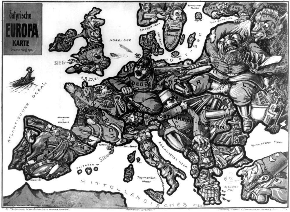
The history of warfare is littered with examples of maps used to dehumanise the enemy. Some of these are very explicit. Satirical maps were produced by all sides in the first world war, depicting Europe as a series of caricatures to dehumanise enemy states and push a victorious war narrative.
Other examples are less obvious. In the Vietnam war, the US military produced maps that designated specific regions of Vietnam as “free-fire zones”, meaning any person or activity within that zone could be considered hostile and targeted with military force. This tactic effectively erased the civilian population from the map, treating the entire area as an enemy stronghold.
The dehumanising effect of maps stems from their inherent abstraction. Maps simplify reality by reducing a complex landscape teeming with life and history into lines, symbols and colours. While necessary for clarity, this simplification often has the consequence of stripping away the human element.
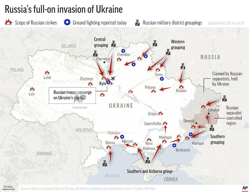
For example, the below map shows the locations of known Russian military strikes and ground attacks after its invasion of Ukraine in February 2022. The map uses symbols to simplify the conflict. Later we would learn that one of these cartoon-like icons represents the Bucha massacre in which 458 Ukrainian civilians and prisoners of war were reportedly killed by Russian forces.
Fuelling conflict
Maps can also be used to reinforce the “us v them” mentality that fuels conflict. They create a visual distinction between “our side” and “theirs” by starkly delineating enemy territory.
In the lead-up to the Rwandan genocide in 1994, extremist Hutu media outlets produced maps that categorised Rwandans by ethnicity: Hutu and Tutsi. These maps weren’t just geographical representations, they were tools for identification and targeting.
The maps often used contrasting colours to sharply divide Hutu and Tutsi areas. This visual distinction created a clear separation between the in-group (Hutu) and the out-group (Tutsi), promoting the idea that Tutsis were not part of the Rwandan fabric.
Read more: Rwanda genocide: 30 years on, why Tutsis are at the centre of DR Congo's conflict
Some maps went further, using symbols like machetes or snakes to represent Tutsis, portraying them as violent and dangerous. These maps were widely distributed through newspapers and radio broadcasts. They not only identified Tutsis but also served as visual propaganda that justified violence against them.
This visual separation fosters a sense of distance and difference, making it easier to view the enemy as an abstract threat rather than fellow human beings. Propaganda maps exploit this effect by exaggerating the size of enemy territory or depicting enemy populations as faceless masses.
Removing the human from the map
The Israel Defence Force’s introduction of grid maps to Gaza in December 2023 has introduced another way of dehumanising populations. Similar to the free-fire zones of the Vietnam war, Israel has divided Gaza into more than 600 blocks, ostensibly to aid in evacuating civilians.
Each block on the map, which can be accessed through a QR code on leaflets and social media posts, can receive evacuation warnings before the bombardment of a given square. However, aid workers have warned that the map risks turning life in Gaza into a “game of battleships” in which the flattening of any grid square is justified under the pretence that it is an empty space on a map.
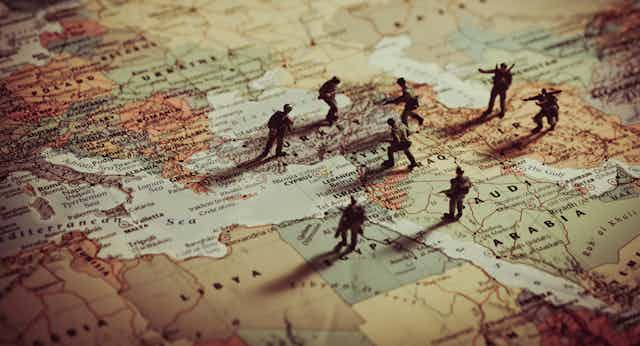
Maps also have an impact on the way we, as observers, view conflict. This can extend beyond the battlefield. Maps often depict refugees as a homogeneous mass, neglecting the individual stories and desires that drove them from their homes.
In the early stages of Russia’s invasion of Ukraine, for example, the BBC came under fire for one map in which it used arrows to depict the movement of refugees. People on social media suggested that these symbols insinuated invasion rather than fleeing. Following criticism, the BBC updated the map to use proportional circles instead.
Lessons are being learned
The dehumanisation inherent in war maps is not inevitable. Including civilian infrastructure and population density on military maps, for instance, can serve as a constant reminder of the human cost of conflict. Oral histories and community mapping projects can also offer alternative perspectives on the land, highlighting the human stories often erased by military cartography.
The Gaza conflict has shown that lessons are being learned about how better to use maps during conflict. Reuters, for example, has employed maps alongside other text and visual elements to help tell a fuller story and complete what maps alone might never be able to do.
Ultimately, maps are tools that can be used for good or ill. We must strive to see beyond the lines and symbols, and remember the human beings whose lives are impacted by the conflicts depicted on maps.