

As heads of state, billionaires and other influencers pondered the issue of inequality at the World Economic Forum in Davos, an unlikely hero emerged in the form of Dutch historian Rutger Bregman. His memorable take down of the super wealthy on tax avoidance clearly resonated, at a time when the deep social divisions associated with inequality are manifesting themselves forcefully across the world: from the gilet jaunes protests in France, to the ongoing fallout from Brexit.
In the UK, people often think about inequality in geographical terms: for example, places such as Kensington in London are considered “rich”, while Blackpool in Lancashire is considered “poor”. In reality there are rich and poor areas almost everywhere, but they are not distributed evenly across England.
Inner urban neighbourhoods are often associated with deprivation, as are the so-called “left-behind” towns so often associated with Brexit, but quite often rural poverty is overlooked. When we began investigating inequality in England, as part of a new project funded by the Nuffield Foundation, we quickly found that the truth is far more complex.
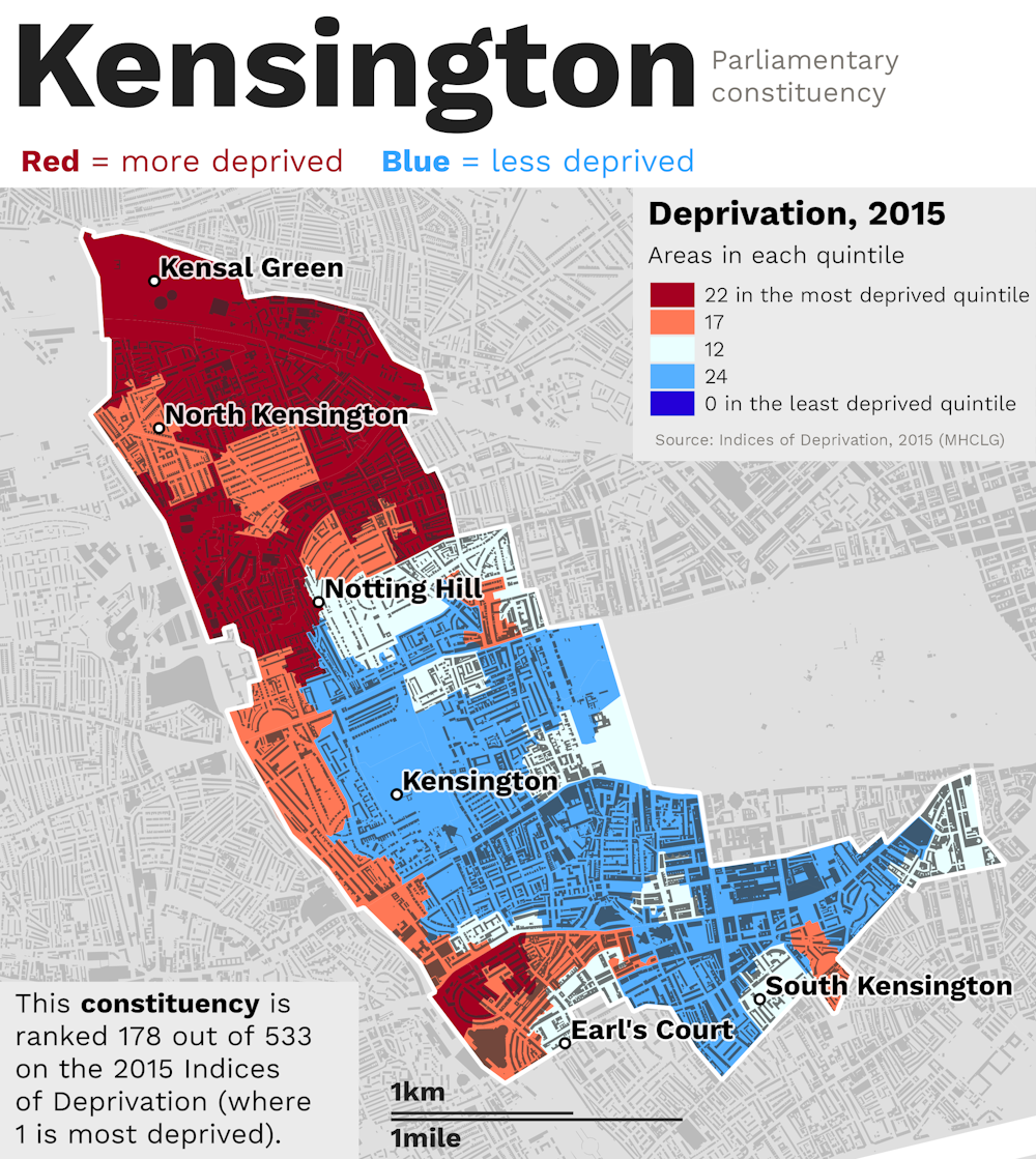
Take Kensington, for example: when we mapped out data from government statistics on deprivation, we found that it’s actually a very unequal area.
We want to cut through old stereotypes and divisions, by presenting data in a new way, which sheds light on the longstanding inequalities within and between places – no matter how big or small, or urban or rural they are.
By the time we complete our project in 2020, we hope to produce an atlas of inequality, which illustrates the scale and severity of inequality across England, right down to a local level – since that’s where its impacts are felt most keenly.
Divided cities?
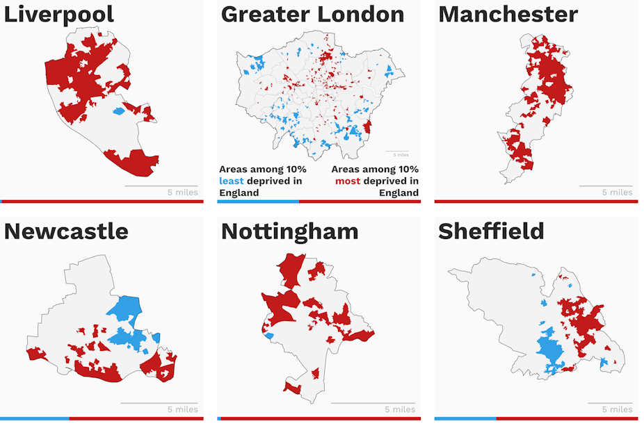
Looking at the data for English cities, the problems with mapping inequality become clearer. The maps below show eight major English cities, plus Greater London. Areas shown in red are among the 10% most deprived in the whole of England, whereas the blue areas are among the 10% least deprived. The ratio of red to blue areas is shown in the bar along the bottom of each city map.
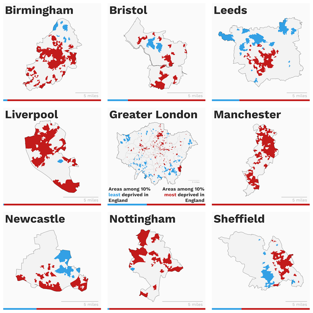
Some cities look very deprived, others are quite mixed. In Sheffield in particular you could almost draw a straight line between the red and blue areas. Where boundaries are drawn matters a lot. Take Manchester, for example: its official boundary doesn’t include places which are functionally part of the city, such as Salford, where a lot of people work.
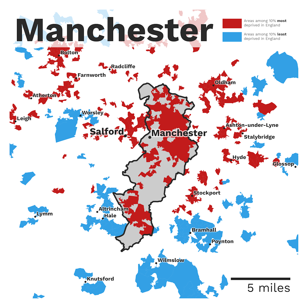
Looking at the map of Manchester above, you might think it’s quite deprived, but you only have to look beyond the boundaries, in the map to the left, to see things in a different light. By contrast, Leeds has a wide boundary which extends far beyond the core of the city, and takes in wealthier places like Wetherby.
The blue areas all sit outside the functional core of the city, yet from an administrative point of view, they’re still part of Leeds. So although you might assume that Manchester is considerably more deprived than Leeds, the reality is more complex.
Is inequality inevitable?
Our initial findings have raised some critical issues, which prompted us to think more deeply about what level of inequality might ultimately be considered “acceptable” in the first place – and especially, whether areas with greater levels of inequality have worse outcomes.
This might seem like a strange thing to consider, but it’s important because it speaks to the issue of what kind of society we want to live in – and, as a result, what policies can be put in place to bring that about.
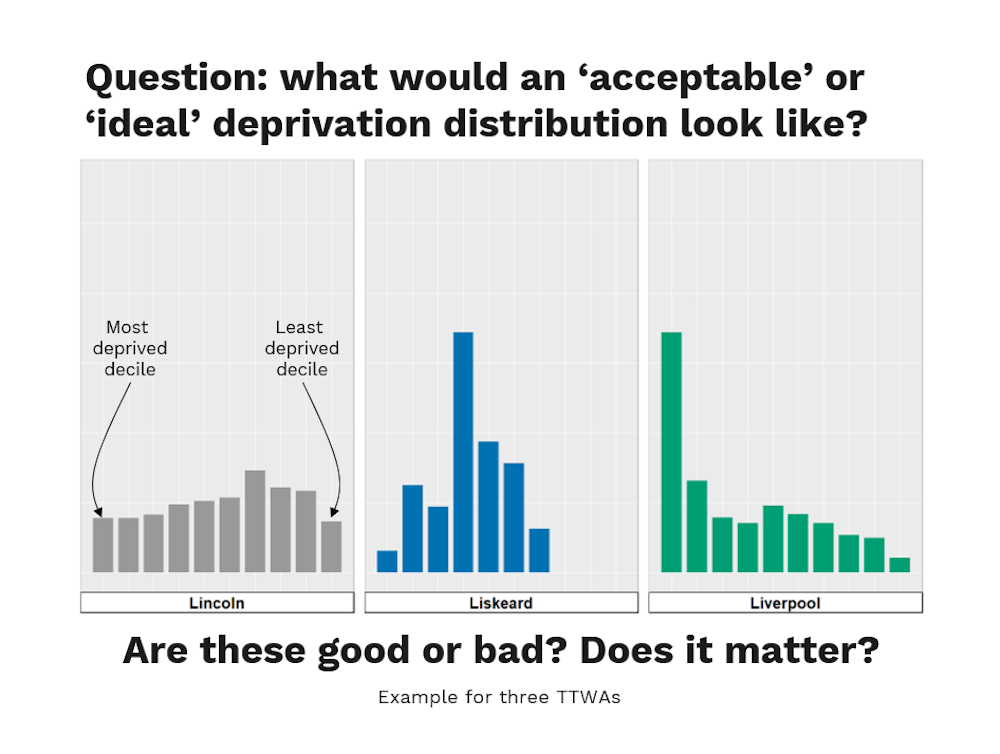
The graph above looks at a very simple measure of inequality across three of England’s 149 official labour market areas (also known as “travel to work areas” or TTWAs). It shows what proportion of neighbourhoods are within each deprivation decile (i.e. poorest 10%, 20% and so on) for Lincoln, Liskeard and Liverpool. For example, you can see that a large proportion of Liverpool’s neighbourhoods are within the 10% most deprived areas across England (the tallest bar on the Liverpool chart), yet this is not the case in Lincoln or Liskeard.
Lincoln has a more balanced profile, and Liskeard has far more areas in the middle. The key question here is how these variations in local inequalities impact both the life chances of individuals and overall levels of economic vitality.
At a time when society is defined more by its cleavages than its cohesiveness, it’s more important than ever to have a clear-eyed understanding of where inequality exists, and what impact it has on local people.
Of course, data and maps aren’t the only way of gaining insights into inequality – nor are they always as compelling as other media, like striking photographs, or people’s personal stories. Our approach is only one way of understanding the world. But it can help to inform leaders in local and national governments about inequality, and, we hope, lead to action which makes life better for people living in relative poverty.