
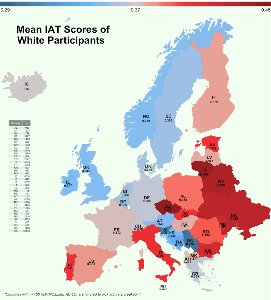
This new map shows how easily white Europeans associate black faces with negative ideas.
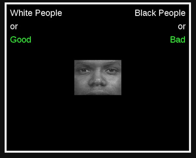
Since 2002, hundreds of thousands of people around the world have logged onto a website run by Harvard University called Project Implicit and taken an “implicit association test” (IAT), a rapid-response task which measures how easily you can pair items from different categories.
To create this new map, we used data from a version of the test which presents white or black faces and positive or negative words. The result shows how easily our minds automatically make the link between the categories – what psychologists call an “implicit racial attitude”.
Each country on the map is coloured according to the average score of test takers from that country. Redder countries show higher average bias, bluer countries show lower average bias, as the scale on the top of the map shows.
Like a similar map which had been made for US states, our map shows variation in the extent of racial bias – but all European countries are racially biased when comparing blacks versus whites.
In every country in Europe, people are slower to associate blackness with positive words such as “good” or “nice” and faster to associate blackness with negative concepts such as “bad” or “evil”. But they are quicker to make the link between blackness and negative concepts in the Czech Republic or Lithuania than they are in Slovenia, the UK or Ireland.
No country had an average score below zero, which would reflect positive associations with blackness. In fact, none had an average score that was even close to zero, which would reflect neither positive nor negative racial associations.
Implicit bias
Overall, we have scores for 144,038 white Europeans, collected between 2002 and 2015, with sample sizes for each country shown on the left-hand side.
Because of the design of the test it is very difficult to deliberately control your score. Many people, including those who sincerely hold non-racist or even anti-racist beliefs, demonstrate positive implicit bias on the test. The exact meaning of implicit attitudes, and the IAT, are controversial, but we believe they reflect the automatic associations we hold in our minds, associations that develop over years of immersion in the social world.
Although we, as individuals, may not hold racist beliefs, the ideas we associate with race may be constructed by a culture which describes people of different ethnicities in consistent ways, and ways which are consistently more or less positive. Looked at like this, the IAT – which at best is a weak measure of individual psychology – may be most useful if individuals’ scores are aggregated to provide a reflection on the collective social world we inhabit.
The results shown in this map give detail to what we already expected – that across Europe racial attitudes are not neutral. Blackness has negative associations for white Europeans, and there are some interesting patterns in how the strength of these negative associations varies across the continent.
North and west Europe, on average, have less strong anti-black associations, although they still have anti-black associations on average. As you move south and east the strength of negative associations tends to increase – but not everywhere. The Balkans look like an exception, compared to surrounding countries. Is this because of some quirk about how people in the Balkans heard about Project Implicit, or because their prejudices aren’t orientated around a white-black axis? For now, we can only speculate.
Open questions
When interpreting the map there are at least two important qualifications to bear in mind.
The first is that the scores only reflect racial attitudes in one dimension: pairing white/black with goodness/badness. Our feelings about ethnicity have many more dimensions which aren’t captured by this measure.
The second is that the data comes from Europeans who visit the the US Project Implicit website, which is in English. We can be certain that the sample reflects a subset of the European population which are more internet-savvy than is typical. They are probably also younger, and more cosmopolitan. These factors are likely to underweight the extent of implicit racism in each country, so that the true levels of implicit racism are probably higher than shown on this map.
This new map is possible because Project Implicit release their data via the Open Science Framework. This site allows scientists to share the raw materials and data from their experiments, allowing anyone to check their working, or re-analyse the data, as we have done here. I believe that open tools and publishing methods like these are necessary to make science better and more reliable.
This article was updated on July 18 2017 to correct the number of white Europeans whose scores were used in the study. The number was 144,038, not 288,076 as previously stated.