
Earlier this year, the UK’s weather and climate service, the Met Office, announced average global temperatures in 2023 were 1.46°C above pre-industrial levels. This made it the hottest year on record, 0.17°C higher than the previous record in 2016.
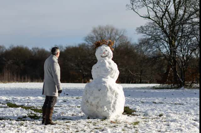
However, shortly after that announcement, the Met Office also forecast a multi-day blast of cold Arctic air bringing sub-zero temperatures, snow and ice to many parts of the UK. When the cold snap arrived, temperatures dropped to -14°C in the Scottish Highlands and -11°C even in England.
Ten days later, a village in the Scottish Highlands reached a balmy 19.9°C, the warmest January temperature ever recorded anywhere in the UK – by a full degree Celsius. That might seem more in keeping with the global warming trend. Yet just ten days on from that record warmth, much of the UK has again been hit by unusually cold and snowy weather.
It’s not just the UK. This winter, record-low temperatures have been observed right across Canada, the US and China.
This might seem confusing. Why are the weather and the climate producing such opposing signs? The reason is that they refer to atmospheric characteristics on substantially different timescales.
You cannot sense the climate
I do not think there is a person on Earth who can truly experience a “global annual average” of temperature. No one really knows what a degree of extra warmth over a century feels like, especially given temperatures might vary by 10°C between day and night in the UK, for example, or by 20°C and more between a hot summer day and a cold winter night.
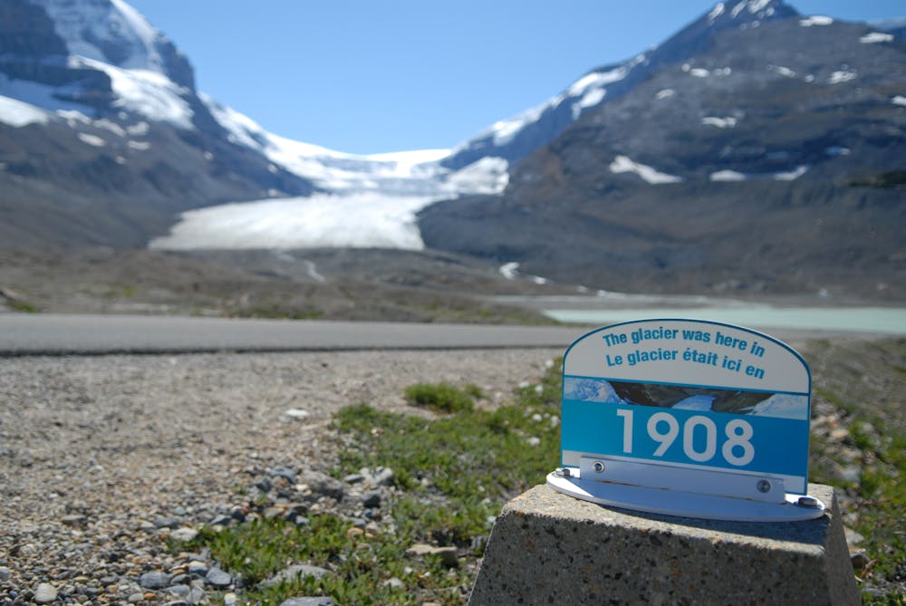
This means we usually have a hard time feeling or recalling seasonal averages and how they change with passing years. We can spot climate changes in environmental shifts like receding glaciers or early flowering plants, and we can track changes with instruments. But it remains very hard to “feel” climate change.
In contrast, we feel and much better remember the weather on daily and weekly timescales – particularly extreme weather like a cold snap, heatwave or strong storm.
Hot one day, cold the next
Weather phenomena are very rapid and variable compared with climate properties that are defined and changing on longer time scales. The weather might be hot one day and cold the next, but an annual mean climate cannot suddenly slide from warm to cold.
The climate is essentially an accumulation of weather across a considerable amount of time. For example, weather information might refer to the local temperature at noon or 4pm, the daily minimum, average or maximum temperatures, or the weekly average. Whereas climate is much longer term.
Climate information might refer to, for example, average temperatures over a month, or averages over seasonal (three-month) periods, years or decades. In climate analysis, we usually look for anomalies with respect to the “baseline” – a longer-term average of perhaps 30 or 50 years of data.
The line wiggles upwards
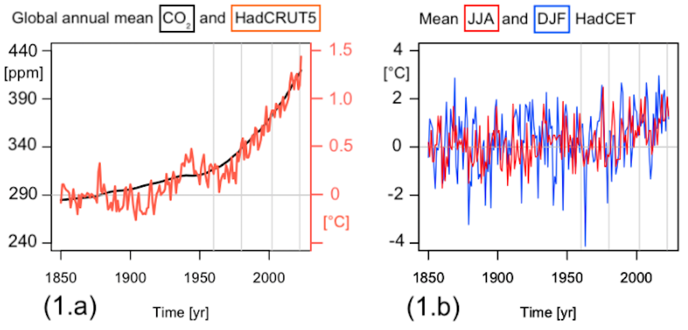
We can use more than a century of data to spot patterns, such as the close relationship in the left graph (above) between global atmospheric CO₂ and near-surface temperatures. There are, of course, some variations of around 0.1°C or so – the wiggles in the red line – as the climate does not change perfectly smoothly. That’s why 2016 was exceptionally hot, and the years after were slightly cooler.
These variations become more pronounced when we zoom in and examine a smaller regional area or shorter time units. For example, the right-hand graph above shows data from the Central England Temperature (HadCET) record, the world’s longest-running instrumental temperature record which began in 1659. This graph, which shows both winter and summer mean temperatures for central England, picks up more substantial variability over the same period from 1850 by both measures – on the order of 1°C. The internal variability of these seasonal means in essence drowns out long-term climate change at this regional scale before 1960s.
Looking at the right-hand graph alone – 174 years of data – you’d struggle to spot recent climate change. But zoom out to the global annual mean data in the left graph, and the long-term trend becomes clear.
We can zoom in even further to look at daily winter weather variability in the English county of Oxfordshire (HadUK-Grid). The histograms below show daily minimum temperatures (the left panels 2.a and 2.c) and daily mean temperatures (the right panels 2.b and 2.d) from two distinct 21-year periods.
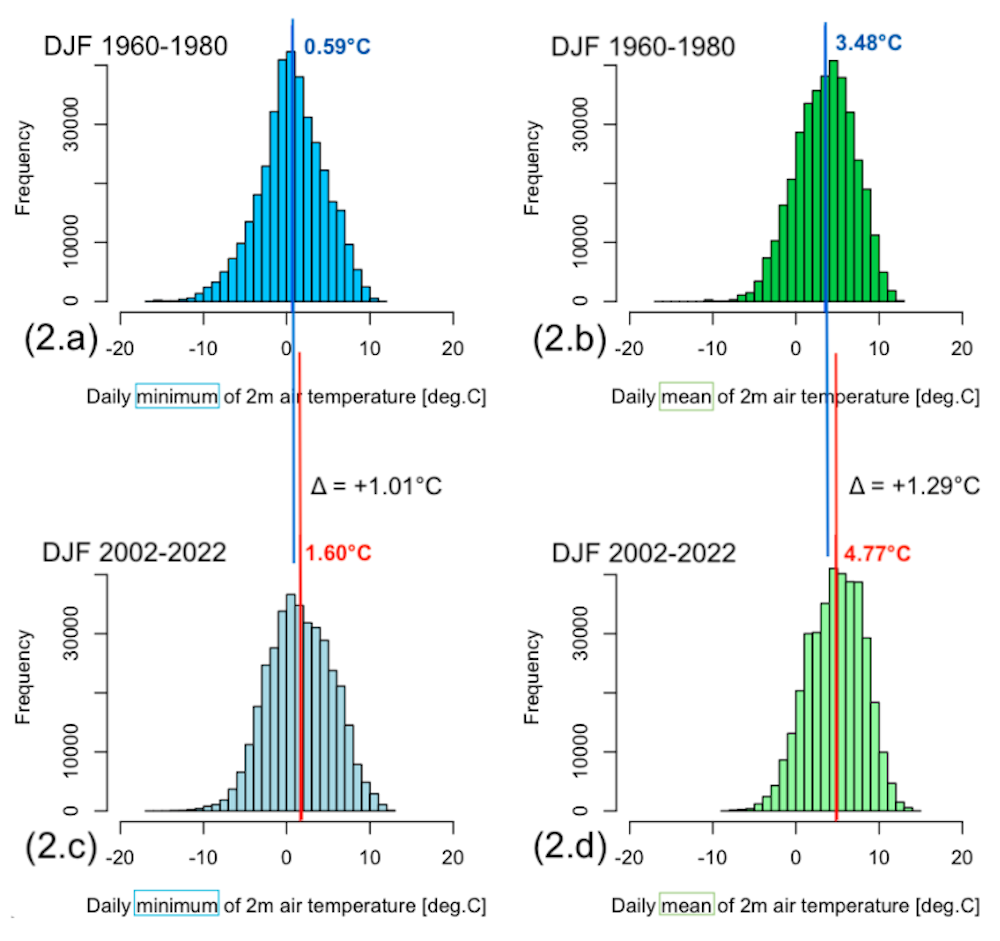
They show that the chances of experiencing sub-zero weather is still significant even in the more recent 2002-2022 period. However, the “tail” of daily minimum temperatures to the left of the mean is thinner, so extreme cold temperatures are less common. The average daily minimum of 0.59°C (the number in blue) has increased by about 1°C to 1.6°C in the more recent period, while the daily mean increased by 1.29°C – both increases are greater than global warming over this time.
These are signs that Oxfordshire is warming over the long term, and its winters are warming slightly faster than the world as a whole. Global climate change makes high temperature extremes more likely, even in winter. It does not forbid winter cold snaps, but it does reduce their likelihood.

Don’t have time to read about climate change as much as you’d like?
Get a weekly roundup in your inbox instead. Every Wednesday, The Conversation’s environment editor writes Imagine, a short email that goes a little deeper into just one climate issue. Join the 30,000+ readers who’ve subscribed so far.