

On April 7, The Conversation published three graphs showing the rise of deaths from COVID-19 in seven countries. What we could not have known then was that April 7 was the point at which the peak, or at least the first peak, in mortality in England and Wales was reached.
Analysis from the Financial Times, which includes deaths outside hospitals, has posited April 8 as the peak for COVID-19 deaths for the whole of the UK.
Here, those April 7 graphs are updated for Europe and geographical evidence is drawn together from around the rest of the world to try to paint a clearer picture of the direction in which we are heading – probably one where countries converge towards a single global death rate.
England and Wales reach a peak
First, the situation in England and Wales. The graph below shows the rise in mortality each day since the outbreak began, not just in hospitals, until April 9. The additional data is provided by the Office for National Statistics in its weekly reports.
This graph and the one below are based on smoothed data, which uses a moving average for the period from the day before to the day after each date shown to better illustrate a trend.
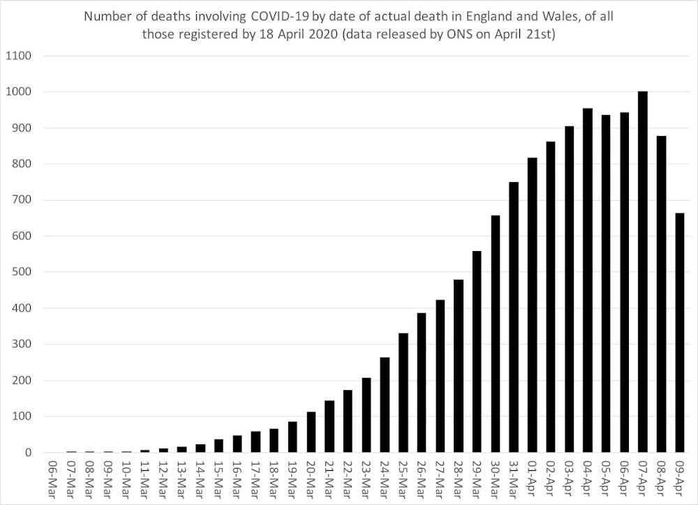
The peak by this method of counting occurred on April 7 when the smoothed number of deaths recorded was 1,001, compared to 944 on April 6 were 879 on April 8.
Rates of change in affected countries
The graph above is conventional. The one below is a bit different.
It shows both the smoothed number of deaths each day but now also the rate of change in that number. And it adds data from seven additional country datasets: France, the USA, Spain, Italy, China, Germany and the UK as a whole.
These seven countries are highlighted because they originally had the highest number of deaths. The data is more up to date in this graph because it is mostly drawn from the most recent daily hospital data.
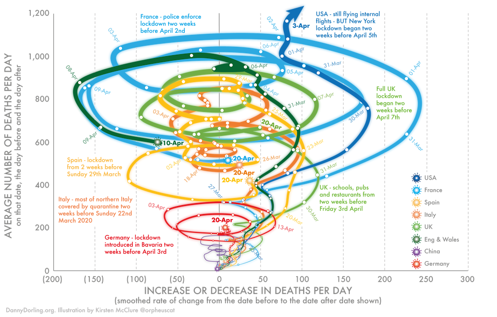
The method of showing change used in the graph above was developed for my book, Slowdown, which I worked on with illustrator Kirsten McClure who turned my crude Excel graphs into the clearer visual shown above.
It’s a useful way to look at data when you are trying to demonstrate change over time. When a line curves to the right, deaths per day are increasing. When it curves to the left, they are decreasing. Loops indicate a change in trend – so death rates rising, falling and rising again.
This graph shows the rise in mortality in seven countries up until April 20. By this point, the daily number of deaths was falling most days in most countries, although it had risen to be very high in the US.
Most intriguing is that from April 7 to 10, the shape of the curve for England and Wales, when all absolutely certain COVID-19 related deaths including in care homes are included, almost exactly matches that for France. This is significant because there is so much debate about how different European countries are doing, when in fact it is the similarities that are most remarkable.
In all the countries shown here, the fall in deaths may have begun a little earlier than the imposition of lockdowns would have suggested, although the lockdowns almost certainly accelerated the falls.
The looping effect was seen originally in China, and may suggest one outbreak superimposed upon another.
The rest of the world
The final graph shows the current fatality rates of all those known to have the virus in the 21 countries that had conducted 10,000 tests by April 22, excluding the seven above.
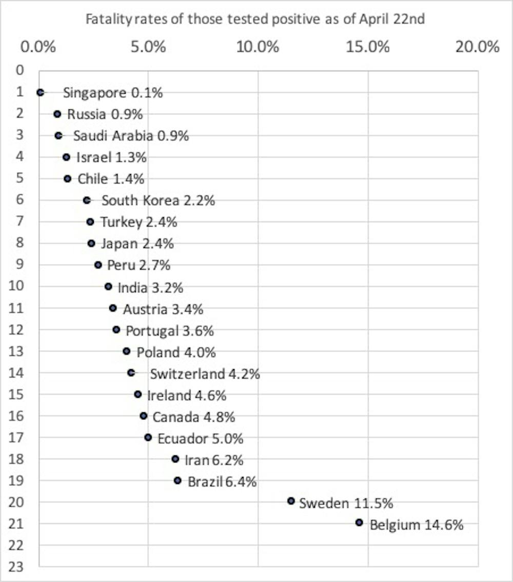
It ranges from Singapore, where only one in 1,000 of all those who have tested positive have died, to Belgium, where 15% or almost one in seven have died. In Belgium, it is almost exclusively people who are very ill who are tested and so the mortality rate appears to be 150 times higher than in Singapore where a much wider range of the public has been tested.
But the real mortality rate of these two countries will end up being very similar, and much nearer to the lower end of the range. It is extremely unlikely that Singapore, with its very efficient health system, is failing to record the deaths of those known to have the disease.
This illustrates a key point: over time, all of these mortality rates will probably begin to converge on a single global rate of those who have caught the disease. This is what has happened in the past. The flu of 1918 may have had a mortality rate as high as 2% of all those who caught it. In contrast, the H1N1 flu of 2009 had a mortality rate 100 times lower at 0.02%.
For COVID-19, the final rate will tend to be towards the lower end of the spectrum shown, if this disease is at all like previous pandemics, which we don’t know for sure yet.
The picture is complex. But these graphs tell us a few key things: England and Wales passed at least one peak on April 7. And, based on the second graph, it’s clear that rates have begun to cascade down in Europe. Across the globe, rates vary widely based on differing testing policies – but we can expect that they will converge around a single figure before too long.

Get the latest news and analysis, direct from the experts in your inbox, every day. Join hundreds of thousands who trust experts by subscribing to our newsletter.