

Love it or hate it, the Comic Sans typeface makes amateur typographers of us all. Now a new version has appeared, promising to lend credibility to the comic line of typefaces.
Comic Neue, designed by Craig Rozynski, is like Comic Sans but has been designed with some key differences that are supposed to make it less unsightly.
We don’t normally talk about typography and often only notice typefaces when they are atypical or inhibit our ability to read. Comic Sans is different. It divides opinion among those who don’t usually identify as typeface enthusiasts. And in its wake, Comic Neue is causing a stir too.
Rozynski says on his website that the typeface “aspires to be the casual script choice for everyone including the typographically savvy”. Do we really need another comic script though? Was Comic Sans really that bad in the first place?
The unloved typeface
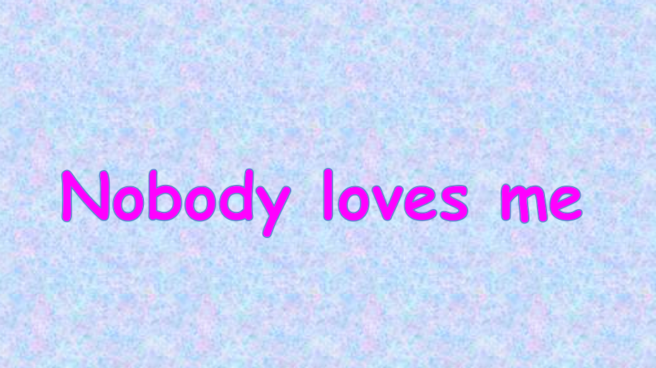
If you have been near a computer in the past 20 years, you have likely encountered Comic Sans, the “fun” typeface with rounded edges that appears to be written with a felt-tipped pen.
If you are an amateur designer, it’s the go-to typeface for just about any occasion that requires a relaxed approach. If you are an experienced designer, it’s the last typeface you’d ever use, unless you want to be ridiculed without mercy.
The typeface, now approaching its 20th anniversary, was originally designed by Vincent Connare for Microsoft Bob, Microsoft’s 1995 interface for various iterations of Windows.
Microsoft Bob came with a dog that would interact with the user. In the initial version of Bob, the dog offered assistance in speech bubbles using Times New Roman. Connare decided that comic dogs probably wouldn’t “speak” that way, and went to work designing something more interesting. He used the hand-drawn characters found in popular comic books like The Dark Knight Returns and the Watchmen series as inspiration for what would later become Comic Sans.
Since then, the typeface has been used for everything from physics presentations to papal documents and its popularity is only matched by the disdain some people have for it. People feel so strongly about the typeface that there is even a website devoted to banning Comic Sans entirely. It is this ridicule that prompted Craig Rozynski to redesign the typeface into the new Comic Neue.
Friendly font
Comic Neue is a sans serif typeface designed to appear casual and friendly. There are numerous different characteristics of the typeface that convey this tone. Generally speaking, the more a typeface resembles handwritten text, the more it is perceived as casual.

Each letter, or character, in a typeface is comprised of a series of straight and curved lines called strokes. While some typefaces change the width of a stroke drastically, each stroke of Comic Neue is the same width throughout. This creates what designers call a mono-weight typeface. These mono-weight strokes mirror the strokes you would get with a pen or pencil. The end of each Comic Neue stroke also comes to a rounded point, which again mirrors handwriting.
Certain characters, such as the lowercase a and g also tell us a great deal about the tone of a typeface. These specific letters have two different variations, known as single and double story.
Single story letters have one enclosed or mostly enclosed space, called a counter. Double story letters have two counters. Single story letters, like those found in Comic Neue, are considered more casual and friendly.
All of these casual attributes can be found in both Comic Sans and Comic Neue. What separates Comic Neue from Comic Sans, however, is the perfection found within each character. Where Comic Sans strokes are often crooked, Comic Neue strokes are exact. The vertical strokes are perfectly vertical and the counters are uniformly rounded. These small changes, combined with a thinner stroke throughout, convey a slightly more professional tone.
Your neue best friend?
Comic Sans is arguably the most misused typeface in history. It incites laughter in some people and rage in others. While the changes made to it to create Comic Neue do contribute to a more professional tone, there is no way to tell if the typeface will be more socially accepted.
The reputation of the comic typefaces may well be irreversibly tainted forever. Some might argue that is a good thing. The internet enables access to a seemingly endless selection of “comic” typefaces: Janda Manatee; Smart Kid; Action Man; Cartwheel; Rudiment; or even the rather unwieldly-named Year Supply of Fairy Cakes. But few of these have ever made it into the mainstream.
Yet other much maligned typefaces are regularly used. Papyrus, a font which many hate as much as Comic Sans, remains a mainstay for many designers.
So can legitimacy be granted to a family of fonts that, by their very nature, are designed for fun? The remains to be seen. In the meantime, Comic Neue offers us one more opportunity to decide if we really need a comic font for that all-important business document.*
*We probably don’t.