

Financial markets can tell us a lot about the economic recovery ahead, based on their direction of travel and how confident investors feel about the future. This is important as we emerge from the COVID-19 pandemic. There is much debate about whether the economic recovery will be a V-shape, indicating a short-lived economic downturn with a quick return to previous levels of output. Or if the recovery will take longer, following a U-shape. Or it could be more like an L-shape, with no near-term recovery and ultimately taking many years or even decades.
Gold prices have hit a record high. This indicates how worried investors are about the economic recovery. But the signs aren’t all bad. A look at five important indicators reveals a mix of all three recovery shapes and shows that financial markets are uncertain about the economic recovery ahead.
1. Gold
Gold as store of value is seen as a safe asset. As gold does not produce any income in terms of dividends or interest payments it is shunned during good times (when stocks are in favour). But its intrinsic value comes to the fore during times of economic difficulty when gold prices go up.

The price of gold has spiked to above the level found in the years following the 2007-08 global financial crisis, which raised a number of questions around the viability of sovereign debt. That gold has reached this level again suggests that investors remain wary.
Read more: Why gold prices go up and down – five charts
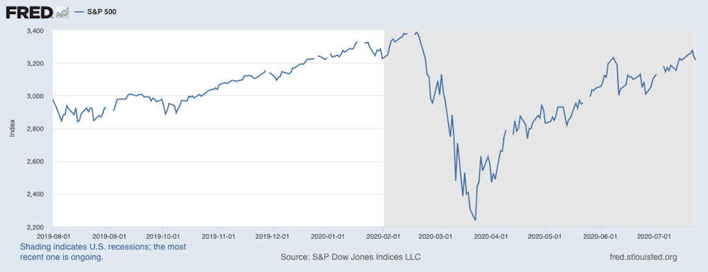
2. Stock markets
Stock prices fluctuate substantially and are typically regarded as being among the riskiest of investments. If a firm goes bankrupt then investors can lose all their money.
The S&P 500, one of the key stock indexes in the US, is below the level it started at this year but is above the level it was at this time last year. It is V-shaped, although the upstroke is a bit wobbly and continued uncertainty currently prevents a full recovery.
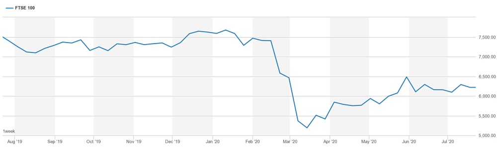
The view from some other markets, however, is less optimistic. For example, the UK’s major index, the FTSE 100, is still some way from recovering its pre-COVID position and has a slightly upward sloping L-shape.
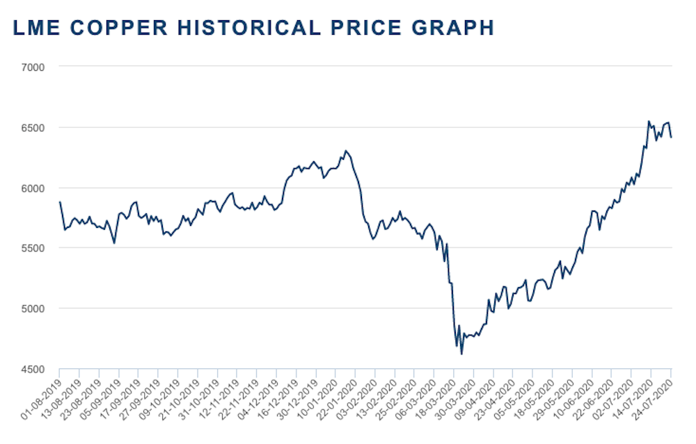
3. Copper
Copper is the most widely used industrial metal. If goods are being made, and economies are expanding, then copper is in demand and the copper price will rise. Copper prices dropped at the start of the year when China was in lockdown. There was a further slump as coronavirus hit Europe and the US in March.
China is the world’s largest importer of copper and is responsible for almost 50% of global copper imports. So the price of copper is largely driven by demand from China and the increase in price from the lowest point around March 19 is consistent with the easing of the shutdown period in China. So the copper recovery shows signs of an elongated V-shape, perhaps stretching into a U.
4. Baltic Dry Index
If goods are being made, they then need to be shipped to their final destination. The Baltic Dry Index is a composite index of the cost of shipping major raw materials. If goods are being shipped around the world from the manufacturer to the consumer then the index will rise.

This index is now not only above its initial US/European lockdown level, but has also returned to the levels it was at prior to China’s shutdown. This suggests a rise in manufacturing output and hope for exports. The dip at the end of the graph does signal a warning that uncertainty remains, however.
5. Government bonds
Like gold, another asset that’s seen as safer to invest in during crises is government bonds, given that governments (generally) do not go bankrupt and fail to repay their debts. When investors are nervous about future economic prospects, they buy government bonds, this then makes these bonds more expensive and reduces the yield that they pay (government bonds pay a fixed cash interest payment).
The yield on bonds is also affected by monetary policy operated by the central bank, with lower interest rates set in weaker economic climates to encourage people to spend. So, we can compare yields of different length bonds (known as the term structure), where a higher yield indicates a more positive outlook.
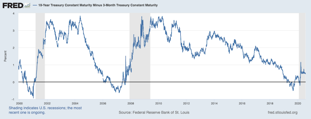
We can take a slightly longer time perspective and see from the graph above that, on the one hand, the upturn in the term structure indicates a recovery. But, on the other hand, the rise seems to have stalled indicating uncertainty going forward.
Overall, the evidence suggests that investors are unsure. That they are buying stocks and the goods used in production is a sign of hope that the global economy will recover quickly. But gold prices also give a dose of realism.

This article is part of our Recovery series – click here for more.