

The Great Bible is often seen as a monument of English reform – but could it also contain the first known example of political photoshopping in early modern England? Printed in 1538-9, it was to be purchased by every parish church in the realm. Its creation was overseen by Henry VIII’s chief minister, Thomas Cromwell. The Great Bible ushered in the English parish Bible and its large size and meticulous printing set the bar for centuries to come. Nowhere is its iconic appearance more evident than in a unique presentation copy made for the Tudor court. This copy was printed on vellum and hand-coloured by highly skilled illuminators.
I encountered this lavish copy while carrying out an in-depth study of the production and use of Bibles in late medieval and early modern England. Researchers have long known about the Great Bible and used its striking title page for illustration. But little or no scientific analysis has ever been carried out on it. So I asked Paola Ricciardi, scientist in residence at the Fitzwilliam Museum in Cambridge, to help me with a new investigation which utilised the latest technology to study the Bible in forensic detail. The results blew us away.
Our analysis revealed a new – and hitherto unknown – plot by Cromwell to literally change the balance of power on the Bible’s front page, just one year before his execution for high treason. We plan to publish our research results in full later this year.

This article is part of Conversation Insights
The Insights team generates long-form journalism derived from interdisciplinary research. The team is working with academics from different backgrounds who have been engaged in projects aimed at tackling societal and scientific challenges.
As Lord Privy Seal and Vicegerent in Spirituals (Henry’s deputy in matters relating to the church), Cromwell was the most powerful man in Henry VIII’s court. Henry’s break from the Catholic Church and the dissolution of the monasteries became an opportunity for Cromwell to advance religious reform. For Cromwell, support for a vernacular Bible (translated into English for the general population) was linked with obedience to the King. But he had to counter a strong opposition and a substantial conservative faction in court and within the church. Henry’s support for religious reform was always limited. His stance on religion was influenced more by his political aims, rather than faith, so his support for a vernacular Bible was hesitant from the start.
Cromwell thought that the best way to ensure royal support was to produce a Bible worthy of royal patronage – both in its content and in its material grandeur. Such a Bible would combine Cromwell’s own evangelical leanings with the political aim of consolidating Henry’s control over the English church. Production began in Paris. English printers were simply not equipped to produce a book of the magnitude sought by Cromwell.

A letter to Cromwell from the production team in Paris dated June 23, 1538, reveals that two luxurious vellum copies of the Bible were being prepared. It reads: “We have here sent unto your lordship two examples, one in parchment, wherein we intend to print one for the King’s grace, and another for your lordship.”
Printed on parchment and meticulously hand-coloured, these copies have survived – one at the National Library of Wales and the other in St John’s College, Cambridge. In November 2019, with the kind assistance of St John’s College, we engaged in a technical and scientific investigation of their copy of the Great Bible.
Scientific analysis
We employed various non-invasive analytical techniques to examine the St John’s Bible, including X-ray fluorescence (XRF) spectroscopy, reflectance spectroscopy (in the ultraviolet, visible and near-infrared range), high-resolution digital microscopy and advanced technical imaging. Scientific investigation of works of art has much to offer and is more reliable for material identification than visual analysis (historically the primary identification method for painting materials and techniques).

The focus of our technical examination of the Bible was the decoration. Knowledge of the painting materials and techniques used to decorate books can provide a wealth of information on production methods and artists’ skills –and, occasionally, on their identity. All of the hundreds of black-and-white images printed in the Bible were painstakingly hand-coloured by a group of talented artists for this special presentation Bible. In some cases, the artists did not simply colour in the print, but made significant changes to the black-and-white printed images used in the regular editions of the Bible.
Our investigation focused on 14 images, spread out across the volume. First, we used a range of spectroscopic methods to analyse a selection of small areas in each image, allowing the identification of individual pigments. The pigments identified throughout the volume were consistent with what is known about the materials used by Continental painters and illuminators during the 16th century. One of the most interesting results of this investigation was the fact that different “palettes” can be identified in different images, which suggests the presence of no less than six (and quite possibly more) artists at work on the decoration of this Bible.
The spectroscopic analysis was followed by high-magnification digital microscopy (in direct as well as raking and transmitted light). The close-up images captured using these methods not only provided greater insight into the stylistic preferences and working methods of the artists, but were also crucial in revealing the extent to which the printed images were modified at the painting stage.
From black and white to colour
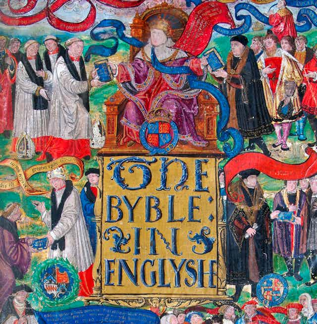
We paid special attention to the Bible’s title pages. Each of the book’s five parts is preceded by a full, illustrated and meticulously hand-coloured title page. The title pages depict scenes from the parts of the Bible they precede (historical books, the words of the prophets, or the New Testament). We discovered that the St John Bible’s main front page was actually a hand-coloured adaption of the printed black-and-white version which would have been present in all the mass-produced Bibles. But this luxurious front page – meant for the eyes of King Henry VIII – contained some key differences, as the slider image below illustrates.
The main black-and-white title page depicts an ideal scenario in which the majestic Henry VIII distributes bibles to lay and religious subjects, assisted by two of his faithful ministers – Thomas Cranmer, Archbishop of Canterbury, and Cromwell. Renowned art historian Tatiana String believes the printed title page was the visual manifestation of Henry’s authority. Henry reigns at the top of the page, distributing bibles to laypeople and clerics, aided by Cromwell to his left and Cranmer to his right (each identified by his coat of arms). The Word of God then reaches the general public in the lower part of the page, who duly proclaim “vivat rex” and “God save the king” (apart from those in prison, who are seen on the bottom right and shout nothing).
This black-and-white title page of the Bible masterminded by Cromwell, distilled his theory of scripture and obedience. The dissemination of the Bible was from top to bottom (literally), resulting in greater submission to the monarch. Its details reveal, however, that it moves away from the more radical reformation ideal of putting the Bible “in the ploughboy’s hands”. The laity at the bottom of the page do not hold the Bible, they simply listen to the Word of God preached from the pulpit. This was a nuanced and hierarchical way to disseminate the book and it reflected the unease Henry had with common people reading the Bible.
In the St John’s copy, the printed title pages were carefully hand painted, with the original print at times peeping through. For example, in the hand-coloured version the prison was obliterated and replaced by a dedication scene. The original brick background is still visible through the red stockings of the green-clad figure.
Cut and paste politics
The most striking modification we found has so far been hidden from scholars working on this Bible. Under a microscope with raking light, it becomes evident that some of the faces were painted on separate pieces of vellum and pasted over the existing page. A thin line can be seen under Cromwell’s face where the image was pasted in. This was done in a highly professional manner, covering much of the border area with paint overlapping the edges and creating the impression of a single image. This major modification applied to Cromwell and another key figure.

We believe that the instigator of this modification was Cromwell himself and the change had much to do with his representation on the page – a page which illustrates Henry’s complex attitude towards the lay readership of scripture, wavering between distribution and retraction. The same phenomenon, more nuanced but equally powerful, is evident in this careful modification. The pasting of Cromwell’s portrait had reshuffled political powers and affinity to the monarch.
In the original black-and-white design, Cromwell is affiliated with distributing the Bible to the laity – his coat of arms is in the middle of the page, below the figure whose features resemble Cromwell, handing the Bible (inscribed verbum dei, or “the Word of God”) to lay nobility. He mirrors Cranmer’s image, on the other side of the page, distributing a similar book to the clergy. This accorded with Cromwell’s central role in lay administration, as with his reformed leaning and his support for the printing of the Great Bible. In this image, then, Cromwell is on the level below the King and positioned in the middle of the page.
In the painted version of the title page, on the other hand, Cromwell is moved up a level and transformed into the person receiving the book from Henry’s left hand. This serves two purposes. It enhances the affinity between Cromwell and Henry, placing them next to each other. It also renders Cromwell in a more passive position, receiving the book from Henry rather than actively distributing it. Given Henry’s ambivalence towards the lay readership, this was a much less hazardous position. The careful and extensive modifications of the title page demonstrate Cromwell’s political prowess and his ability to read the political map and manipulate the visual image accordingly.
This transformation was both careful and premeditated. A back-light exposure reveals that the faces underneath the pasted elements had not been previously painted in, but rather left blank – anticipating the subsequent pasting. The scientific analysis reveals that the two faces were painted at the same time, most likely in a setting different from the painting of other features in the Bible. Very similar pigment mixtures were used across the two faces and they differ from those employed for flesh tones in the rest of the Bible.
Similarly, the pigments used in the uppermost sections of the fur garments in which the two figures are cloaked (those closest to the faces) differ from those identified in the lower portions of the garments. The same is true for the green brushstrokes surrounding the faces, painted with posnjakite (a copper sulphate mineral) unlike the rest of the grassy landscapes, which were painted in a different sulphate of copper.
This all suggests a targeted campaign. The separation between the painting of the other elements of the presentation copy and the faces reveals that the latter was carried out in a different location and at a later time – most likely in England – after the Bible had arrived from Paris. Reallocating the painting of the faces to London ensured greater accuracy, especially for those whose likeness was less well known outside of England.
In London, very few artists were capable of such skilled and intricate work. The workshops of either Lucas Horenbout or Hans Holbein are the likely location where these portraits were painted and inserted into the title page. The involvement of artists with such close ties to Henry’s court (Horenbout was King’s Painter and court miniaturist from 1525 until his death in 1544, and Holbein was also painting for the court by the mid-1530s) would have guaranteed great accuracy in the depiction of key people. The features of the upper pasted face on the title page closely resemble known depictions of Cromwell. The image of him in the hand-coloured title page is probably his last accurate portrait.

Machiavellian manoeuvring
But who was the second person, distributing Bibles below Cromwell? There is no obvious answer. Based on court politics at the time, and the iconography of the portrait, we believe that this could be Richard Rich, Chancellor of the Court of Augmentations (responsible for dissolving English monasteries) and Speaker of the House of Commons. A comparison between Rich’s known portrait and the pasted face supports this hypothesis.

This would demonstrate, once again, Cromwell’s political manoeuvring. Rich, once an affiliate of Cromwell and a leading politician at the court, would have been a natural ally in the dissemination of the Bible to the laity. By placing him underneath, further removed from Henry and closer to the more tricky endeavour of empowering the lay readership, Rich was presented as subordinate to Cromwell (which was not the case at the time) and with a clearer evangelical stance (again, this was not the case).
Rich was instrumental in facilitating the execution of Cromwell soon after and this may attest to Cromwell’s distrust of him. A few years earlier, Rich’s testimony was key in the executions of John Fisher and Thomas More.
Jane Seymour
The image of the woman on the bottom right of the page (and in front of the prison in the black-and-white page) was also changed in the painted copy. In the printed image, a woman is sitting next to a group of children, her hair in curls, possibly with a white undercap. Her hands instruct the children, while she is facing the man on her left (who appears to be the prison warden).

In the painted image, however, this was completely transformed. The woman now faces the children and her features are more distinct and more subtle. Her headgear has been turned into a lavish gable hood, worn by nobility and royalty. This sumptuous gable, trimmed in gold and possibly jewelled, together with the distinctive facial features are reminiscent of Holbein’s portrait of Jane Seymour, painted in 1536.
The portrait was well known at the time and served to inspire other depictions of Jane Seymour, who was Queen of England from 1536 to 1537 as Henry’s third wife. One such portrait was made in 1539 – the same year as the hand-painted title page. The importance of this figure is revealed when looking at the materials used for its creation.

The woman’s headdress and collar are the only instances where gold leaf was used on the page. Every other gilded area was decorated using “shell” (or powdered) gold. Pigment analysis also reveals the dress, which appears white with dark grey lines, contained tarnished silver. This combination of dazzling gold and silver makes the woman a truly spectacular addition to the colour title page.
Cromwell and Cranmer had previously used the King’s affinity to Seymour to elicit his support for the English Bible. In 1537, they evoked her pregnancy in the dedication to Henry which prefaced the Matthew Bible. The title page of that Bible proclaimed: “Set forth with the King’s most gracious licence.” Seymour’s pregnancy led to the birth of the future Edward VI – Henry’s much sought-after male heir. It is little wonder then that the woman in the painted title page is instructing a group of children, with her gaze directed to them – unlike the turned head of the woman in the original image.

Seymour died shortly after labour on October 24, 1537. Henry grieved for her and cherished her memory. Her loss permeated throughout the remainder of his life and he was subsequently buried at her side at Windsor Castle. A further change of mind about this female portrait is evident in the hand-painted title page. The analysis of the woman’s dress reveals an additional layer of modification, which attests to a later transformation of the figure. Under a microscope, it becomes evident that the white of the upper part of the dress conceals a red layer of paint.
The dress was therefore originally red with a low neckline, mirroring the dress worn by Seymour in the Holbein portrait and was later modified. The motivation for this later transformation is not yet known.
Political upheaval and betrayal
The importance of this presentation copy of the Great Bible – and its sister copy held in Wales – should not be underestimated. These copies were most likely the first ones seen by Henry and his court.
The modifications we have uncovered provide a unique insight into Cromwell’s thought process. Between the design of the printed title page and the hand-colouring, he has grown more cautious and more wary of Henry’s support of the English Bible and reform in general. As a result, he wished to distance himself from the role of distributing Bibles and instead put in his place the person who was to play a key role in his downfall and execution.
The Great Bible was reprinted in six subsequent editions, all produced in quick succession between 1539 and 1541. Henry approved of the printed title page, which was kept in all editions – and later even replaced the title page to the New Testament. However, further transformations to the title page reveal the political upheavals which were to come and the ultimate fate of Cromwell.
Shortly after the appearance of the Great Bible, Cromwell devised Henry’s ill-fated marriage to Anne of Cleves in January 1540. The conservative faction in court used this opportunity to move against Cromwell, leading to his execution in July 1540 – in which the perfidious testament of Rich was instrumental.
The printers of subsequent editions of the Great Bible faced the problem of retaining the image of a convicted traitor. The solution was not to replace the woodcut used for printing altogether (a cumbersome and very costly endeavour). Instead of erasing Cromwell’s image entirely, they erased his coat of arms from the fourth edition of November 1540 and all subsequent editions thereafter.

Rather than completely obliterating Cromwell’s memory, the blank circle reminded readers of the fate of traitors to the Crown. Henry also grew disillusioned with the dissemination of bibles to the laity. He came to realise that reality was different to the ideal of the printed title page, and that reading the Bible did not necessarily lead people to shout “long live the king”, but rather to think for themselves.
Cromwell’s fear, leading him to rejig the images, became a reality. Henry’s distrust of lay reading led to legislation in 1543, prohibiting lay women and men of the lower classes from accessing the Bible. Our analysis reveals how key players reacted to political and religious changes. The image modifications have laid bare the truth of the English Reformation period and illustrated just how dangerous and political 16th-century England was – especially in the court of King Henry VIII.

For you: more from our Insights series:
The world needs pharmaceuticals from China and India to beat coronavirus
Searching for Misha: the life and tragedies of the world’s most famous polar bear
To hear about new Insights articles, join the hundreds of thousands of people who value The Conversation’s evidence-based news. Subscribe to our newsletter.