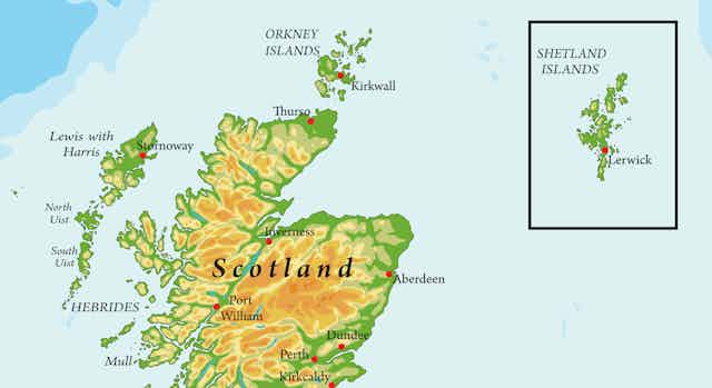

Take a 12 hour ferry north from mainland Scotland, and you’ll reach the Shetland Isles – the northernmost place in the UK. The only part of Britain to be considered “subarctic”, the archipelago of about 100 islands is found at the same latitude as the southern tip of Greenland. It’s so far north that, on most maps of the UK or Scotland, Shetland is cut out and placed in an inserted box somewhere off the coast of Aberdeenshire or the Highlands.
Yet this aspect of cartographic design has long been controversial among the 23,000 people who live on the islands. This was a point made recently by the their representative in the Scottish parliament, Tavish Scott MSP, who has passed an amendment to the Islands (Scotland) Bill which now prevents public bodies in Scotland from including the Shetland Islands in an “inset map” (in a box).
The Ordnance Survey, Britain’s national mapping agency, was against the move as it would imply “publishing maps that are mostly sea”, while we must now wait and see how this actually impacts maps produced by Scotland’s various public bodies, which do have a get-out clause if they use an inset, but explain their reasons.
Nonetheless, the idea behind the law change is certainly laudable. With Shetland in a box off the coast, it is easy to forget how much of a logistical and financial challenge it is to travel from the island to the mainland. It is a full 125 miles from the northern coast of the mainland to Shetland – about the same distance going from London to Nottingham. Placing the islands in their true geographical location should remind people of this reality.
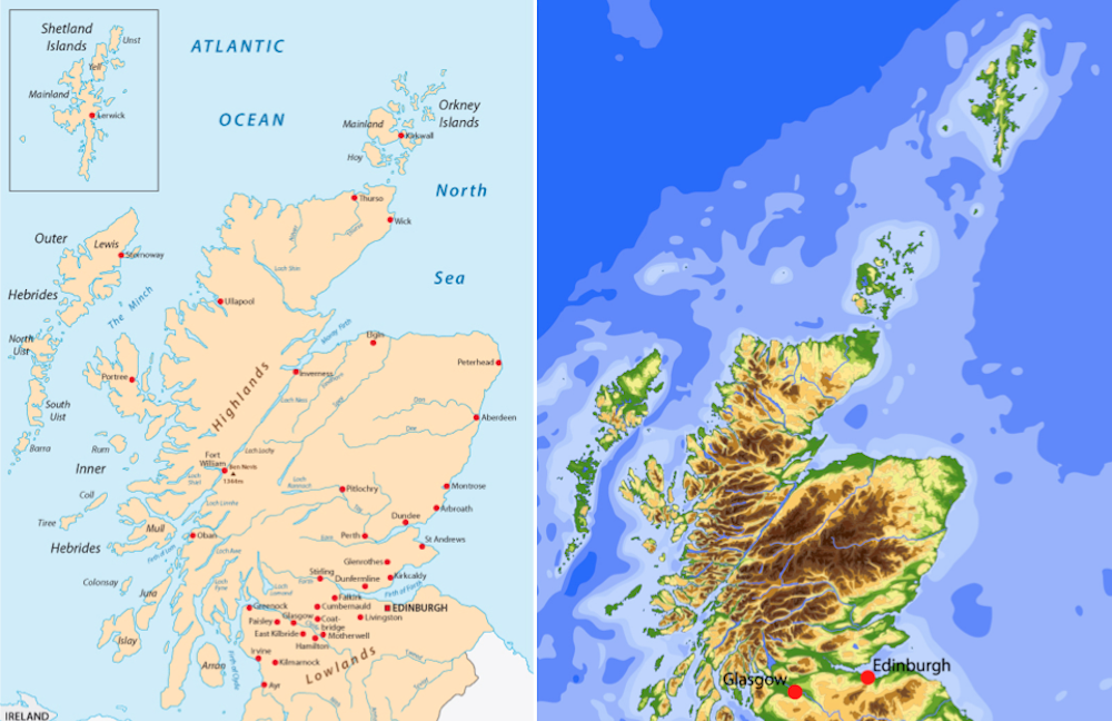
However, Scott has perhaps forgotten why the islands were put in a box in the first place, and this reason hasn’t changed in the hundreds of years that people have been making maps of Scotland. Due to their geographical isolation, including them in a box allows the rest of Scotland to be shown in much more detail. If the Shetland Isles were mapped in their true location, we would end up with a map that is largely sea, with the rest of the Scottish mainland around 40% smaller.
When creating any map, whoever is making it has to decide what to include and what not to include. If you had a map of the town or city where you live, would you include the internal layout of your home? Obviously not – marking out the distance you need to travel from your sofa to your kitchen to make a cup of tea would be both impractical and irrelevant for almost all users of the map.
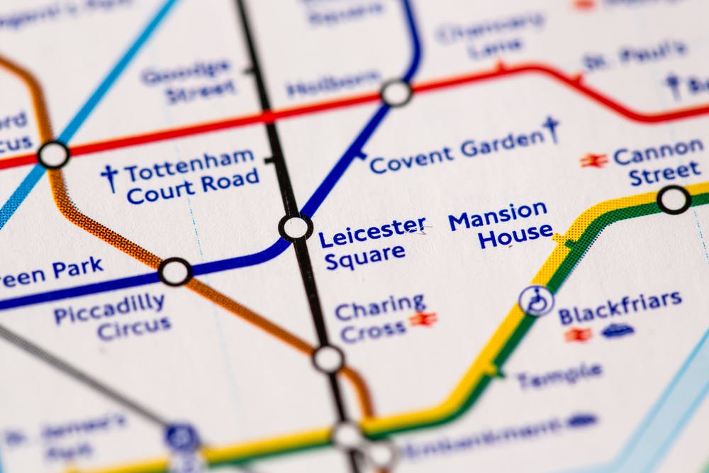
So what to include in a map depends on what the map is for. The London Underground map is a great example of one that only includes what it needs to: it lists the stations, the tube lines and is very clear on which lines connect where. (It also includes the River Thames, which is arguably not vital, but helps people orientate themselves and so was reinstated after it was removed in 2009). As a map to work out where to go in Central London on foot it is no help at all, but that’s not the point.
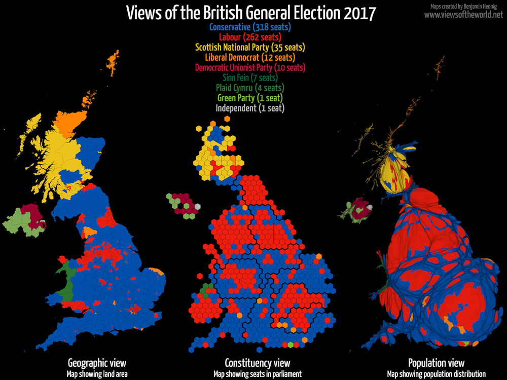
Hexagon-based maps used in parliamentary elections are another iconic example. Most viewers are not interested in the geographic area of each constituency, but do want to easily assess the total number of seats and which party has a majority.
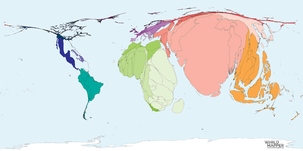
Decisions made at the design stage can alter how a map is interpreted, sometimes quite significantly. We can automate some of the process using Geographic Information Science (GIS) computer programs, but we have to use these tools carefully, with the end product in mind. Insets are just one element of a map that can have an impact on the message it conveys. The Worldmapper website uses cartograms to adjust maps to show variables other than space geographically, and Vox has a great video explaining different projection systems used to display the globe.
And the Shetland Isles? Some maps of Scotland should include the islands in their true geographic location in order to highlight their remoteness and logistical issues, as Scott says. However, not all maps need to: sometimes this is not relevant to the map, and it is more important to give more prominence to the central belt of Edinburgh and Glasgow where many more people live.
It all depends on what the aim of the map is. The choices made by the map maker have a big impact on the output of the process and how the map is viewed. It is impossible to represent everything on a map, and sometimes what we decide to leave out is much more important than what we decide to include.