

Statistics is a useful tool for understanding the patterns in the world around us. But our intuition often lets us down when it comes to interpreting those patterns. In this series we look at some of the common mistakes we make and how to avoid them when thinking about statistics, probability and risk.
1. Assuming small differences are meaningful
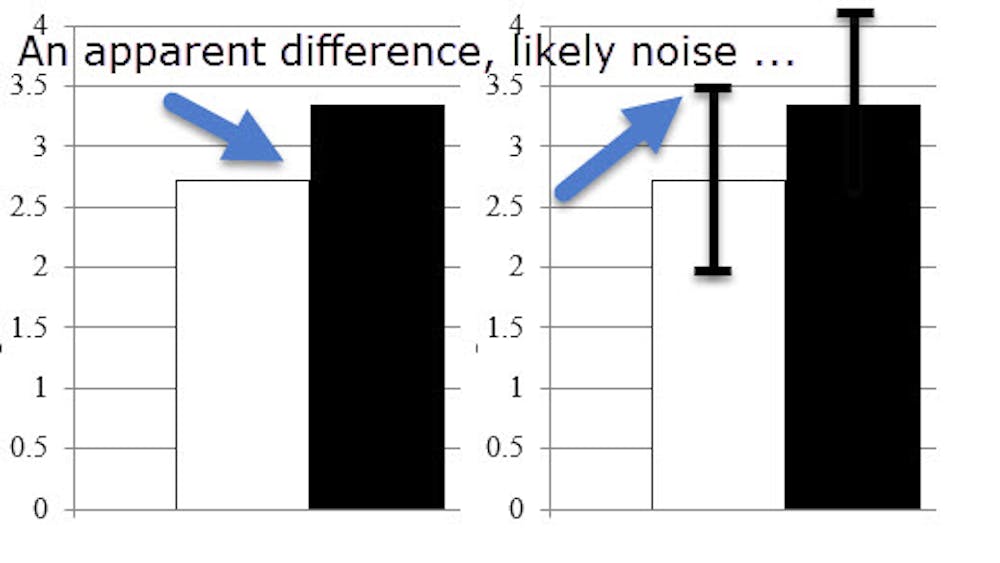
Many of the daily fluctuations in the stock market represent chance rather than anything meaningful. Differences in polls when one party is ahead by a point or two are often just statistical noise.
You can avoid drawing faulty conclusions about the causes of such fluctuations by demanding to see the “margin of error” relating to the numbers.
If the difference is smaller than the margin of error, there is likely no meaningful difference, and the variation is probably just down to random fluctuations.
2. Equating statistical significance with real-world significance
We often hear generalisations about how two groups differ in some way, such as that women are more nurturing while men are physically stronger.
These differences often draw on stereotypes and folk wisdom but often ignore the similarities in people between the two groups, and the variation in people within the groups.
If you pick two men at random, there is likely to be quite a lot of difference in their physical strength. And if you pick one man and one woman, they may end up being very similar in terms of nurturing, or the man may be more nurturing than the woman.
You can avoid this error by asking for the “effect size” of the differences between groups. This is a measure of how much the average of one group differs from the average of another.
If the effect size is small, then the two groups are very similar. Even if the effect size is large, the two groups will still likely have a great deal of variation within them, so not all members of one group will be different from all members of another group.
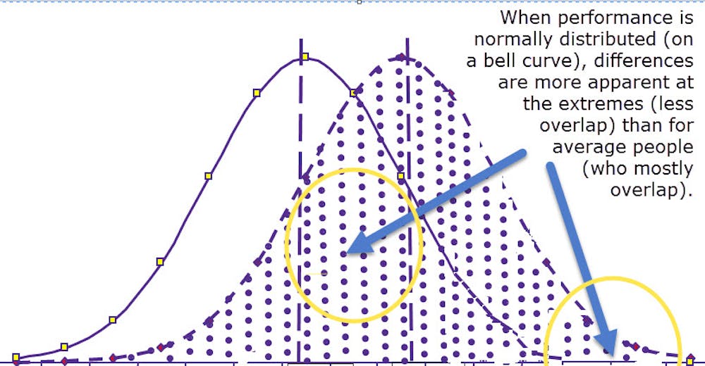
3. Neglecting to look at extremes
The flipside of effect size is relevant when the thing that you’re focusing on follows a “normal distribution” (sometimes called a “bell curve”). This is where most people are near the average score and only a tiny group is well above or well below average.
When that happens, a small change in performance for the group produces a difference that means nothing for the average person (see point 2) but that changes the character of the extremes more radically.
Avoid this error by reflecting on whether you’re dealing with extremes or not. When you’re dealing with average people, small group differences often don’t matter. When you care a lot about the extremes, small group differences can matter heaps.
4. Trusting coincidence
Did you know there’s a correlation between the number of people who drowned each year in the United States by falling into a swimming pool and number of films Nicholas Cage appeared in?
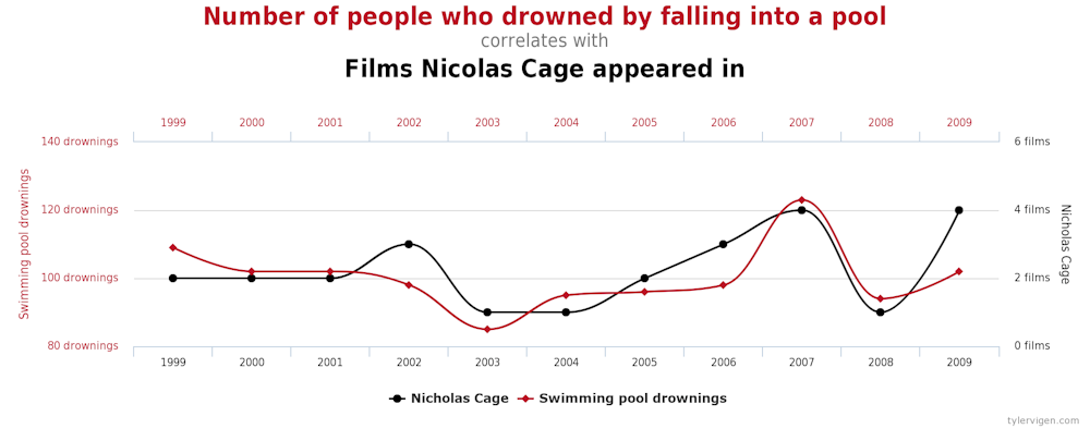
If you look hard enough you can find interesting patterns and correlations that are merely due to coincidence.
Just because two things happen to change at the same time, or in similar patterns, does not mean they are related.
Avoid this error by asking how reliable the observed association is. Is it a one-off, or has it happened multiple times? Can future associations be predicted? If you have seen it only once, then it is likely to be due to random chance.
5. Getting causation backwards
When two things are correlated – say, unemployment and mental health issues – it might be tempting to see an “obvious” causal path – say that mental health problems lead to unemployment.
But sometimes the causal path goes in the other direction, such as unemployment causing mental health issues.
You can avoid this error by remembering to think about reverse causality when you see an association. Could the influence go in the other direction? Or could it go both ways, creating a feedback loop?
6. Forgetting to consider outside causes
People often fail to evaluate possible “third factors”, or outside causes, that may create an association between two things because both are actually outcomes of the third factor.
For example, there might be an association between eating at restaurants and better cardiovascular health. That might lead you to believe there is a causal connection between the two.
However, it might turn out that those who can afford to eat at restaurants regularly are in a high socioeconomic bracket, and can also afford better health care, and it’s the health care that affords better cardiovascular health.
You can avoid this error by remembering to think about third factors when you see a correlation. If you’re following up on one thing as a possible cause, ask yourself what, in turn, causes that thing? Could that third factor cause both observed outcomes?
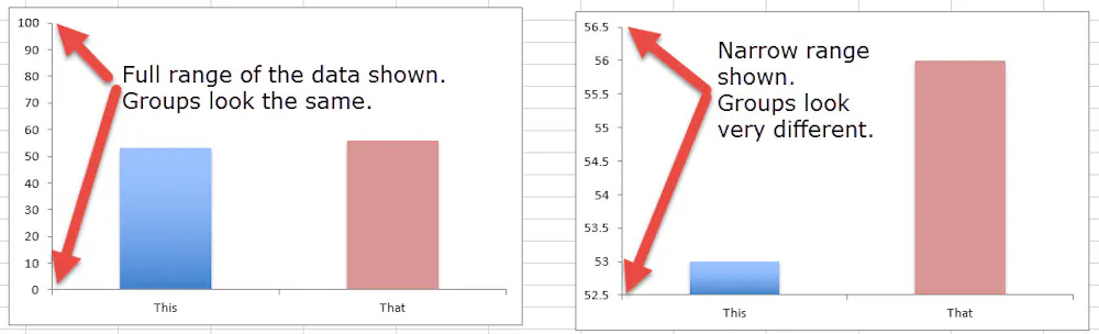
7. Deceptive graphs
A lot of mischief occurs in the scaling and labelling of the vertical axis on graphs. The labels should show the full meaningful range of whatever you’re looking at.
But sometimes the graph maker chooses a narrower range to make a small difference or association look more impactful. On a scale from 0 to 100, two columns might look the same height. But if you graph the same data only showing from 52.5 to 56.5, they might look drastically different.
You can avoid this error by taking care to note graph’s labels along the axes. Be especially sceptical of unlabelled graphs.