


Confirmed COVID-19 cases have now passed 10 million: what will they be next week, globally and in your country?
Having a good estimate can help health authorities with their responses and will guide governments as they ease lockdowns. To this end, we have been publishing real-time forecasts for confirmed cases and deaths for many parts of the world on an almost daily basis since March 20. These have largely been reliable indicators of what can be expected to happen in the next week.
Many of the more formal models for predicting the pandemic – such as the well-publicised Imperial College London model that guided the UK government’s response – use maths to try to explain the underlying processes of the outbreak, and do this by adopting a small number of interpretable parameters (such as the R number). They make predictions based on understanding how outbreaks work in general.
Our forecasts, on the other hand, don’t attempt to understand why changes occur. Instead, they are based purely on data from the current pandemic, looking at how it has already evolved and shifted to predict what will happen next. This often leads to more accurate predictions.
Why epidemiological models can struggle
Imagine you are travelling by road from Boston to California. Knowing from previous trips that California is your destination, we track your journey and try to forecast each day’s itinerary. When there are road closures, you briefly detour, so our forecasts go wrong for a while, then recover. Many models have such an in-built “reversion to the mean” that can handle these sorts of small changes.
Usually this model works well. But what if you hear about wildfires in California and decide to visit Canada instead? The forecasts become increasingly poor if we maintain that you are still going to California. The model needs to recover from such a “structural break”.

.jpg)
Most models in the social sciences and epidemiology have a theory behind them that’s based on available evidence from the past. This simple travel example shows why such models may not be good for making predictions: they risk being too highly driven by their theoretical formulations – such as that you’re going to California.
The Office for Budget Responsibility’s predictions of UK productivity after the 2008 financial crisis are a great visual example of what happens when such models go wrong. See the lovely graphs available from their historical forecast database. We call them hedgehog graphs, because the wildly erroneous forecasts look like spines going away from the confirmed data.
In epidemiology, most models have a sound theoretical basis. They take account of epidemics starting slowly, then exponentially increasing and eventually slowing. However, human behaviour and policy reactions can lead to abrupt changes that can be difficult to allow for (such as unexpectedly visiting Canada). Data may also suddenly shift in a pandemic – ramping up testing may reveal many new infections, or cases in care homes may suddenly join the dataset. To be effective in such settings, forecasting devices must be sufficiently robust to handle problems of changing trends and sudden shifts in outcomes and measurements. Our short-term forecasts can handle this in a way more formal models often can’t.
How our forecasts work and perform
To create our forecasts – say, for the total number of COVID-19 cases in a country – we first create trend lines based on the confirmed data that we have. Every time a new data point is added, this creates a new trend line – so there are as many trend lines as there are data points. A machine learning algorithm then selects the trends that matter out of all of those available, and those it chooses are averaged to show how the process has evolved over time (the trend in the data). Forecasts are derived from this underlying trend, as well as by looking at the gap between earlier forecasts and actual outcomes.
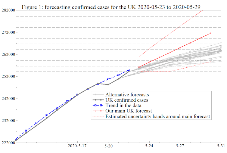
It may seem surprising, but this works. The graph below shows the forecast we made on May 22 for how the UK’s total number of COVID-19 cases would increase over the next week or so (the solid red line). Our forecast for May 30 was just under 272,000. The reported outcome ended up being 272,826.
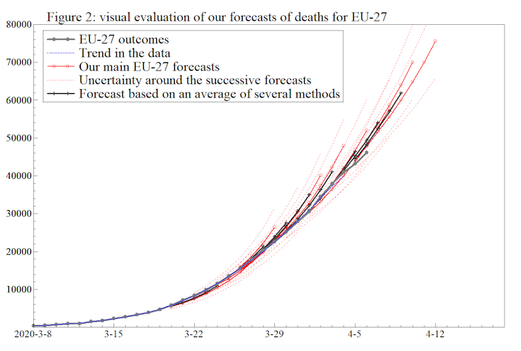
This second graph shows forecasts of EU COVID-19 deaths that we made during March and April. The successive forecasts made over time are shown in red, with the actual data points in grey. The overlap between the grey and red lines shows that the forecasting here was pretty accurate. Compare the close bunching of the lines here to the hedgehog graphs mentioned earlier!
However, a more precise way of judging the accuracy of forecasts is to look at a measure called mean absolute error (MAE). Absolute errors are the numerical differences between predictions and what the actual values turn out to be; MAE is the average of these differences for a set period. MAE gives a general measure of how far off your predictions were.
Up to April 4, the MAE for our one-week-ahead forecasts for COVID-19 deaths across a number of mainly European countries was 629, whereas on average forecasts by the Imperial College London COVID-19 Response Team for deaths in the same countries over the same period were out by 1,068. When incorporating the following week’s data, on average our forecasts were out by roughly the same amount – 678 – whereas Imperial’s MAE had grown to 1,912. After April 11, our MAE figures began to mirror one another’s, but at least in the early stages of the pandemic, our predictions seemed to be more accurate.
During the pandemic, these forecasts have provided useful insights for the week ahead, and now that Latin America is the epicenter of the outbreak, agencies like the Inter-American Development Bank are using them. Not only is our more robust way of forecasting playing a role in the current pandemic, we believe it may be essential in a second wave.