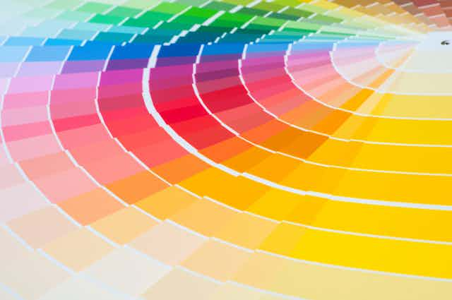
When people are sad they are often said to be “blue”. Jealousy is implied if someone is described as being “green with envy”. Angry people “see red” while yellow is associated with happiness, and in contrast, black and shades of grey have negative connotations. Why are certain emotions associated with certain colours? And where did these associations come from?
The impact of colour on emotion has long been of particular interest to artists, poets and philosophers. In the 19th century, the poet Johann Wolfgang von Goethe wrote his Theory of Colour (1810), a treatise on the nature and function of colour in relation to mood. Goethe’s work is poetic rather than scientific and based on his own subjective experience, but is a spellbinding account of the emotive experience of colour. Another key writer is the artist Joseph Albers, whose seminal study on The Interaction of Colour (1963) focused on the effect of colour on altering human perception.
There is some accepted research on the psychology of colour, although there is little empirical work and only a few systematic studies. These divide into two main views as to what the relationship between colour and emotions is. One holds that this relationship is culturally determined, and therefore varies across people and cultures. The other suggests a more psychophysiological basis for this relationship between colour and mood, implying that it is universal.
Studies seem to conclude that colour can affect mood, but they do not agree on which moods are brought out by which colours. Additionally, research has found that different shades of the same colour (for example pale blue and dark blue) can have completely different connotations when people are asked to specifically relate their mood to a colour.
Despite a relative lack of research, colour psychology has been applied in marketing and branding, with the aim of influencing consumers’ perception of goods and services. Colour theory, on the other hand, is more concerned with the rules and guidelines regarding the use of colour and colour combination in art and design.
“Colours, like features, follow the changes of the emotions,” the artist Pablo Picasso once said. But there remain many unanswered questions.

How to use colour to communicate
Given the links between colour and emotion, we wanted to consider whether colour could be used as a language to express how we feel. In particular, we are interested in the potential of using colour as a visual language to express emotions for people with communication difficulties.
Our research developed from an interdisciplinary collaboration across the social sciences, art theory and practice and speech and language therapy. We worked with a group of seven people with aphasia – a language impairment following brain injury such as a stroke.
In a series of workshops, we explored how we might use colour to express how we feel, using stickers as the medium. As a first step, we developed a series of concrete words adapted from the Positive-Affect Negative-Affect Schedule (PANAS), which records positive and negative mood.
Research has found that with people with aphasia tend to have problems with processing abstract words. We therefore developed six pairs of concrete words to prompt thinking about emotions: happy/sad; soft/sharp; big/small; new/old; share/hide; high/low. Participants were asked to choose what colours they felt in relation to these words. Later workshops introduced the idea of shapes, texture and sizes to consider the intensity of felt emotions and moving away from words towards a colour language.

We found that concrete words can be a useful starting point for discussion and to ask people how they feel, and that colour offers people with communication difficulty another way to respond without using words. For a small number of words, similar colour choices were made by different people (such as dark, muted colours for “sad”). But for other words, people’s choice were quite individual. We found that people had different “colour vocabularies”.
We therefore produced a “Colour and Emotion Toolkit”, containing a manual which presents a number of exercises for start thinking about colour and emotion; a colour mat, which provides a communication tool for expressing emotion; and a diary, to record emotion over time. We hope that speech therapists will work with these tools to develop a tailored means of communication with their clients. Colleagues of ours will be trialling this in the near future.
We also put on an exhibition to mark the end of the project, including research materials produced within participants and artist responses to the theme of colour, emotion and well-being. This is on display at the UCLH Street Gallery in London.
Measuring well-being creatively
One potential use for this toolkit is to develop a new non-verbal measure for well-being. Well-being can be understood as how people feel and function. The psychological definition of well-being includes emotions, such as happiness, as well as meaning and satisfaction. Measuring well-being is becoming a central concern for public policy to assess social progress. It also enables organisations to improve the design and delivery of programmes and services, especially in the contexts of healthcare and culture-in-health interventions.
But well-being is usually measured through questionnaires that rely on language. These are not readily useful for people with communication difficulties. Furthermore, they focus on a cognitive assessment of well-being rather than recording the immediacy of feelings and sensations. Our toolkit provides a way for people with communication difficulties to express how they feel – using colour rather than questions.
Clearly, colour is emotional: it is an immediate way in which we experience the world. Colour can therefore provide a communication tool which offers a different way of talking about how we feel. Our project points to ways in which we can use colour to develop non-verbal approaches to assess mood and well-being outcomes, with potential application in a variety of therapy and clinical situations.

