
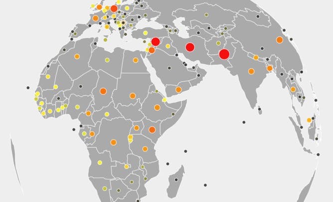
Welcome to our new infographic, displaying global populations of refugees from 1975-2010, as part of The Conversation’s expert panel on asylum seekers.
Using UNHCR data compiled by the United Nations Refugee Agency, the graphic highlights refugee populations across the world over time: where refugees settled, and where they came from. Every population the UNHCR has counted over 35 years is charted on this spinning globe.
Click the image above to launch the application: spin the globe, stop the clock and focus on an individual country to read its refugee story.
Note the UNHCR data does not include refugees who were resettled in Australia, only those who arrived in Australia as asylum seekers and were found to be refugees.
An earlier version of this infographic relied on a misinterpretation of the UNHCR data. The population estimates were misinterpreted as refugee arrivals per year. This infographic corrects these errors.
Read the rest of The Conversation’s asylum seeker coverage:
Asylum seekers and Australia: the evidence
The Conversation panel on asylum seekers: meet the experts
What does the Australian public really think about asylum seekers?
Refugee intake starts in the region: making a difference in regional burden sharing
Refugees and asylum seekers in Malaysia: the good, the bad and the unexpected
Resettling refugees: the evidence supports increasing our intake
What role does Australia play in accepting the world’s refugees?
Who are Australia’s ‘boat people’, and why don’t they get on planes?
Uncomfortable truths: busting the top three asylum seeker myths
There’s no evidence that asylum seeker deterrence policy works
There’s more to regional collaboration than the Malaysia Arrangement
How immigration policy harms asylum seekers’ mental health
Asylum seekers in Indonesia: why do they get on boats?
Preventing deaths at sea: asking the experts on asylum seekers